The best movie about the man. Ever.
We’ll Take Manhattan is the best movie ever about the life of David Bailey, the photographer who with Donovan and Duffy changed fashion photography, simultaneously causing an irreversible cultural upheaval. Bailey, who pre-dated the Beatles, was a working class lad who broke the rule that Vogue photographers had to be public school boys – or at least spoke like them – form ruling substance as ever. And, until Bailey, with his rugged masculinity, came along, it didn’t hurt to be somewhat effete, to put it politely. The girls, after all, would be safe. The likes of John French and Cecil Beaton would never rule again.
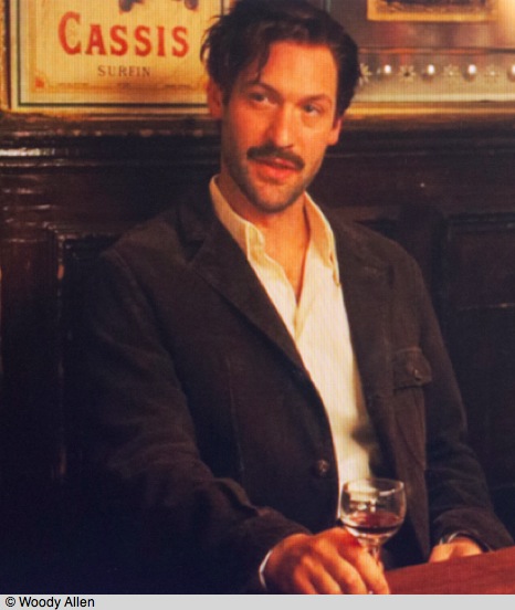
The acting in the movie is exceptionally good, and Aneurin Barnard as Bailey just nails the in-your-face, don’t-give-a-damn, cheeky Cockney persona of the original. I speak from experience. While a student at UC London in the early seventies, I was also a student member of the Royal Photographic Society which, while it took itself awfully seriously, also had the redeeming factor that it would invite great photographers from across the world to speak every now and then. Amazingly, one such lecturer was Bailey, and to say that his presentation was irreverent is like calling the pyramids labor intensive. By the time he got through with ‘effing this’ and ‘bollocks that’ I was both charmed and exhausted from laughing, not necessarily emotions shared by the many Colonel Blimps in the audience. He just did not give a damn and he changed photography. On a natural high, I walked home from Mayfair to Kensington that night, and I swear I flew. As a matter of fact, crossing Hyde Park, I lay down under the stars on the big lawn, stared at the sky and concluded that not a whole lot was wrong with a world which allowed a Bailey to rise to the top.
Not only does Barnard get the rôle down, but his handling of the TLR Rolleiflex T (the nobs used the 2.8C) and the SLR Pentax S3 (the well heeled hewed to the SV) is picture perfect. He really knows how to use a camera, something missing from just about every picture about photographers. (Hemmings does not do as well with his Nikon F in Blow Up). The filmmakers get the shutter sound of the Rollei wrong and show the S3 as having TTL metering, when it had none, but these are minor gripes. The movie chronicles a trip Bailey and his girlfriend Jean Shrimpton make to Manhattan on assignment for British Vogue and there are wonderful depictions of Clare Rendelsham and the fearsome NY editor, Diana Vreeland who, quite clearly, breakfasted on broken bottles. Vreeland’s successor, Anna Wintour, prefers razor blades.
Karen Gillan gets the naïvete and innocence of the young Shrimpton just so; her only disadvantage is that acting Shrimpton is simply impossible, as acting is the lesser part of the rôle. You have to look like The Shrimp and that, I’m afraid, cannot be done.
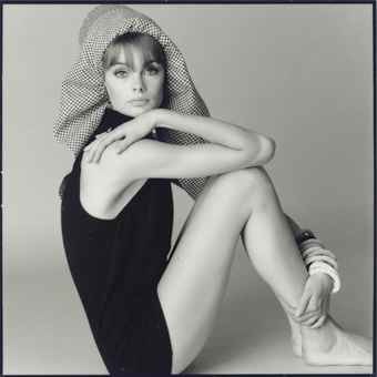
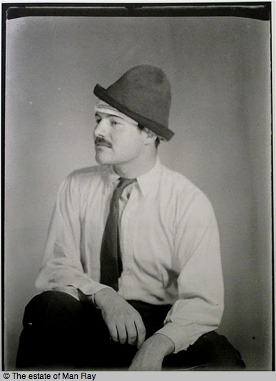
The beyond perfect Jean Shrimpton, 1960s.
Many years later Bailey, famous for his use of the Pentax, had his camera featured in what is surely the greatest gear ad ever. ‘David Bailey’s Pentax’ was all the copy said and that’s all anyone needed to know. He subsequently revealed that he had taken sandpaper to the camera to convey the battle scarred look, and in retrospect it’s obvious when you look at where the ‘wear’ occurred on the body. In the real world, the areas on the front near the prism could never be worn from use. And while I never thought about it at the time I first saw the ad, I love the way Bailey fooled one and all. That’s all you need to know about the man.
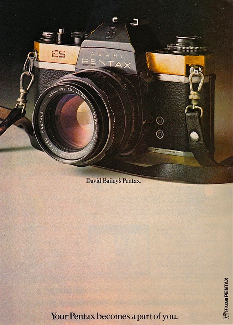
Sandpaper works wonders.
The movie premiered on the BBC on January 24th, 2012. Because the BBC is run by a bunch of people with umbrellas up their posteriors, the chances we will ever see it here are remote. They have been promising to release their iPlayer on a subscription basis in the US for ages now. What they really need is someone to get a hold of their payroll and a blue pencil, apply the latter to the whole senior layer of management and privatize the bloody thing, because for the last two years this is what I get when dialing up their application in the most powerful consumer market in the world:
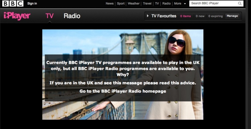
The BBC. Arse indistinguishable from elbow.
The profit motive has clearly yet to darken the BBC’s doors and it’s high time it did. Wanna get the movie? Good luck – cultivate your British friendships. It’s worth the effort.
My fantasy about early Bailey? Click here.
Comment from the writer/director: See the Comments for details of a US showing from John McKay, who wrote and directed the movie. He also adds some fascinating details regarding Aneurin Barnard’s photography during the making of the movie. Be sure to watch the short in John’s link where he tells how the original locations were used in his movie.
Here’s the short:
David Bailey Takes Manhattan on Nowness.com.