The Leica DP – Part I

Finally – a digital Leica

Preconceptions abound in our society.

Italians are great lovers.
The French cannot be trusted.
The Welsh are liars.
Poles are stupid.
Jews are smart.
The British cannot cook.
Americans are crass.

And so on.

When it comes to photography, the one that always jumps to mind is:

Leica makes the best lenses.

This is about as accurate as the little collection of bigotry introducing this piece.

What is ‘best’ is a function of the situation. If you want an interchangeable lens camera with tracking autofocus, for example, there is no best Leica lens. In fact, there is no Leica lens. Better look to the great Japanese manufacturers (or, more correctly, designers, as most everything is made in China anyway) for that.

Yet, I confess, that after over thirty years of using Leica M rangefinders with any number of Leica optics attached, that I am something of a bigot. You see, I do believe Leica makes (some of) the best lenses. Even the Leica company is beginning to realize that its salvation lies not in making bodies, but in supplying lenses for other manufacturer’ bodies. Small, undercapitalized, forever on the verge of bankruptcy, Leica Camera cannot hope to develop a competent modern body without massive out sourcing of electronic needs – LCDs, motors, microprocessors, software, you name it.

Back in 1976 Leica showed a working version of their Correfot autofocusing system at Photokina. That was the last that was heard of it on a camera. Either they failed to patent it or lacked the capital to enforce their patent so that, before you knew it, every major Japanese manufacturer had autofocus based on Leica’s (or was it Honeywell’s) genius.

No, it takes major capital to make electronic gizmos and Leica cannot hope to compete.

When I moved from medium format to full frame digital, acquiring a Canon 5D from the sales proceeds of all that clunky 6×6 gear, the knowledge still rankled that a miniature camera, as the original 35mm cameras were known, was missing from my tool kit. ‘Miniature’ is the operative word, for whereas the 5D delivers medium format quality with a fraction of the bulk and weight of medium format, no one could accuse the body and lens of being compact. Try to stick it in your pocket and Mae West would be apt to remark “Is that a 5D in your pants or are you just happy to see me?”

I have long been searching for a digital camera which would combine those special features a street shooter needs, and I have some claim to the appellation, much of my early work having been street photography, pure and simple. You can see the results of these Leica years in my book Street Smarts. What are those special features? Well, the camera must be small and unobtrusive. Quiet of course. Must have a 28mm or 35mm lens. Must have the shortest possible shutter delay. And it must have an optical viewfinder. Plus, of course, that elusive Leica lens.

Let me present the Leica DP, or the Leica Digital Panasonic:

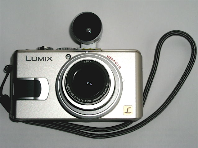
I wasn’t about to wait for the much rumored digital Leica M. First, who knows when, if ever, it will be available. Second $5,000+ paid to a near-bankrupt company for a body with a cropped sensor, which makes my 35mm Summicron into a 46mm ersatz wide angle, is not my cup of tea. So when the Panasonic company released its Lumix LX1 I spent the last of my excess medium format gear proceeds and got one. Something tells me Panasonic will last longer than Leica and while not chump change, the $480 I paid beats the $5k or whatever that the Digital M will go for. The lens is a 28-112mm (I’m using 35mm full frame conventions here) zoom, f/2.8 at the widest setting, falling to f/4.9 at the long end. I had no desire for a zoom, but there was no alternative. What attracted me most to the camera was that it came in chrome (I like to look as amateur as possible) and boasted a very short shutter lag. The latter has been the bane of all but the most costly digital cameras. Sure, the 5D has a lag similar to a Leica M, but it’s hardly a low visibility candid camera.

The biggest drawbacks were the lack of an optical viewfinder and reports that the sensor is very noisy. Well, an email to Cameraquest and $160 later saw a gorgeous Voigtlander 28mm optical viewfinder of bejeweled quality arrive in the mail. Some 3M Super Weatherstrip Adhesive and a few minutes of work saw the finder neatly glued to the top of the LX1, where it replicates the camera’s field of view pretty accurately at the widest setting of the lens. I was going to glue an accessory shoe to the top plate of the LX1 but the only useable space – between the mode dial and the pop-up flash – is so tight that I had to resort to simply gluing the finder directly to the top plate. By using weatherstrip adhesive the bond can be undone at any time with 3M Adhesive Remover, yet is robust enough that the integrity of the ensemble remains unthreatened. You can see just how tight the clearance is here:

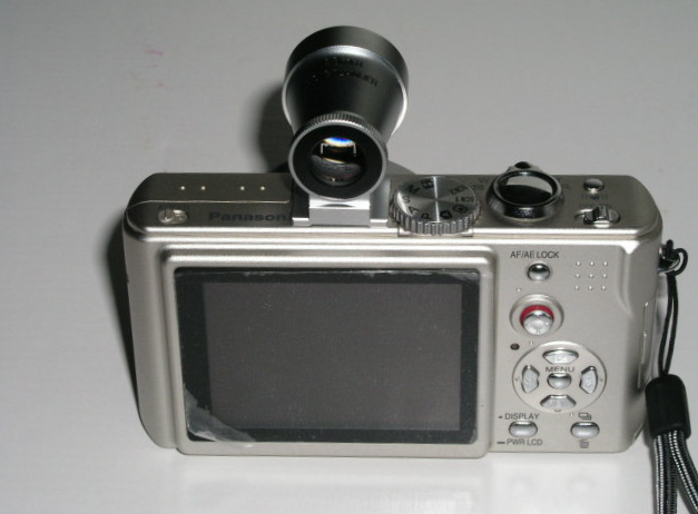
Here’s how the assembly looks from behind ….
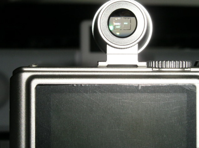
….and in close up:

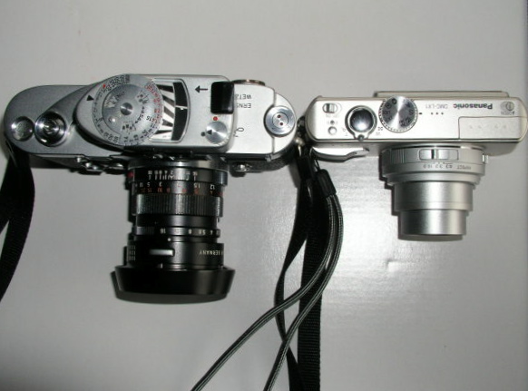
Compared with the M3 the Leica DP is miniscule, weighing in at some 6 ounces plus some 2 ounces for the finder.

Here’s a top view:

Now for some tuning. The LX1 comes with the usual mind numbing collection of mostly useless digital settings. I set the lens at 28mm and the aspect ratio to 16:9. There are three ratios – widescreen 16:9 (like a movie), classical Leica 3:2 and standard digital 4:3. I like the widescreeen look so I went with that. Second, the mode dial was set to ‘A’, meaning aperture priority – you set the aperture, the camera does the shutter speed. I keep it at f/2.8, the maximum. That gives me a shutter speed range of 8 seconds to 1/1000. Stop down a bit and you can get to 1/2000. You will not miss that as the camera has built in vibration reduction, somewhat akin to the IS feature on some Canon lenses, and good for a couple of shutter speeds in terms of camera shake.

ISO is set to 100 until I can figure out just how bad the digital noise is at higher speeds (the camera only goes up to 400 – just like TriX of old), and focusing is set to ‘high speed center area’ to further reduce shutter lag compared with the standard multi-area setting. I leave the auto focusing on but reprogram the AE/AF lock button on the rear to lock exposure only. That way scenes with, say too much sky, are pre-metered by pointing the camera down and jabbing the AE button. Focus can be locked separately, if needed, by taking the first pressure on the shutter release with the focus rectangle pointed at the area of interest, prior to final re-composition. All take much less time than manually focusing your Leica M and messing about with the aperture and shutter speed controls.

How is the key aspect of this combination, shutter lag? Well, accepting that the Leica M and the Canon EOS 5D are pretty much instantaneous, there is a very short delay with the Leica DP as focus take place. Not enough to bother about. The default setting for shutter sound made by the DP is described as ‘soft’ (a very loud ‘clack’) and the loud setting is something like a Pentax 6×7 going off. I switched the shutter sound to ‘Off’ and while you can just barely hear the shutter tripping in a quiet room, in practice you learn to judge when the picture has been taken from the feel of the shutter release button. Compared to a Leica M? Well, the M’s shutter noise is to the Leica DP what the Pentax 6×7 is to the M. The Leica DP wouldn’t disturb your next audience with the Pope in his chambers.

Hey! wait a minute, you protest. Why didn’t I buy the Leica D-Lux 2 which is, after all, a real Leica. Oh! do come on. I saved $300 on the identical Lumix and put some of the savings towards the viewfinder and a 1gB Sandisk Extreme III fast SD card, the better to write out those RAW files that the camera produces. You can opt for a variety of JPGs too, of course, but I feel RAW is the way to go with a noise challenged sensor. The 32 mB card shipped with the camera is a joke – it will accommodate 2 or 3 images. The 1gB Sandisk will store 52 pictures using the highest quality RAW setting with the 16:9 aspect ratio. That feels like two 24 exposure rolls of film from the old days, just right for a day’s street photography. Still, if you want to pay another $300 for a silly red label, have at it.

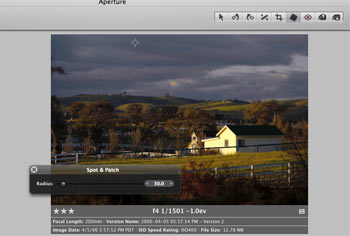
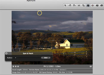
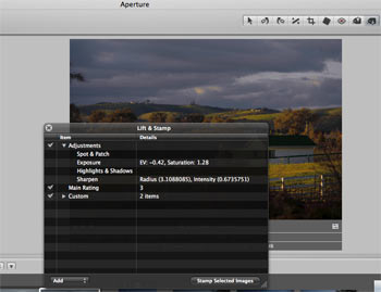
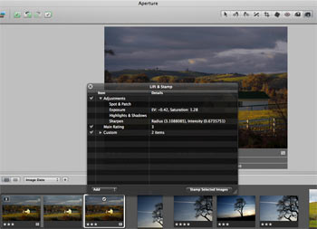
Drawbacks so far? Well, Aperture does not yet recognize LX1 RAW, so it’s back to that old dog Photoshop CS2 and Adobe Camera RAW for conversions. This combination has all the ergonomics of a Swiss Army knife but at least it yields high quality RAW conversions. Once converted to TIFF the images can then be dropped into the Aperture database. The camera is also very small, meaning it’s easy to drop. The provided wrist strap fixes that. Finally, apertures or shutter speeds (if you use aperture or shutter priority) have to be set using the built in LCD (the camera can be used in fully manual mode if you desire) but at least it’s easily readable in all but the brightest sunlight. That’s in contrast to the truly horrid screen in the $3,000 Canon EOS 5D body. C’mon Canon, wake up!

In Part II I relate some practical field experience with this little jewel. Meanwhile, I’m off to find one of those idiotic ‘Leica’ red stickers, beloved of dentists and investment bankers who collect jewelry, as it should double the value of my new Leica DP.

Competition lives

And it helps improve the breed, as ever

When I read the other day that Mamiya was quitting the photography business, having blown not a few Yen in developing its medium format digital camera, I confess my first reaction was unease. While Mamiya may have been guilty of poor market analysis – Canon’s 35mm format sensors being the equal of just about anything medium format offers at a fraction of the price – it is never a good thing to have less choice.

Take a look at today’s monopolists and their uniformly execrable products and customer service – Microsoft’s operating system, Adobe’s Photoshop, Intuit’s Quicken, the handful of oligopolistic US defense manufacturers, the US Government (the worst monopolist of all) – and you get the idea.

However, I thought a more analytical approach might make better sense of Mamiya’s demise, so I dug out the old 1976 Wallace Heaton Blue Book, the photography equipment catalog published by a famous London camera store, and did some figuring.

Here were your choices some thirty years ago:

First, 35mm SLRs: Nikon, Canon, Pentax, Leica, Rollei, Zodel (Zodel?), Olympus, Minolta, Miranda, Yasicha, Petriflex, Praktica, Mamiya and Exakta were listed in that order.

35mm rangefinder cameras included Leica, Minolta, Yasicha, Canon, Agfa, Dignette (what?), Nikon, Rollei, Olympus and Konica.

No digital cameras, of course.

Seventeen manufacturers all told.

Then I went to the B&H web site to see what’s out there today.

SLR film cameras: Canon, Contax (now defunct), KonicaMinolta (kaput), Leica, Nikon, Pentax, Phoenix, Sigma, Vivitar and Voigtlander.

35mm film cameras: Canon, Contax (now defunct), Fantasea, Goko, Kalimar, KonicaMinolta (now defunct), Leica, Lomographic, Nikon, Olympus, Pentax, Rollei and Zeiss.

Digital cameras: Bushnell, Canon, Casio, Epson, Fuji, HP, Kodak, KonicaMinolta (gone), Mamiya (gone), Nikon, Olympus, Panasonic, Pentax, Rollei, Samsung, Sanyo and Sony.

Make that twenty four active manufacturers, or some 40% more than there were thirty years ago. And many of these are consumer electronics companies first (Canon, Casio, Epson, Fuji, HP, Panasonic, Samsung, Sanyo and Sony), and camera makers a distant second.

So while Canon could do with some serious full frame sensor competition, the capitalist world as seen through the metric of choice of photo gear seems to be ticking along just fine. Those that fell by the wayside, KonicaMinolta, Mamiya, Miranda etc. just failed to make products enough people wanted, which is as it should be.

Look, the alternative is GM – a company making products no one wants with its hand out to the government, aka the taxpayer’s pocket. I prefer a good bankruptcy myself.

Early photographic vision

Uccello and Carravaggio had it down 500 years ago

As a boy growing up in London I lose count of the number of visits I made to The National Gallery in London. Whether going through my Impressionist period, High Renaissance or early Renaissance, there was always something there to fascinate and to intrigue. While photography had always been my first love in the visual arts, I think I learned more about seeing from gazing at the art in this great collection than from any number of photography books.

Some of these experiences left deep impressions. When asked which of the works on display I liked most, nay, desired to possess, the choices narrow to a few. Titian’s ‘Noli Me Tangere’ (1512) (Do Not Touch Me) of course. I have always been captivated by the dynamic use of diagonals – Christ, Mary Magdalen, the tree, the lovely warm light, Christ’s daring near-nakedness. You can feel the motion as he grabs the shroud to prevent Mary pulling on it. It is hard to conceive of a more perfectly balanced composition and if you think you cannot get away, as a photographer, with lampposts growing out of people’s heads, well just look what Titian did with that tree!

I have always felt that The National Gallery has way over-restored its Titians to near-Cibachrome color intensity, and that clearly shows here, but the magic of the picture saves the day.

So when it comes to lessons in composition, just check a few Titians out.

Botticelli’s Portrait of a Young Man (1485) is simply arresting. It’s one of the smallest paintings on display at 16″ by 12″ – the size of a regular photographic print. But you walk into that gallery and there’s only one thing you can see. The certainty of the gaze, the confident bearing, the red cap accent, the somewhat rushed rendering of the tunic, all to good purpose. It places all the focus on the eyes. When I first saw this – I was probably fourteen at the time – I made such a bee line for the picture that I nearly knocked over one of London’s dowager ladies in my rush. It’s that good. I frequently fantasized about pinching this masterpiece – how hard would it be to make off with a 16″ by 12″ canvas, after all? To this day the use of daylight and the way shadows model the face leave anything Vermeer did with lighting in, well, the shade.

As a photographer it is simply impossible not to like Caravaggio. Versions of The Supper at Emmaus hang in both the National Gallery and the Louvre, the diners’ ragged clothing rendered just so, the worms in the fruit on the table and, of course, Caravaggio’s signature lighting. But great as that painting is, it is simply eclipsed by The Conversion of Saul (St. Paul). In London’s Swinging Sixties the 21mm lens on a 35mm camera was de rigeur for any self respecting trendie. You saw its abuse everywhere, especially on record sleeves of the more extreme rock groups. Wild perspective, severely receding lines, objects very close to the lens, distortion galore. Well just take a look at this. Caravaggio had the 21mm figured. What is breathtaking about this canvas is how little space he has worked in. Painted in 1601 the canvas is simply enormous – some 7 1/2 by 6 feet. In other words, the horse is rendered at almost life size. Why so large? Caravaggio was a student of perspective. He knew that viewers would get too close to the painting, but that, by doing so, the grandeur of his ultra-wide angled vision would be correctly rendered and the perspective distortion would disappear. And so it does. The painting is immensely involving. You are there. Like a movie in a theater compared to the same thing on television, you have to see this live. Not reproduced.

But easily the strangest use of perspective on view in The National Gallery belongs to a visionary whose work preceded that of all the above, none other than Paolo Uccello. In 1450 he painted three enormous panels depicting the battle at San Romano in which the Florentine army defeated Siena some twenty years earlier. The three panels are some 6 feet by 10 feet in size. One (the weakest, and that’s a cruel critique) hangs in The National Gallery. The others hang in the Louvre and the Uffizi. Fitting that three of the greatest masterpieces of the early Renaissance should hang in the three greatest Renaissance collections.

Appropriately, the best hangs in the Florentine collection, but look, if you gave me the one in London I would have no issues with finding wall space for it. I assert that there is more to be learned, as a photographer, from this one painting than from any number of academic studies on the use of perspective. By the time this painting was made, artists understood the rendering of perspective well. Uccello just chose to disregard the rules, dramatically foreshortening perspective, predating surrealism by some six hundred years. The repeating motif of the lances, the purposeful abuse of sizing (look how small the dead soldier in the left foreground is), the steep, tilted, climbing background with the horsemen rendered way too large, the detritus of battle painted in seemingly random perspective. It’s magic. Simply the greatest lesson in the (ab)use of perspective on canvas.

As photographers, we have a lot to learn from the masters.

And no, I harbored no fantasies about making off with the Uccello. It’s just too big to stash under a genuine English raincoat.

Boxers

Book review

I confess that I approached ‘Boxers’ by Carol Huebner Venezia (an American photographer, the exotic name notwithstanding) with great anticipation. The publicity talked of how the photographer had got inside the psyche of the professionals in Gleason’s Gym in Brooklyn where many famous fighters had trained. Further, the publicists intoned, she counterbalances the tough end of the sport with pictures of fighters in Italy. I quote:

“Boxing offers those working class men who learn the sport a slim chance of realizing the American dream. But the price for social standing and above-average income is often broken bones and chronic health problems. In contrast, in Assisi, in the center of the Italian boxing world, boxing is about athletic competition and the art of the sport.”

Well, based on what I see here, she never made the remotest emotional contact with her subjects in either location. Indeed, some of the best pictures have no boxers in them – one of a young child in the ring and another of swinging sacks, or whatever you call those things, that boxers pummel. Nary a boxer in sight. Great pictures though.

Despite the high fallutin’ text, based largely in academic drivel, the woman’s inability to get inside the brains (or what’s left of them) of her subjects is mystifying. It’s not as if she didn’t try, as the pictures span over a decade.

Let me quote from the introduction just to reassure you I am not making this up:

“If we look at the group of pictures as a whole, there appears to be a clear impulse to movement both in the single photographs and as a sequence”. What? Nearly every picture in the book is stiffly posed in a pale imitation of August Sander. Sander is much lauded in the introduction let it be said, and the comparison only goes to show the photographer in a negative light.

One of the few snaps with movement is of the swinging medicine (yes, now I recall what they call them) balls in a deserted gym. Why these should be moving when there is no one in sight beats me, but it’s a neat idea, I suppose.

Here’s another Doozie from the intro:

“The objective approach of this photography avoids pathos or any explicit critique of society”.

Please.

So that’s where our higher education monies are going? To pay boobs to write claptrap like that? What a travesty. Time they got a real job and learned to write English.

Lots more of the above garbage is to be found in the introduction. No need to dwell there.

On to the pictures.

There are a scant thirty all told, one of which, the one so badly exposed that no facial details can be discerned, also appears on the cover. Not exactly what you would call value in a $30 paperback. Fully half of these are static portraits, some in what could be a studio setting, of half naked guys who, absent their gloves, could as well be construction workers. Or fit investment bankers, come to think of it. The remaining pictures are generally so irrelevant to the genre that I really wonder why the woman bothered? Maybe she liked to go to Gleason’s for the vicarious pleasure of seeing all those muscles, the camera as an excuse, but the guys in the ring clearly did not accept her as one of their own. Heck, she’s probably the wrong gender and color anyway.

I would like to say something positive about this book. I cannot. I just feel I have been ripped off.

Update May 18, 2009: This book is so unquestionably bad, the photography so regurgitably awful, that I finally consigned my copy to where it belongs. The garbage bin. Good riddance.

Stamp out sensor dust

Apple’s Aperture has a unique tool for the job

It’s no secret that image sensors in digital cameras with removeable lenses are prone to atrract dust. The Canon EOS 5D I use seems to be especially bad in this regard from what I have read on the various chat boards. While I give my sensor a swipe with the anti-static brush now and then, the reality is that sensor dust does crop up and can be a real problem if many snaps are exposed with the dust mote in place on the sensor.

The one positive about all of this is that Apple’s Aperture has a tool to remove such dust spots, as the designers recognized that any particular speck of sensor dust will have the exact same position on the resulting photographs from image to image. The dust mote does not move even if the camera does.

Apple’s Aperture provides a tool, unique as far as I can tell, which permits rapid removal of sensor dust from mutiple images. So if you have just taken two hundred pictures only to find an offending dust spot in each, at the same location, the Aperture Lift and Stamp tool is for you.

Here’s how it works. In this picture you can see the Spot and Patch tools cross-haired locator at the top of the image, where the offending dust spot makes its home:

Hit enter and the circle becomes yellow, effecting removal of the spot on the selected image:

Unlike with Photoshop, there is no need to select a source for the patch – Aperture does it automatically based on the area sorrounding the defect.

Now click on the Lift part of the Lift and Stamp tool icons visible at the top of the screen – it’s the one with the arrow pointing up.

The type is small here, but the original discloses that I have made four adjustments – Spot & Patch, Exposure, Highlights & Shadows and Sharpening.

Now highlight all the images with a like dust defect (Shift-Click for contiguous ones or Control-Click for non-adjacent ones), click the Stamp icon of the Lift and Stamp tool (the one with the arrow pointing down) and click on any one of the selected images.

The dust mote is removed in all of them. In my case, as I have also made Exposure, Highlight & Shadow and Sharpening adjustments, these would also be conferred on all these images. So if the images are different, do the Spot & Patch and Lift & Stamp work first, then selectively change other parameters in images as you please. The images selected for dust removal can be versions of one image, disparate images, or both.

Don’t forget to clean the camera’s sensor after doing this!

See what I mean about good design? Care to find this feature in Photoshop? I think not.