Monthly Archives: September 2011

Perfect Resize 7

Smoke and mirrors.

You see them all the time in the Bay Area of San Francisco. Little Hondas with a gigantic and noisy tailpipe, invariably driven by someone about five feet tall, almost hidden behind the wheel. Lots of chrome, lots of noise, not all that much ooomph to show for it.

It’s an image which kept coming to mind as I tested Perfect Resize 7 which, in a past life, was better known as Genuine Fractals. The product’s stated aim is to allow you to make monster prints from small files, with the best possible quality, better than your regular processing application can achieve.

PR7 claims to get a quart out of a pint pot, just like that Honda driver, and it can’t be done. As the old car guy saying has it, there’s no substitute for cubic inches or, in the case of digital imaging, large sensor sizes.

PR7 retails at a costly $70-100 and installs as a Photoshop, Lightroom 2 or 3 or Aperture 2.1 or later plugin, accessible from within each application. Alternatively, you can open your file in the stand-alone variant which comes with the download. The download is 38.5mB and there’s a useful base tutorial; the others refuse to open (and they want how much?) owing to carelessness by the makers, but use is intuitive ebough. I tried PR7 in LR3.

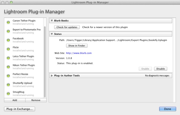
After checking that it’s correctly installed as a plugin in LR3 –

– I invoked it using a favorite Canon 5D file of our son. The app opens within LR3 thus –

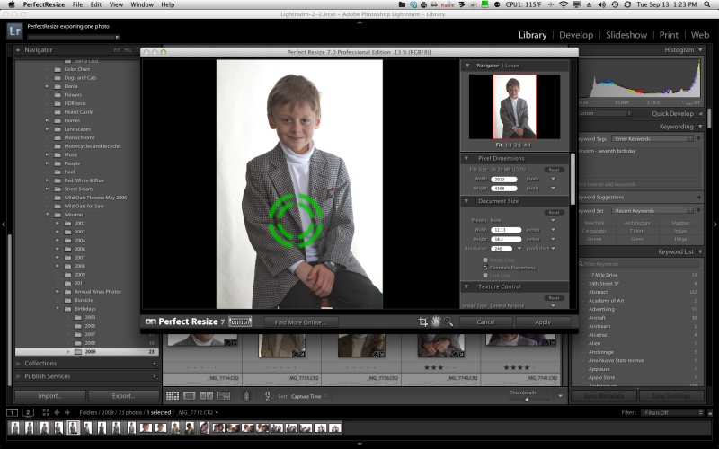
– and the controls are self-explanatory. I took the image from its (approx) 13″ x 19″ native size and enlarged it 4 times to 26″ x 38″, saving it back into LR3. The difference in the 5D RAW file size and the PR7 file size is startling –

– fully 19.4 times the size! Generation of the PR7 file took 45 seconds on my speedy Core4Quad 3.6gHz Hackintosh – a very fast machine. Do this a lot and you will be buying more hard drive storage fast. And if your computer is slow, be prepared to wait while PR7 does its non-magic. Is it worth it?

In a word, no.

Here are side by side screen shots of the 5d original and the PR7 versions:

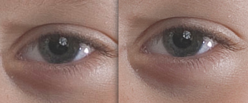
5D original RAW image on the left; 4x PR7 on the right.

In addition to tweaking the micro-contrast (something LR3 can do with the Clarity slider), color balance changes slightly, as visible above – not good – and noise is reduced.

The original, taken on the superb 85mm f/1.8 Canon EF lens with my Novatron studio flash clearly shows the flash umbrella reflected in the eye. So does the PR7 version but the details are fuzzed in exchange for reduced noise and pixelation. It’s far clearer with full screen display of the original images than in the reduced size here. Frankly, you can get as good or better results using LR3’s native noise reduction tools with a touch of sharpening, without the nasty color shift PR7 introduces. You profiled that monitor for a reason, no?

So if you want wall sized prints – and PR7 does offer a nice tiling option but not something I would blow $70 on – and don’t want to be buying ever larger hard drives for the ridiculous file sizes created by (not so) Perfect Resize 7, save your money and use LR3 as is. Further, the tiling option does not work properly with LR3 – I told PR7 to make a tiled print with two constituent images of 18″ x 24″ each for a 24″ x 36″ original on two prints. When reimporting back and trying to stack the modified file into LR3, a single image is saved even though I told PR7 to ‘stack with original’. Save it to your desktop and you get the two images required which then have to be reimported into LR3 – a royal pain. It’s simply faster to tell LR3 to print a 24″ x 36″ original and do it in two passes.

WTC

A memory.

1982

No one could accuse them of being great architecture. Minoru Yamasaki’s sole nod to aesthetics were the Mayan columns at the base. Everything else was just bigness. Get as many rentable square feet in as possible. Then double it to save money on design fees.

The plaza was one of the most soulless places on earth. Dominated by an ugly spherical sculpture in its center, you rarely saw anyone out there at lunch. The ugliness was one reason. The wind tunnel that the design had created was the other.

On some days the upper floors would quite literally have their head in the clouds. My client on the 95th floor of the south tower could see nothing but white from the windows. On others, it was so clear that the sheer gargantuan overkill of these monoliths left all around them dwarfed. The lovely art deco Bankers Trust building at 1 Wall Street seemed like a miniature. All you could see was the steam rising from the rooftop air conditioners.

They were so large and housed so many that the Postal Service gave them their own zip code. At traffic hours the flow of people through the giant rotating doors was a spectacle that simply said ‘New York’ – energy, speed, bustle.

Windows on the World was the restaurant on the 106th floor of the north tower. You took a separate elevator for the last few floors. Once, when I was in it, the high winds made the tower rock and twist causing failsafes to lock the elevator car half way up. We waited patiently, helpless, for the thing to restart. At 100 floors up you are the obedient, hapless servant of structural engineers. The restaurant, strangely for a tourist location, was as good as it gets.

The only time they really came to life was on a clear night. I was walking up Broadway from 1 New York Plaza, late, where I worked at Salomon Brothers, to the Chambers Street station inside the towers, and was dumbfounded by the sheer beauty of the digital art they portrayed. I simply stopped and stared. Some windows lit, others black, it seemed like a perfect realization of the synapses of a digital computer, silently coming on and off in their obedient response in Ones and Zeroes.

I lived on West 56th Street and would take the subway downtown at weekends to Wall Street to wonder at the architectural wonders everywhere to be seen. The area was always deserted. No one lived in the financial district back then. And, try as I might, I never did take a good picture of WTC. I’m not sure it was something that was possible.

(Snapped with a Leica M3, 50mm Summicron, Kodachrome 64).

The BJP

A British institution.

The British Journal of Photography has been around since Fox Talbot was snapping on his wet plates, meaning over 150 years. While today if you want detailed, insightful gear reviews you go to DPReview.com (if, that is, you can stomach the endless brand flame wars and detritus passing for Comments), until digital came along the place to go was the BJP.

Under its former long standing editor Geoffrey Crawley (editor 1966-87), you got technical analysis at a high level, unsullied by commercial considerations. Maybe his landmark work remains his review of one of the most advanced (and complex and expensive) cameras from the end of the film era, the Zeiss Ikon Contarex Super. He also extensively reviewed pro grade equipment, frequently Nikon and Canon hardware, each eventually accorded a book of his reviews.

When I was a kid you would find me every Saturday morning at the Kensington Public Library poring over the latest edition of the BJP, back when it was a weekly. The BJP was always a very serious – and slim – offering and once a year they used to publish an annual book of the best avant garde photography, containing some 150 pages – the BJP Almanac of Photography, to give it the full Victorian-era name. I remaindered my many issues a while back. What was purportedly new and modern in 1970 was simply awful in 2000. Tired, derivative, excessive. But it seemed like fun at the time.

Now the paper magazine is monthly and I’m not even sure if you can get it in the US. However, BJP just released an iPad app which I have been trying for a couple of days now, with mixed results.

What follows is based on my use on the iPad1. As the iPad1 represents fully 45% of all iPads ever sold, it doesn’t cut it to excuse slowness because of the more modest A4 CPU in this model. It accounts for almost half of all readership, after all. Maybe it’s faster with the A5 in iPad2? I do not know as I do not own one.

The blinking model on the cover of the first issue. A needless gimmick.

The first issue is free if, that is, you can figure out how to download it, matters being made worse by the fact that a couple of the articles in it are also advertised as for sale. Stability is reasonable – I was kicked out a couple of times in a couple of hours of browsing, and returned to the last page viewed. Screen refresh rates are so-so – it takes a couple of seconds for the image to sharpen. Zinio started much like this and progressively improved. BJP has to do better if it is to succeed as an online publication. Blur-to-sharp delays look most unappealing. Navigation is sub-optimal. Sometimes a touch-and-drag is refused. You flick side-to-side to view photographs yet many pages require the iPad be turned to landscape to view the 5% of the image cut off in portrait mode. Everything should be in portrait fit – that’s how we read. Keep the landscape option, by all means, but make everything fit in the portrait orientation. Worse, when the content switches from photograph to text, the text has to be scrolled vertically rather than simply continuing to the next page. Consistency of finger motions between pages is a must for touch screen consumption.

One of the (many) index pages.

I have no idea what the eventual price will be but if I have a major issue with the iPad magazine it is that the editors seem to have forgotten the old dictum that ‘less is more’. The first issue resembles more of a core dump than edited content, running to some 182 unnumbered pages, and it’s simply too much. No working pro, who is after all the target audience here, will have the time to go through this sea of mediocrity in search of the occasional gem. Over half the pages contain photographs, which is good, but the content is shockingly mediocre. There are some two dozen photographers featured and most, names withheld, really should consider road construction or sewer cleaning as hobbies, where they would doubtless excel. A random search of online photoblogs will, for the most part, find better work. That one of the photographers interviewed seemingly prides himself on his ignorance of technique makes a statement about editorial policy in a pro magazine that I do not want to think about.

As for the gear reviews, they vary from poor to awful. with the one addressing the Sigma SD1 being one of the worst pieces of pseudo-technical clap trap I have ever read. It manages in one fell swoop to leave you confused, angry and dumber than when you started reading it. Quite an accomplishment.

Indexation is a mess. The main index at the front repeats every page of the many subsequent indexes buried in the body of the work. What is needed is a simple multiple choice main index – Features, Profiles, Technology – with a touch on any one of these jumping the reader to the relevant sub-index where the contents can be displayed without clutter or confusion. The sub-index, in turn, should have a ‘return to main index’ touch icon. As it is, the consolidated index page at the front is very hard to use, being one huge, scrolling mess. Simple always wins, especially within the space-constrained confines of an iPad’s display.

There are also a dozen or so gear advertisements – not enough, I fear, to sustain this effort – with many including videos to display features. The Hasselblad ads are especially well done.

It obviously took a lot of hard work to produce this massive tome, but hard work alone does not correlate with success. The publication needs the underlying code tightened and made to work faster and more responsively, indexation needs a major work over, the photography content needs drastic editing and a move to excellence and the gear reviews would best be dropped, being largely useless. These are done much better by any number of web sites and it’s hard to see how the BJP adds value here. Geofrrey Crawley must be spinning in his grave. You might as well read manufacturers’ press releases where the lies are more prolific, but the English far better.

The Mirrorless Revolution

Bloomberg nails it.

Bloomberg has an interesting piece on how Nikon and Canon are missing the boat by not offering a mirrorless DSLR.


Click the picture to read the article.

As an early adopter and buyer of the first EVF interchangeable lens MFT DSLR, the Panasonic G1, I tend to agree that it’s the future. The EVF will only get better, it’s cheaper to make than the prism/mirror combination used in old tech, and there are no moving parts and no need for complex retrofocus lens designs to clear flapping mirrors.

While I tend to take this quote – “Mirrorless cameras accounted for 40.5 percent of SLR sales in the country in July, surging from 5 percent in early 2009, according to BCN.” – with a bushel of salt, there’s reason to believe that mirrorless DSLRs are gaining market share. Apochryphal data are mostly useless (just because your local bookstore is full does not tell you whether it’s booming or having a going-out-of-business sale), yet I constantly read that big DSLR owners are dumping their heavy gear for something they actually will take along on the next trip. I know, having done likewise with my (quite superb, I hasten to add) Canon 5D outfit with no fewer than eight lenses, in preference for the Panny G1 with but three compact zooms. Yes, it almost always goes along with me, not something that could be said of the 5D.

Still, I keep hoping that someone at these two dominant gear makers is working on an APS-C or full frame EVF design with a silent shutter and fast focus – things now found in several models in the Panasonic range. The disappointing Fuji X10, with its miniscule sensor almost got it right. What’s needed is a fast lens with a 28-90mm zoom range, compactness, silence, no shutter or focus lag and a proper sensor, not some nail clipping. The lens doesn’t even have to be removable. Price it at $750 and you will be rich. Canon and Nikon – are you listening?

Dick Blick

A great place for mounts and supplies.

I first made mention of Dick Blick in these pages when writing about how I mount and frame large prints.

My Fletcher FlexiMaster Framing Tool came from Dick Blick Art Materials making trivial a job which would otherwise be too horrid to contemplate.

The other day I wanted to order some 4B (super soft) graphite leads for my son’s pencil, which he uses for schoolwork. My interest in writing instruments is not new to this journal; I wrote of that great ball pen classic the Bic Cristal earlier and my accidental over order has me set for life! When it comes to pencils, the best pencils come from Germany – just like the best cameras used to. Forget your Genine Murrican Dixon Ticonderoga with its wretched soft wood construction, lack of heft and a graphite lead waiting to snap at the merest provocation. Real pencils say ‘Staedtler’ on the body and while I was an aficionado of their splendid wooden ones when younger, time marches on. So when our son needed a really good pencil for homework it had to be a Staedtler, one of the retractable ones. The ergonomics are superb, the design appealing to the eye and the range of hardness in graphites large – everything from 4H (so hard you wonder who needs this) to 4B, the latter a pleasure to write or draw with and easily erased when errors crop up.

Now, elegant as they are, I cannot abide those super fine 0.2mm/0.5mm/0.7mm offerings from Staedtler or the Japanese. Those are for limp wristed pansies. A Real Man (my son) writes fast and presses hard. Those sub-millimeter graphites do not cut it. Period. And forget built-in erasers which always run out when you need them. Carry a big one.

The Staedtler Technico Lead Holder.

Indeed, the criteria for nomination to the exalted level of ‘Classic’ set forth in that earlier piece on the Bic ball pen apply equally here:

  • It has to have class. I can’t define that but I know it when I see it.
  • It must be superbly functional.
  • Its use must be second nature.
  • It must have magic. Yes, that sense of fitness for purpose you get when you pick it up, use it.
  • It must be made well enough to survive the ravages of time and use.
  • It must be reliable.

So you can add the Staedtler Lumograph to a short list where others of the like of the Porsche 911, the Leica M2, the Rollei 3.5F, a Patek Philippe Golden Ellipse, an iPad and the Border Terrier make their home. Most have a definite attitude, but only the last comes with a wet, cold nose.

The Staedtler Technico Lead Holder runs all of $5 and holds a real lead – 2mm in diameter. You are not going to break that. The retraction mechanism is easy, simple and fun and the removable cap includes a point sharpener. Perfection. Ideal for signing your limited run prints with chi-chi ‘1 out of 100’ nonsense (because you will never sell that many). And while you can find these in many local art stores, good luck finding 4B leads. So I dialed up DickBlick.com on the web and ordered the boy some 4B and 2B inserts. Except, being the doofus that I am, I ordered 4H and 2H, realizing my error only after I hit ‘Pay’.

This is where it gets good, and this is where you will want to give your business to Dick Blick. I called them with the usual dread of interminable phone trees and someone who speaks English on a par with the guy behind the counter at the local 711. Well, blow me down. A lady with a genuine American voice speaking perfect English (errr, American) answered on the first ring. No punch this for English, that for Spanish and kick your cat for Swahili. I pleaded stupidity, she changed the order like that, and my boy is now rejoicing in 4B leads in the best mechanical pencil on earth, and has no excuse for a less than perfect point. The two I bought him will likely last through graduation, and he’s in Fourth Grade!

There’s more to it than that. Blick’s paper catalog may only show a fraction of what is available on their web site, but it includes a cornucopia of supplies for mounting and framing photographs. Frames, mats, mounts in any shape, material, finish and color you desire. And tools galore, from the point setting tool I mentioned above to mat cutters, tools and jigs for making your own frames, and so on.

While I have long been a customer of Documounts for my mounting and framing supplies, Dick Blick is going to get my next order. All because of my silly mistake.