Category Archives: iPhone

A smartphone with a decent camera

Night Mode optimisation

A modicum of care does the trick.

Night Mode is one of those brilliant enhancements in the iPhone 11 which obsoletes every ‘serious’ camera on the market.

Those 8 billion plus transistors in the iPhone’s A13 chip are put hard to work taking multiple images and then stitch together the best bits for a stunningly good result. And the device’s outstanding HDR technology makes sure that the dynamic range is constrained to what the technology can handle. No highlights are burned out.

Still, a modicum of care will be repaid with the best possible images. If you use the iPhone’s default Camera app, Night Mode is automatically invoked when needed. You cannot force it ‘on’.

When Night Mode is active a yellow flag appears at the top left of the iPhone’s display and the image ‘seen’ at the time of exposure remains frozen on the screen. When processing is complete some three seconds later – and you are warned to keep the camera still – a second image appears on the display showing what was recorded. If you notice a significant shift between the locations of objects in the second image compared with the first then it’s more than likely that the result will be blurred. I obviate this problem by using a monopod, which eliminates vertical motion which is the real killer here. I don’t bother with any attachment device, simply holding the iPhone tightly against the top of the monopod. The results are peerless, as these two images from the garden at night illustrate. The extreme dynamic range will only embarrass your DSLR or mirrorless monster. Don’t bother. Get an iPhone 11 – these are SOOC, naturally:

Back to the future

Minolta pointed the way.

Given that they have yet to have an idea not stolen from someone else – meanly mostly from Apple – I spend little time in reading about anything from Samsung.

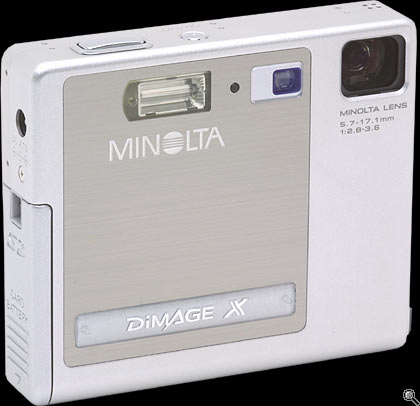
But their most recent theft is surprising only for how long it took them to think of it, for their latest ‘high-end’ phone (there’s an oxymoron for you) steals from a 2002 inspired design by Minolta in its 2mp Dimage digital point and shoot.


The elegant Minolta Dimage of 2002.

This elegant design had one truly original feature, in addition to its neat packaging in that small square case. It used a periscope optical zoom, vertically oriented inside the case, with light rays deflected through the associated right angle with a mirrored prism. This allowed the incorporation of an otherwise lengthy optical path within the tight confines of the body, a small 3.3″ x 2.8″ x 0.8″. For comparison, my iPhone 11 Pro in its case measures 5.5″ x 3″ x 0.5″.

This cutaway view shows how it worked:


Illustration of the ‘folded’ optical path.

We can expect to see this sort of thing in a future iPhone as modern technology has made things even smaller 18 years after Minolta’s inspired design. Optical zooms beat digital zooms as there’s no pixel degredation as magnifications increase.

Now if there’s a criticism to be leveled at the iPhone 11 Pro – in addition to its poor ergonomics – it’s that there’s no lens at the long end. Sure, there’s a 10x digital zoom, but you can do that just as easily in Lightroom, with all the attendant issues. So you are stuck with ultrawide, very wide and normal, call it 12mm, 24mm and 50mm FFE, all superb but none of them long.

So if Apple can add one of those ‘periscope’ optical zooms and make the 50mm a 50-200mm optic, well, that’s going to be all she wrote for the few remaining sales of silly-priced and even sillier-sized DSLRs.

A wrist strap for the iPhone

Avoiding ‘Woopsie’.

When snapping away with the iPhone at the car show the other day, I kept the iPhone’s camera turned on at all times and in my left hand, ready for instant action. Half way through this sojourn I had what can only be described as a Big Moment and almost dropped the bloody thing on the ground. Hard unyielding ground, protective case be damned. These things never work when needed; I use mine to hold credit cards and my driver’s license.

So it occurred to me that what is called for is a wrist tether and after reviewing the awful choices on Amazon I decided to craft my own. A custom tether – I’m selling these for $499, free shipping, to all iPhone 11 Pro owners. Lesser models need not apply. Comes with an autographed Certificate of Authenticity.

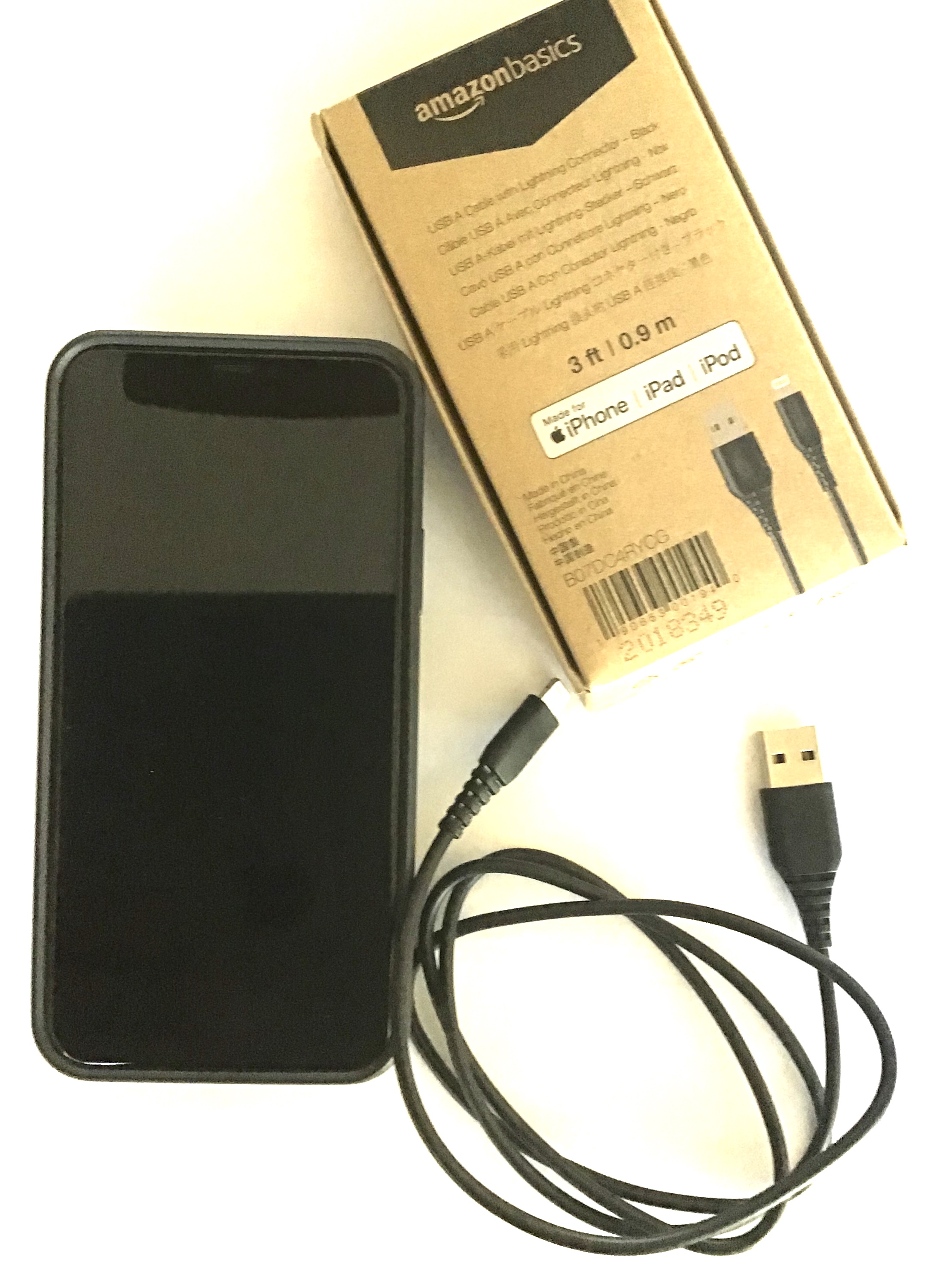
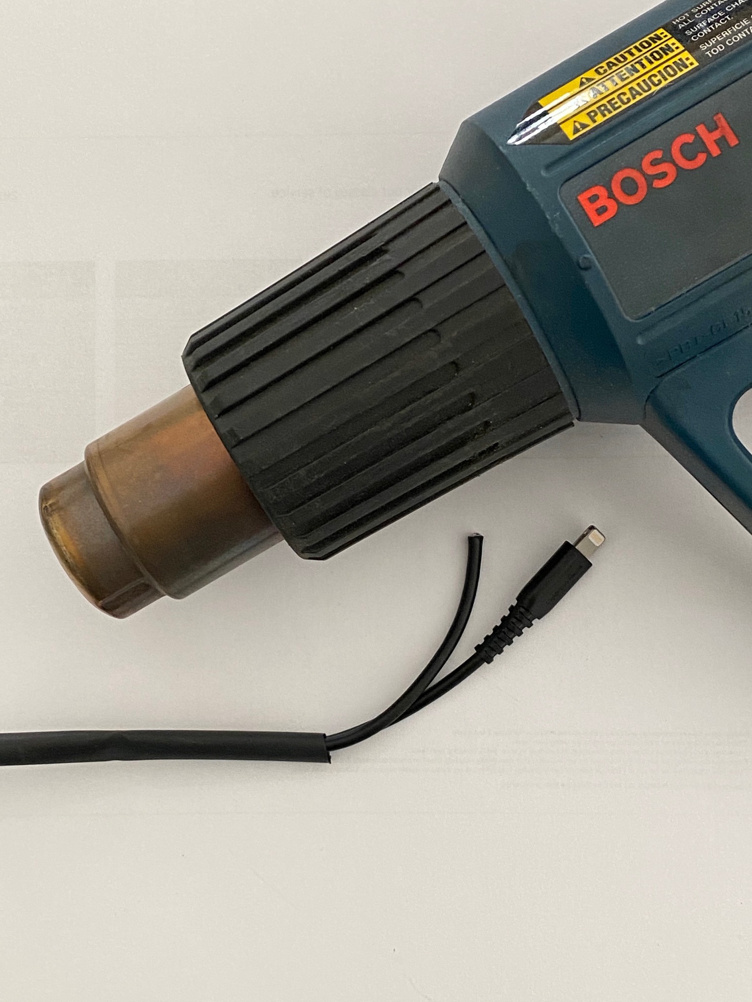
A 3 foot Lightning cable is purchased form Amazon for all of $7.


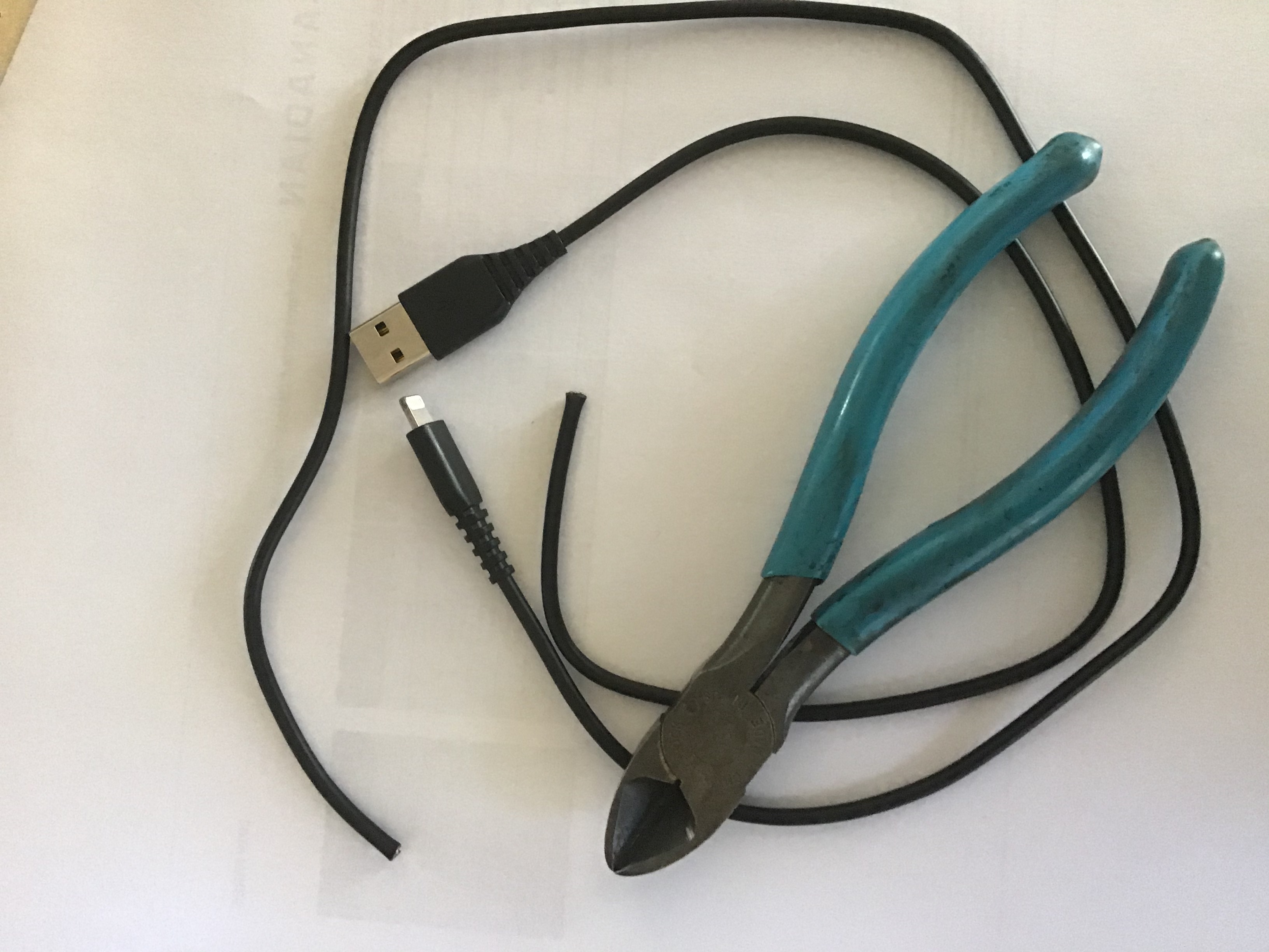
It’s cut at 22″ from the Lightning connector end.


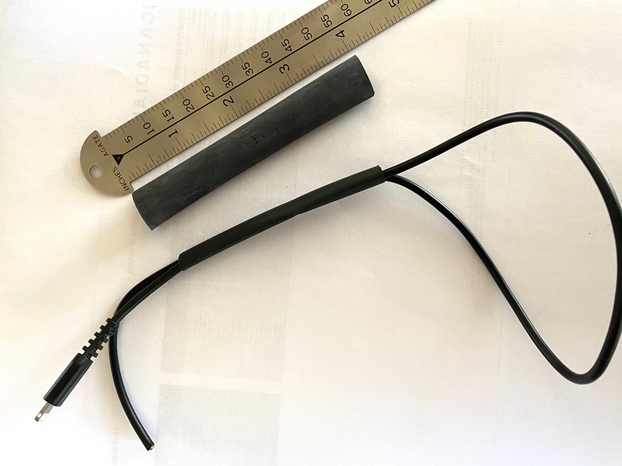
Two pieces of heat shrink tubing are cut to 3″ (small) and 4″ (large) length. The small must accommodate two passes of the cable. The large must be able to slip over the Lightning connector.


The cable is doubled up after measuring for the correct wrist strap loop diameter. Leave 2.5″ of the tail exposed and heat shrink the tubing in place.


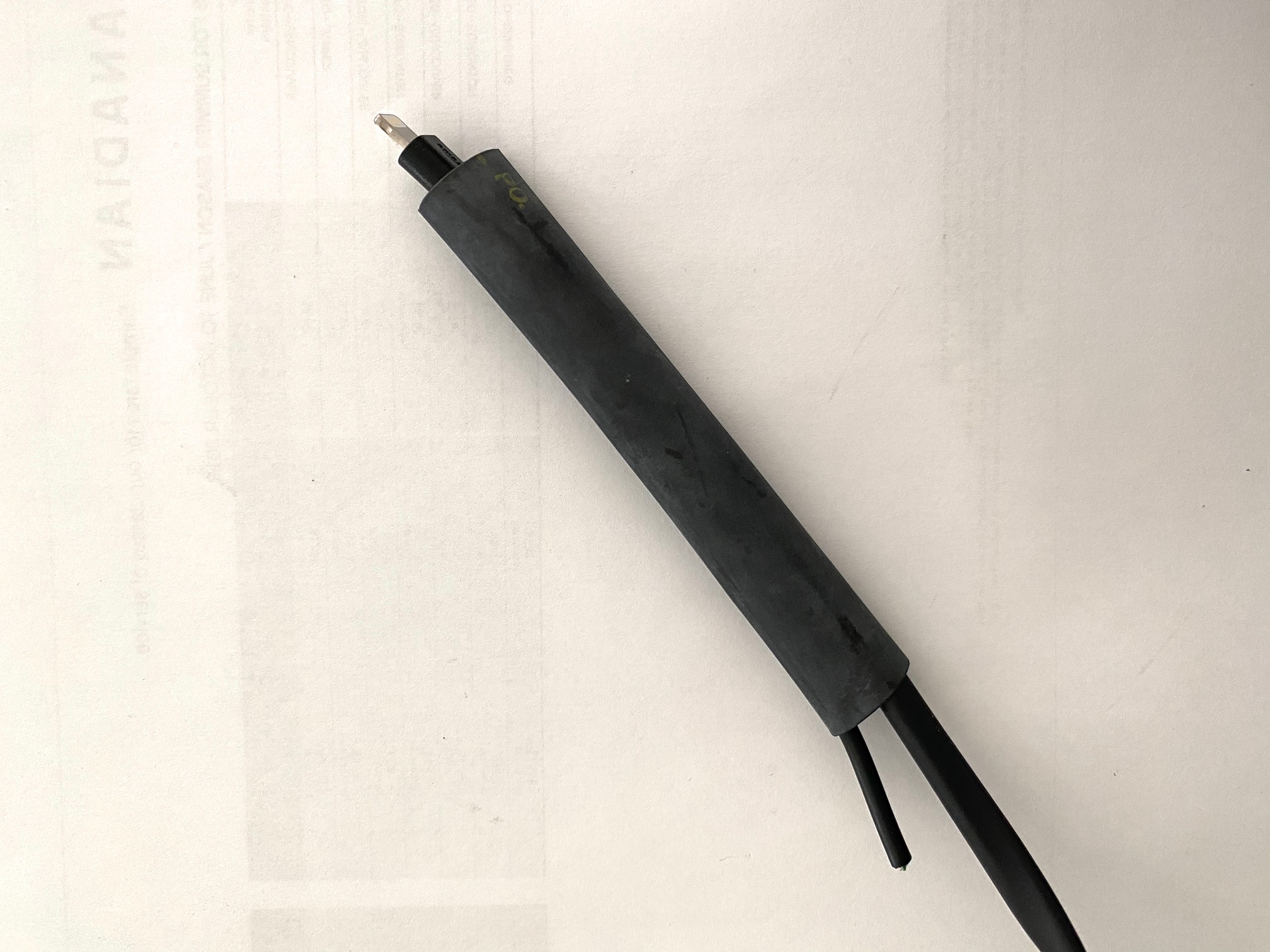
Next the broad diameter tubing is slipped over the Lightning connector and over the small diameter shrunken tubing; the tail is doubled back into the large tubing.


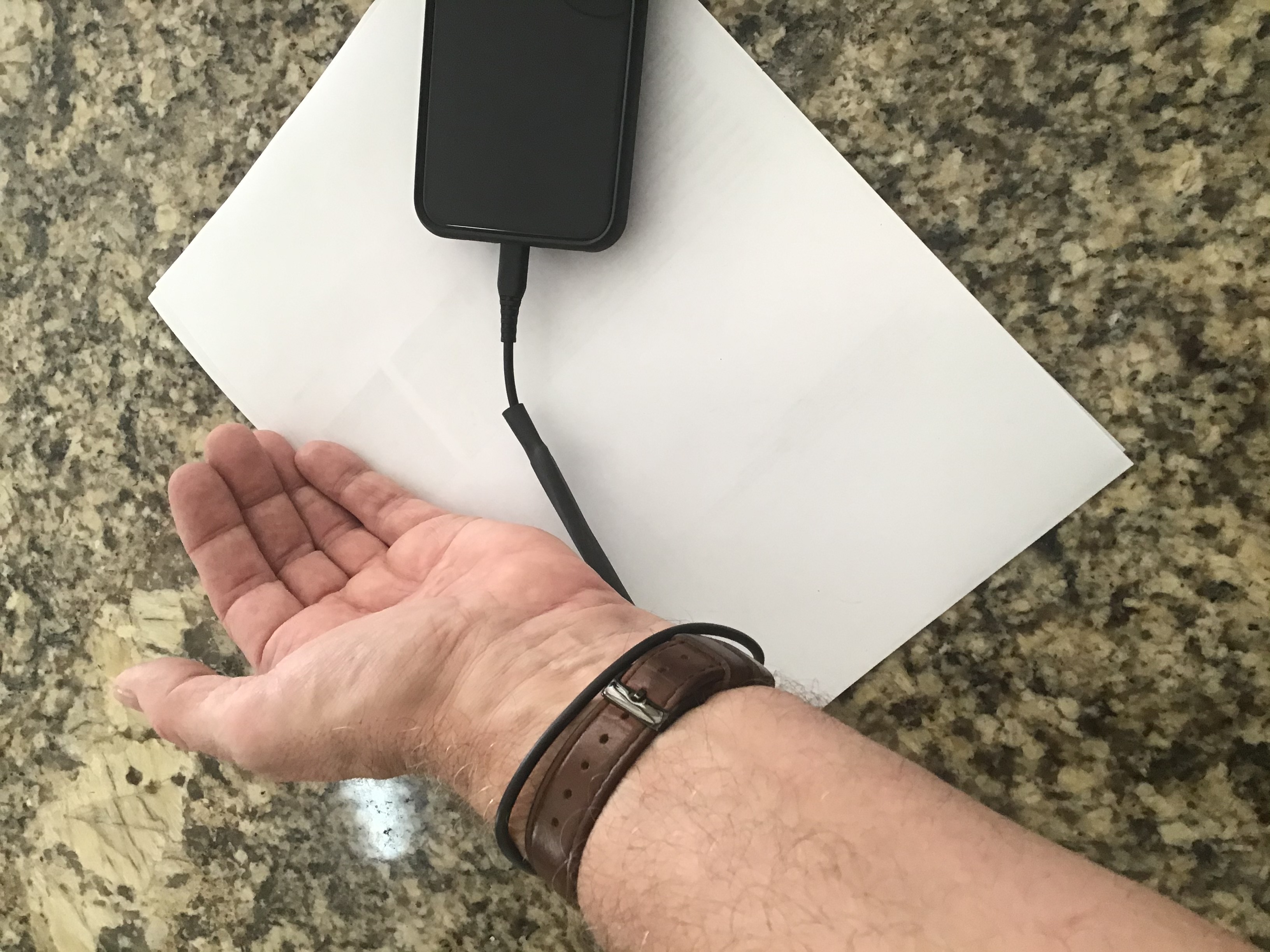
The large diameter tubing is heat shrunk into place and the wrist strap/tether is complete.


Belt and suspenders:

Apple has carefully designed the Lightning connector to prevent excessive force requirements for insertion or removal. Give the above assembly a strong yank and phone and wrist strap part company.

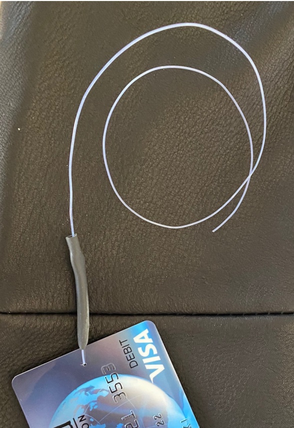
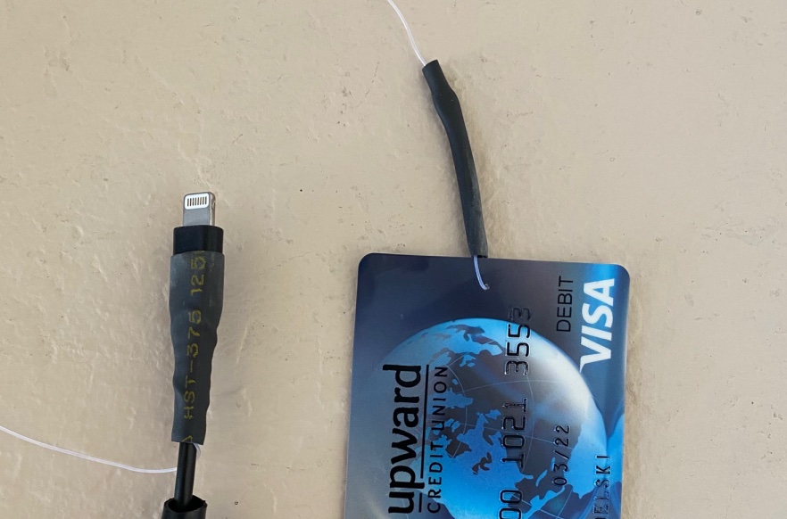
So a fail-safe is added in the form of a monofilament loop, one end attached to an old credit card, the other to the end of the wrist strap.


I used a very fine #60 drill to make a hole in the credit card
to permit pass-through of the length of 30lb. monofilament.


The monofilament is secured on both ends with a length of heat shrink-tubing, the tail
is reversed and a second length of larger diameter tubing is installed atop.


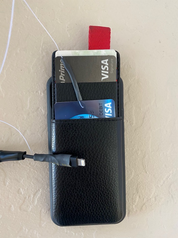
The credit card is installed in the sliding opening for credit cards,
the opening is shut and the whole assembly is very secure. In the event of a
serious yank the Lightning cable will still separate from the iPhone,
but the credit card will save all.

The credit card is actually installed with the loop inserted first, for maximum security, not as shown in the image above.

No more ‘Woopsie’.

I use a Lameeku iPhone 11 Pro wallet and am very pleased with it.

Focos depth masks

A closer look at a useful app.

I made mention of the inexpensive Focos app as part of my preliminary look at the new iPhone 11 Pro.

Since then I have done more reading and learning and set forth below how to use manual masking to optimise out of focus areas.

I mistakenly stated that Focos used the depth map which iPhone 11 saves with the image. In fact iPhone 11 only saves such a depth map – a detailed database showing the distance of each pixel in the image from the lens – with images taken using the Portrait mode. In Portrait mode the iPhone 11 switches to the 2x lens and, indeed, the extent of the blurring of out of focus areas can be changed in the iPhone stock Photos app. Go into edit mode, tap the yellow concentric circle at top left and you can adjust the aperture and hence the OOF effect.

Yet Focos allows DOF manipulation even on images taken on pre-iPhone X models, the first iPhone with a depth sensor. That sensor is also used as part of the FaceID security access protection system for the device.

How does Focos do this? It uses Artificial Intelligence to guesstimate the distance of image points from the lens, such AI based on analysis of over one million images, according to the developer. This allows the photographer to not only change the degree of blurring in post processing, but also to change the exact point of sharpest focus, something that cannot be done in iPhone X and 11 Portrait mode images, or in any other image from those iPhones in post-processing.

Mostly, for solid components in the picture, Focos does a good job at establishing its own depth map based on this AI approach. But sometimes it’s not so good.

Take this image:


Original iPhone 11 image, no Portrait mode.

Passing this through Focos keeps the jacket and embossed stitching razor sharp, but the hair is not sharply rendered.

In such cases, Focos has a manual facility where the depth map and the sharp area can be changed.

The default depth map (red areas) for this image has been extended to add the back of the veteran’s head, originally not shaded in red:


The sharp area mask has been extended in Focos on the iPhone.

Rather than using an imprecise finger to mask the sharp area, I use an inexpensive electrostatic pen, something like this:
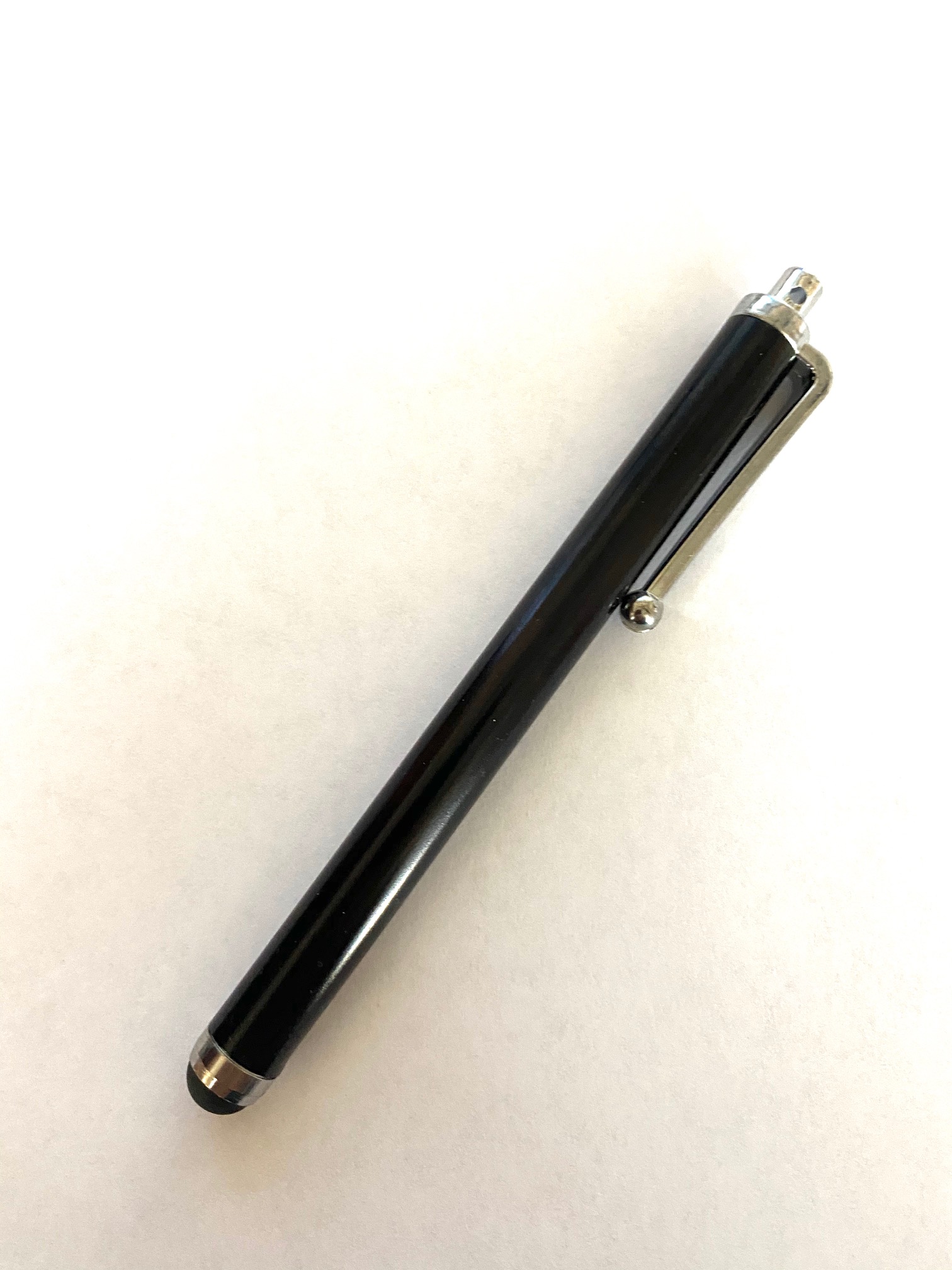


Pen used for masking.

Further, while the image can be enlarged on the iPhone for greater masking precision, it’s far easier to do this on the larger iPad screen, so I use AirDrop to export the image to Photos on the iPad, and have at it there. The aperture/OOF effect are adjusted in this screen:
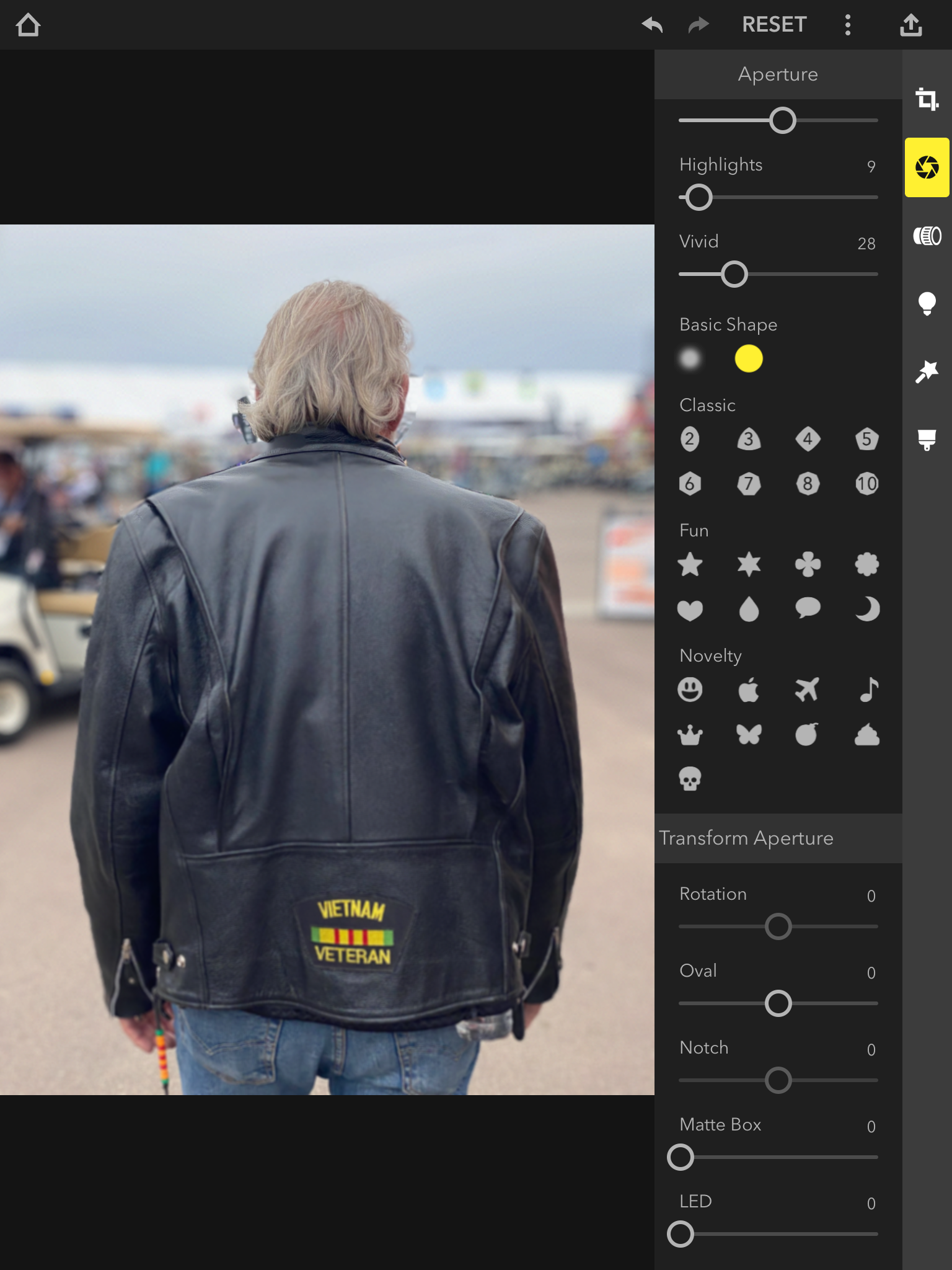


Adjusting the degree of blur on the iPad.

Then the blur appearance is modified using your lens of choice. I invariably use the Leitz 50mm Elmar as I like the benign bokeh it delivers – and because I used one for years:
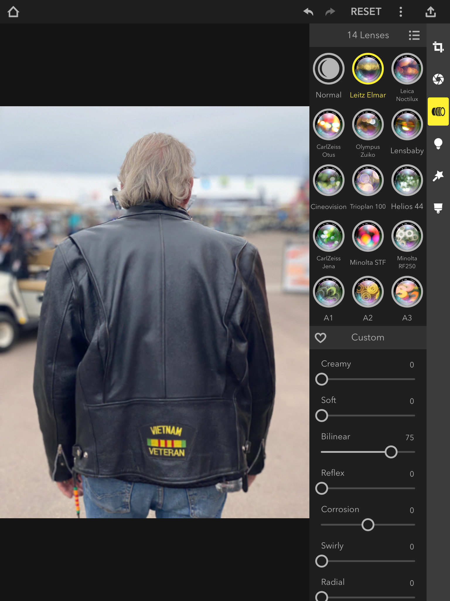


Lens choices, shown on the iPad.

And here is the happy result, which takes less time to do than it does to explain:


The final result.

So for those instances where Focos does a poor auto-masking job, manual masking easily fixes what ails it.

What happens when the going gets tough? This is the sort of image which is a nightmare for computational photography when it’s a case of blurring backgrounds. In Portrait mode the iPhone 11 does a very poor job:


SOOC in Portrait mode.

At f/4.5, the camera’s selected aperture, some of the spokes have gone missing. This is likely because there are simply too few pixels in the depth map sensor to permit creation of a sufficiently detailed enough map. The spokes are small in the image and likely preclude sufficiently accurate depth map recording. As this image was taken using Portrait mode, meaning the iPhone has stored a depth map, how does it look when the aperture is increased to the maximum available, f/1.4 in the Photos app? Even worse:
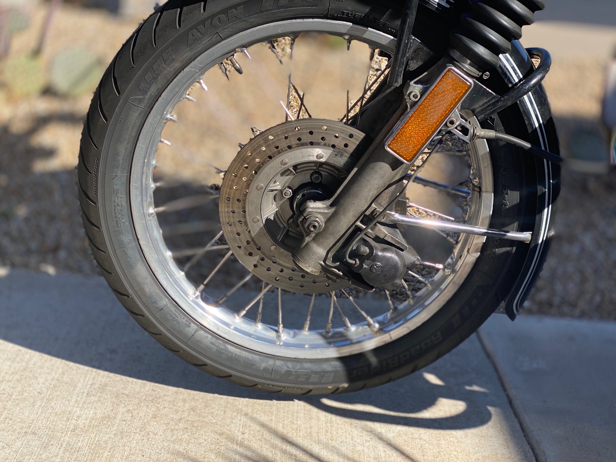


Aperture changed in iPhone Photos edit mode. At maximum aperture spokes disappear.

How about a regular, non-Portrait mode image snapped on the iPhone 11 Pro and manipulated in Focos for an f/1.4 aperture? Still awful, though better than the iPhone’s Portrait mode + in camera depth map delivers, but some OOF areas are shown sharp:
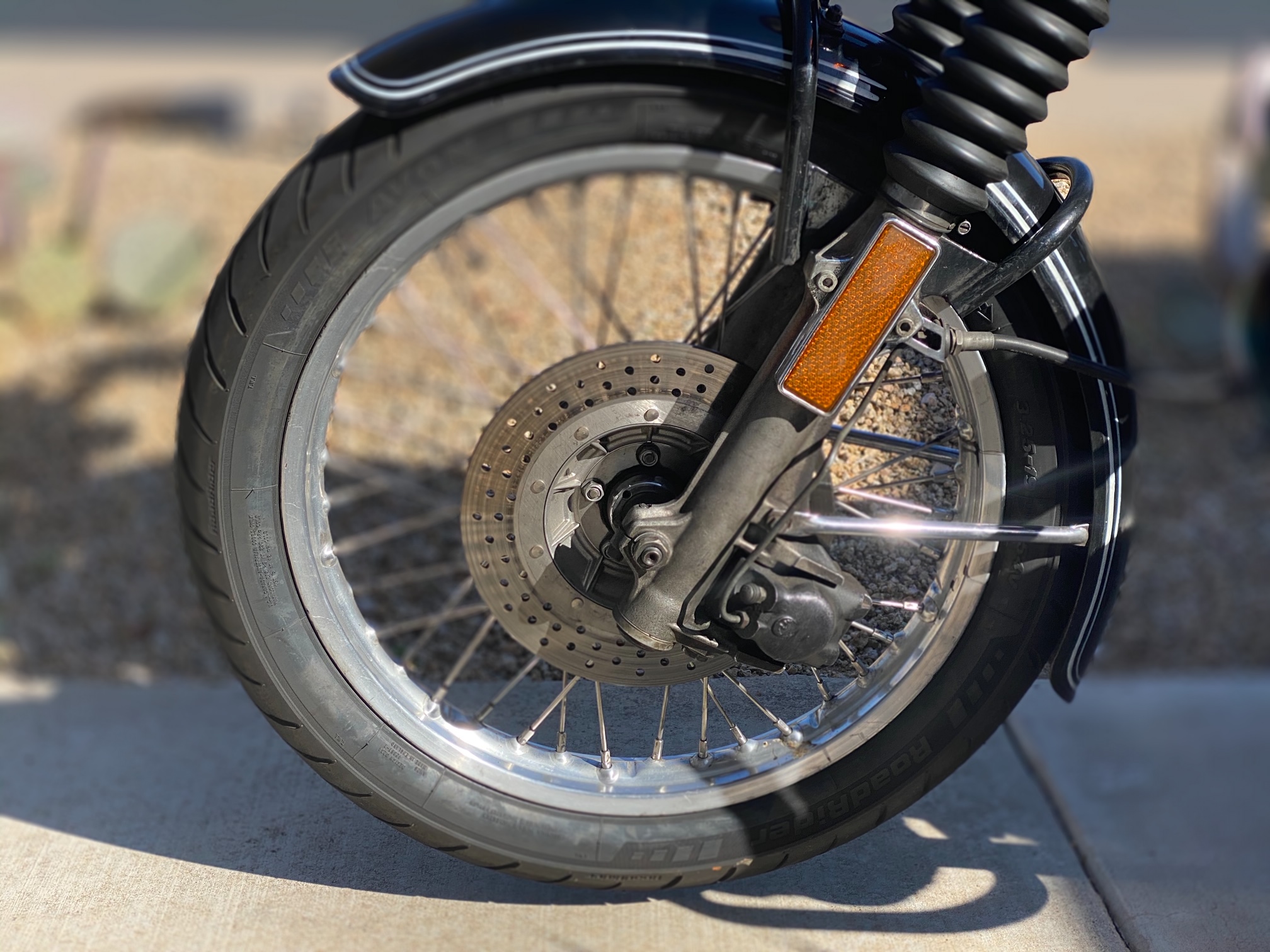


The final result.

So until depth sensors get finer ‘grained’ both the iPhone’s Portrait mode and Focos’s AI approach leave something to be desired. And only a true masochist would seek to edit the spoked wheel image for proper rendering. Simply move the slider to f/16 in either image and all is sharp. Forget about bokeh. That will have to do for now as we await a better iPhone depth sensor – which is likely, given Apple’s increasing focus on 3D rendering in future iPhones.

When should you use Focos in lieu of the iPhone’s portrait mode? If taking bursts, as Portrait mode prohibits those. Or when you need the far greater versatility Focos offers for manipulating OOF areas. Otherwise, the iPhone 11 Pro’s native Portrait mode is perfectly fine, as long as your preferred daily rider and photo subject is not a classic bike with spoked wheels!
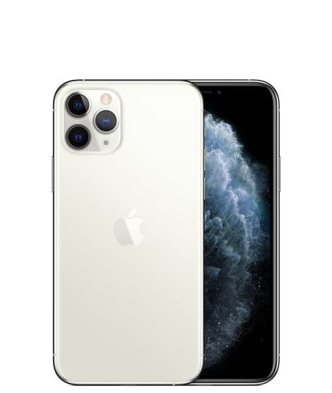
Should Apple make a stand alone camera?

Capitalizing on its software and hardware advances.

In an end-of-2019 piece I wrote:

“I have had two transformative iPhone experiences – in 2007 when I bought iPhone 1 on the day it became available, and this year when I bought the iPhone 11 Pro which will change the photography hardware landscape permanently. All of the big makers will be gone in a few years. The iPhone’s camera is an order of magnitude better, doing things the clumsy SLR offerings can only dream of. The remaining reasons to buy clunky gear are that you need high definition from really long lenses – a couple of guys at Nat Geo – and because showing up at the Vogue studios with an iPhone to snap today’s supermodel just does not earn machismo points.”

So should Apple make a stand alone camera?

Apple has made a stand alone camera before. That was in 1997 and sensors were not up to much and, face it, the product looked like a door stop.

But now, with computational software making bad images great, with image quality rivaling that from big, clunky gear, and Sony’s superb lenses and sensors in the iPhone 11 Pro, is it not time for Apple to capitalize on its imaging prowess and make a true camera?

I no longer think this make sense. No one who has used the latest iPhone as a camera wants to revert to interchangeable lenses and all the bulk and weight of the traditional digital body. When you have computational photography working for you, a feature missing from every stand alone camera out there, who needs the clutter of lenses and gadget bags? Heck, even tripods are passé. On the other hand, most serious snappers using the iPhone will confirm that its ergonomics are pretty awful. There is a total absence of physical buttons and dials with all those satisfying, confirming clicks, and gripping the thing steadily – and keeping digits out of the way of the ultra wide lens’s field of view – is not easy. However, I do not think that Apple is about to return to physical controls in its pocket devices any more than it is likely to add a mechanical keyboard to the iPhone.

No, there’s lots of room for ergonomic improvement within the constraints of the iPhone’s small size and now, with chief designer Jony Ive no longer with the company, I expect that ergonomics will improve fast. Ive confused svelte with easy to use and his obsession with light weight and looks resulted in devices increasingly hard to hold and with mediocre battery life. A minuscule increase in thickness in the iPhone 11 fixed the battery life issue for good – good for a day of really hard use with ease – and I expect that the iPhone 12 will revert to the square sides design of the magnificent iPhone 4.


The iPhone 4 of 2011.

Aperture wheel? Not needed, as each image is stored with a depth map, allowing depth of field to be adjusted in post processing. Shutter speed wheel? Nah. With OIS shutter speeds don’t matter a whole lot and in action images burst sequences allow the best image to be easily chosen. Point of best exposure? Just touch the screen. So after much use of cameras in the iPhone I am coming around to concluding that the desire for physical controls is so much refusal to adapt and change. All that’s needed is a carcass design which allows this slippery-as-an-eel device to be held with solid purchase for the fingers. You know, like that iPhone of a decade ago.

Plus who wants a stand alone device robbed of all the functionality of the regular iPhone?

P.S. Apple – a longer fourth lens would be nice!