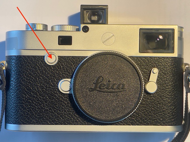
An excellent and inexpensive ultra-wide.
For an index of all Leica-related articles click here.
A brief history of Leica 21mm lenses:
The history of Leitz and Leica’s 21mm focal length lenses for the M body is long. It starts with the 21mm f/4 Super Angulon which came in LTM and M bayonet mounts. Possibly owing to a lack of resources Leitz delegated design to Schneider Kreuznach in the Rhineland. Schneider had a long and distinguished history of making lenses for large format cameras. Now they would apply their skills to crafting the widest lens available for the 35mm format. Characterized by fairly severe vignetting wide open and by a deeply protruding rear element assembly the lens was, nevertheless, a startling technical accomplishment and opened up new vistas for photographers willing to exploit the very wide angle of view.
Introduced in 1958 the optic sported no fewer than nine elements. While we take 12mm ultra-wide optics for granted today, 21mm was as wide as it got back in 1958. Not content with what they had accomplished Schneider and Leitz had another go, coming up with the improved 21mm f/3.4 Super Angulon in 1963, a lens which soldiered on until 1980. The number of elements dropped to eight and performance improved but the rear still protruded mightily into the throat of the camera. I mention this in the context of later digital sensors which do not take kindly to lens elements very close to the sensor. The obliqueness of the light rays striking the sensor makes for color artifacts which are tough to correct.

A handsome lens. The 21mm f/3.4 Super Angolan.
Note the deep rear lens cap to accommodate the protruding elements.
After several variations on the theme Leica now lists two 21mm lenses – the 21mm f/3.4 ASPH Super-Elmar-M and the exotic 21mm f/1.4 ASPH Summilux-M. Both include wallet emptying pricing and aspherical elements and by all accounts are the finest 21mm optics on the planet. I do not propose to find out.
The competition steps in:
When patents on the Leica M bayonet lens mount expired other makers saw opportunities to market 21mm optics for Leica M cameras, always at far more affordable prices. Now there is a veritable cornucopia of availability, with most adopting a retrofocus design which sees the rear element well clear of the focal plane, ideal for use with digital sensors. Prices are as low as $400 if you like Chinese products.

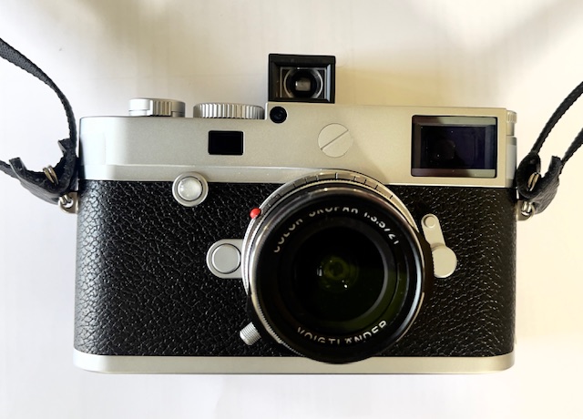
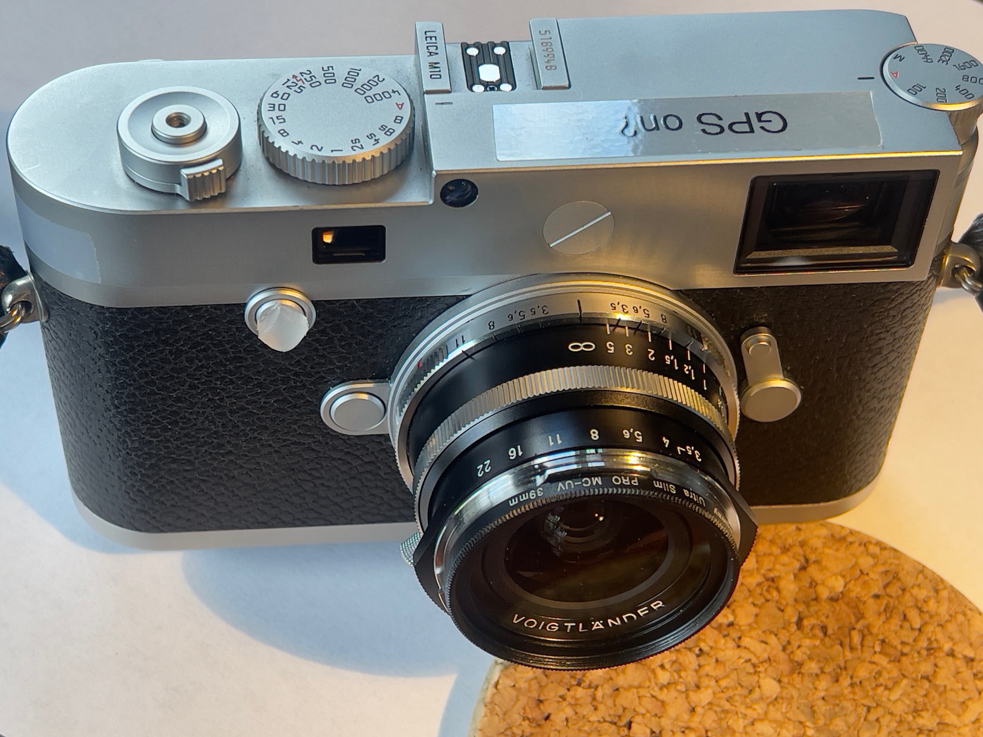
The 21mm f/3.4 VM Aspherical Voigtländer Classic
version of the Color-Skopar on the Leica M10.
Aperture and focus rotation directions are identical to Leica lenses.
Voigtländer/Cosina:
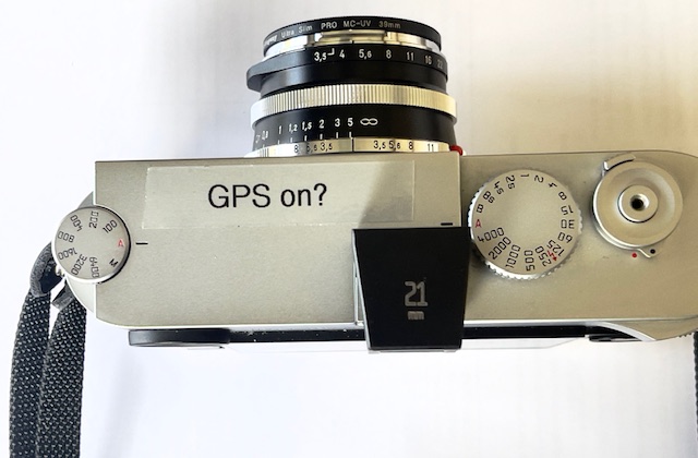
Voigtländer (now Cosina, Japan) updated its 21mm f/4 Color-Skopar, designed for film cameras, to the 21mm f/3.5 version with a retrofocus design aimed at digital Ms, and I recently acquired a mint used one for $400, overpriced lens hood and original box included. (I sold the largely useless lens hood for $50, making my net cost $350, plus $7.94 for the six-bit coding template, below). New that set runs $750 at B&H. The lens comes in three versions, all with the same optics, with the ‘Classic’ version introduced in 2018. The Classic is black and chrome, above, and the two more modern looking versions, one silver the other black, were introduced later.
Adding 6-bit coding:
Given the success I have had with coding my two Canon LTM lenses adapted to the Leica M mount, the first order of the day with the 21mm Color-Skopar lens was to add 6-bit coding. This is especially important with a wider lens as the protruding rear element is typically a likely cause of color artifacts. 6-bit coding tells the camera’s software to correct these, which it does better than Lightroom. The M10 firmware only shows two 21mm Leica lens options, the pre-ASPH 21mm f/2.8 Elmarit-M and the 21mm f/2.8 ASPH Elmarit-M. The later Super-Elmar and Summilux-M are not choices, so even if you code for these optics you will not get the related result. I tried. The lens was reported as a 21mm f/2.8 Elmarit-M.
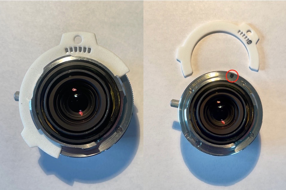
On many Voigtländer/Cosina lenses there’s a groove in the mount where painted on codes will not be erased through friction between lens mount and body flange. Probably a neat way of sidestepping Leica’s patented engraved coding pits. Luckily the Color-Skopar has this recess.

The machined groove is clearly visible and
will retain 6-bit ink codes without friction wear.
Unlike the two Canon LTM lenses which required LTM-to-M bayonet adapters, the Color-Skopar comes in an M mount making it trickier to correctly place the 6-bit codes, as the lens comes without the corresponding pits machined in the mount. You need a precision template to accurately place the code ink markings.
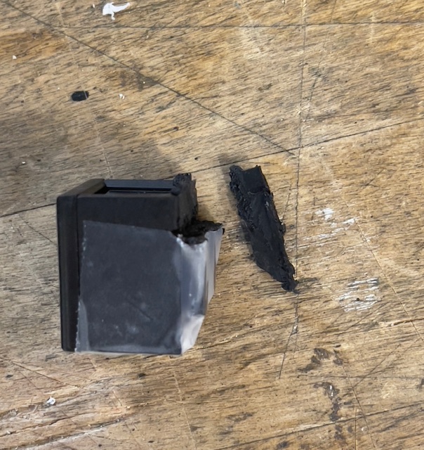
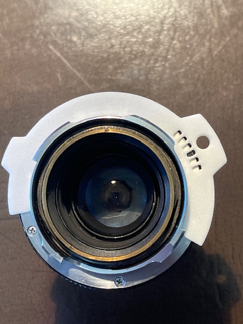
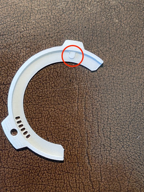
All credit for what follows goes to reader Yukosteel on the Fred Miranda site, who developed a file for 3D machining which generates an accurate coding template. I ordered the template online from Xometry by submitting the Yukosteel 3D printer coding template file found here. Nice work by that person. The cost was a very reasonable $7.94 shipped and the tool can be reused ad infinitum. A small protuberance fits in the cutout for the lens locking catch for proper positioning on the bayonet mount and you can then paint in the required codes using the tool’s cut-outs, with a non-shiny black ink pen. The fit is perfect with no play.

The template fitted to my 6-bit coded 90mm Tele-Elmarit.
The point of first fitting the template to a coded lens – one known to work correctly on the M10 – was to check that the openings for coding align exactly with the existing 6-bit pits. They do. Well done Xometry and Yukosteel.

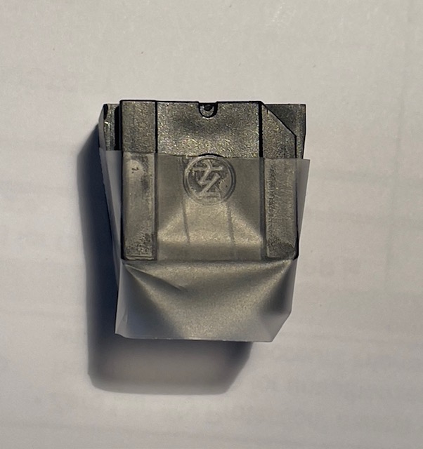
The rear of the template shows the locating peg
(circled) for the camera’s lens locking pin location on the lens.
As with the two Canon optics, I took test images at full aperture with the 21mm Color-Skopar trying each of the M10’s two 21mm lens profiles, determining the best result in LRc. There was very little to choose in terms of color fringing at the extreme edges whether uncoded or coded for the two Leica optics. Once done, I looked up the corresponding 6-bit code in this table. The Leica 21mm pre-ASPH f/2.8 Elmarit-M was the best choice and the code is 000001, with ‘1’ indicating black paint and ‘0’ meaning do nothing. The template is fitted to the Color-Skopar and the Uni Ball pen used to color the indicated pit black. Done. Without a template your chances of accurately placing the codes are low and for under $8 why wouldn’t you do it right first time?

The coding template is fitted to the mounting
flange and the ‘000001’ code is added.
This takes all of ten seconds to do.
Viewfinding:
With the advent of live view in the Leica M240 and all subsequent digital Leicas (excluding the LCD-less ‘D’ variants) the need for a separate viewfinder for framing went away. You can still use an accessory shoe mounted finder of course but for most chimping the LCD display does the trick. That’s what I propose as even used 21mm finders from a variety of makers seldom sell for under $200. If the live view approach fails I’ll look into picking up one of those. As to focus, the depth of field with a 21mm lens is so great that even guesstimating at just about any aperture will see everything in focus. However, to be accurate, the rangefinder works just fine – far better than is needed in fact.
Optical design and filter choice:
The lens sells new for $650-$700 depending on the external finish (the optics are identical), and includes an aspherical element. (A commonplace in modern lenses, but deemed insanely exotic when the first lens thus equipped, the 50mm Leitz f/1.2 Noctilux, was introduced in 1966. Lens grinding technology was insufficiently advanced at the time so the two aspherical surfaces had to be ground by hand!). Add $99 for the ridiculously priced Voigtländer lens hood. The Type I (mine) weighs in at a mere 180 grams – 6.3 ounces – without the hood. By all accounts the earlier f/4 version should be avoided if use with a digital M is contemplated – the peripheral color fringing is pretty bad and hard to correct. The filter size is the standard Leica 39mm and I opted for a thin one to avoid any risk of vignetting. Cosina Japan’s specifications sheet can be found here.
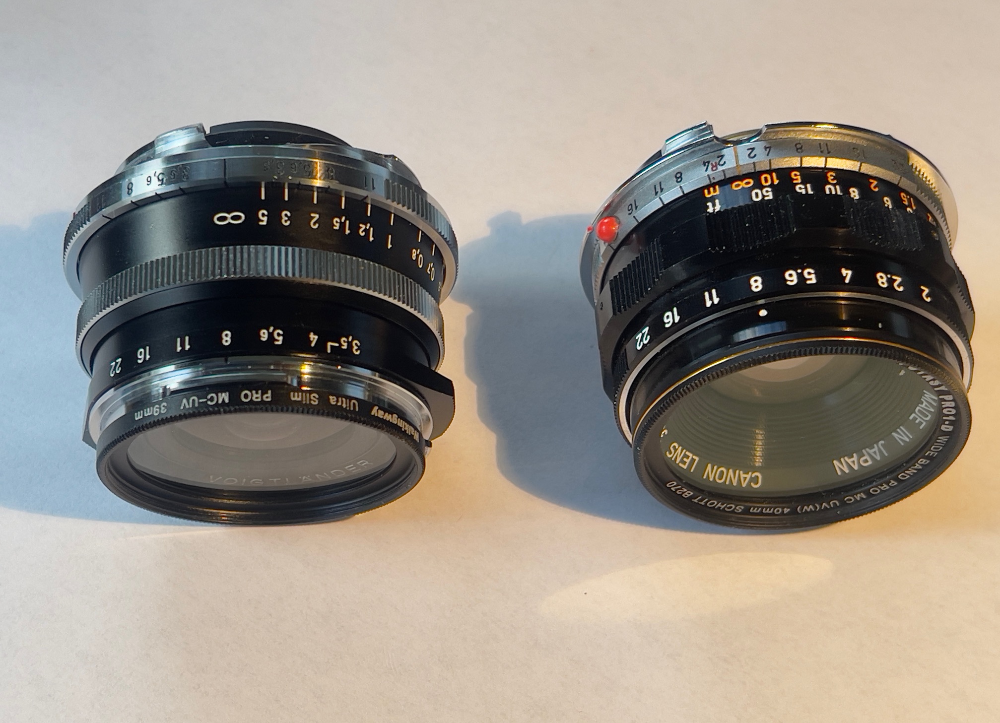
The lens is tiny and with a slim UV filter fitted weighs just 185 grams/6.5 ozs. For comparison the 35mm f/2 Canon LTM with bayonet adapter and UV filter comes in at 139 grams/4.9 ozs. Fit and finish are all metal and Leica quality, the focus collar resistance is just so and the apertures are in half click-stops through f/22. Small protuberances on the aperture ring make it easy to grasp. The black rimmed UV filter not only serves to protect the front element, it also masks off the poorly thought out chrome bayonet front ring which can only be a source of reflections and flare in bright lighting. The distance scale is marked in meters only and the depth of field scale is very hard to read, and only extends to f/11. The 50+ year-old Canon’s DoF scale is far superior in this regard. Not that big a deal as with a 21mm focal length lens almost everything is sharp near to far.
Adding a red indexing dome:
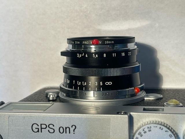
The lens mounting index – a thin red line – is awful, being small and very hard to find. I determined to add a red indexing dome, much as I did with the two Canon lenses. I’m a frequent lens changer in the field and regard the addition of a proper index essential.
What follows is not for those inexperienced with machine tools. I worked in a machine tool shop as a kid so the requisite skills are ingrained. If this is new to you delegate the work. I took a drill to the lens this morning as the area where I wanted to place the red indexing dot is serrated and could not provide a proper glue base. The index would inevitably be knocked off in use.
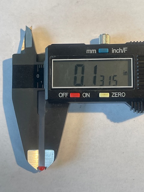
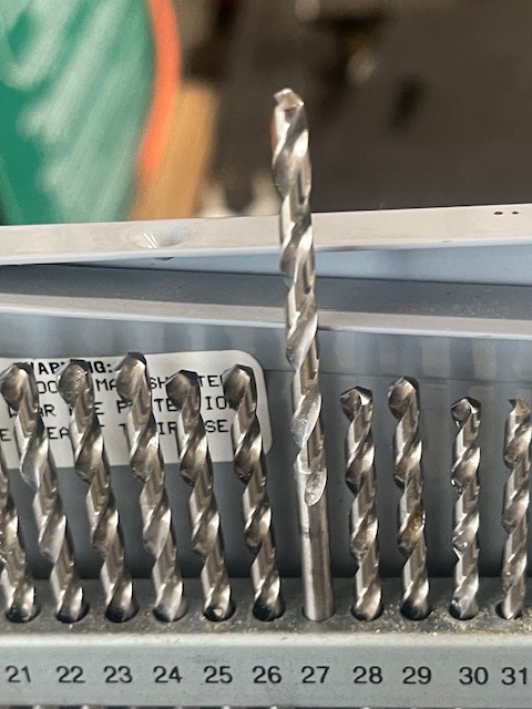
I used a small drill press and a machinist’s vice, using a slightly oversized drill. You cannot do this with a hand drill – the bit will slip and your lens will be marred. The red dot’s diameter is 0.1315” so I used a #27 (0.1465”) drill – call it 1/100th inch oversize. That alloy coated brass ring proved to be very hard so I had to take it easy, a small bite at a time, when drilling. Everything had to be rigidly bolted to the drill press’s table to prevent the drill bit from wandering or the lens moving. Quite why Voigtländer did not add this beats me.
The JB Weld epoxy takes 24 hours to dry.

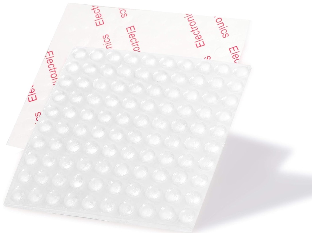
Measuring the red indexing dome.

A slightly oversized drill is used.

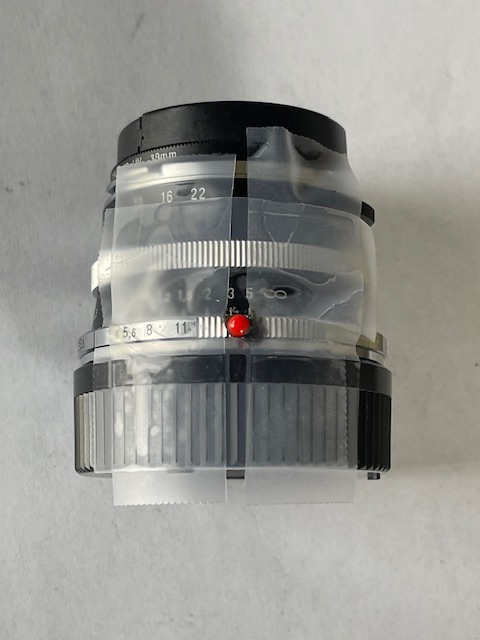
Scotch tape sees to it that the epoxy does not spread to where it is not needed.

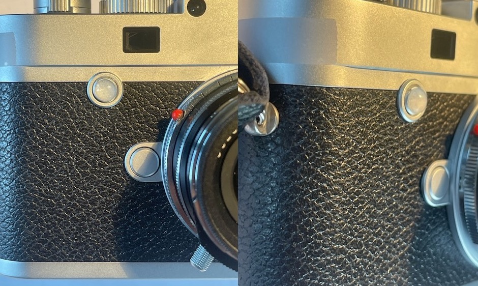
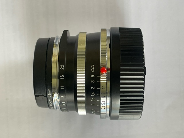
Installed.
The red indexing dome and the related drilled hole are immediately adjacent to the focus collar and if you get any epoxy on the junction your lens will be locked and unable to focus. It bears repeating – if you are not comfortable with machine tools delegate the work.
Adding a proper aperture index:
Someone really needs to speak to the Cosina designers with a baseball bat. Not only is the thin engraved red line for mounting the lens nearly invisible, the similar line – black this time – for the aperture index is even less so. What is it with these people? Have they ever actually used this otherwise fine lens in the field? Do they think all their customers have the eyesight of a 16 year old? Leica does a fine job of index design on their many lenses and it’s not like Cosina is faced with a patent issue. A red half dome of plastic and a dab of paint would fail any patent application on grounds of obviousness. Well, a drop of red acrylic paint on the UV filter does the job the pathetic stock aperture index does not:

Proper aperture index added.
Now that’s what I call a red dot.
Lens hood and rear element protrusion:
The lens hood cannot be fitted when a filter is mounted so it’s for sale. Poor design. I would rather have a protective filter than a clunky hood without a filter fitted. The rear element does not protrude beyond the rear guard ring, meaning the lens can be carried in a shoulder bag without a rear lens cap fitted without fear of abrasion to the rear glass.

Both the 21mm Voigtländer and the 35mm Canon LTM lenses are
very small indeed.Canon did a far better design job on the
DoF scale than Voigtländer.
Focusing:
The Color-Skopar has a handy small protruding nub for focusing which works well, but sadly there is no infinity lock, making removal of the lens a tad tricky given how narrow the rear serrated ring is. The focus throw is a short 120 degrees with the closest 0.5 meter focus distance inside the 0.7 meter minimum limit of the rangefinder. (My M10 rangefinder couples down to an indicated 0.6 meters). Use live view below this distance. Ordinarily a short focus throw suggests less precision in focusing but again the very short focal length of the Color-Skopar overcomes even large focusing errors.
Performance:
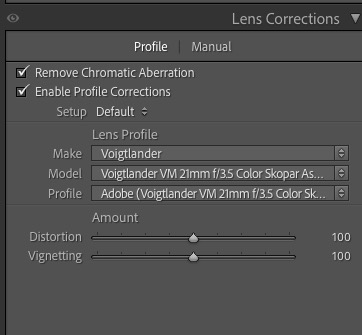
Performance with 6-bit coding in place? What minor vignetting exists is easily corrected in LRc which includes a lens correction profile for the lens. That profile also corrects minor barrel distortion, handy to know for architectural work. I can see absoloutely no color fringing at any aperture, likely a combination of the aspherical element, the distance of the rear lens from the camera’s sensor and the 6-bit coding. That all sounds horribly complex but in practice happens invisibly. Full aperture is usable across the frame for large prints with the lens peaking at f/5.6 and staying there through f/11. Diffraction kicks in at f/16 and f/22 so for pin sharp large prints these apertures are best avoided. I would say that full frame 36″ x 48″ prints at any aperture are fine but the two smallest f-stops start to show resolution drop-off in print sizes larger than this. In other words chimp in LRc at 100% and everything is perfect. Up that to 200% – a monster print or a massive crop – and the aberrations start to show if the viewer sticks his nose in it.
The wide angle optical design world has come a long way since that 21mm f/4 Super Angulon of 1958. Simply stated this is an extraordinary piece of optical and mechanical engineering at a bargain price for a mint used example. Even bought new the lens is a bargain. Given the level of performance of the Color-Skopar I am rather mystified why anyone would pay $4,000-$9,000 for the current Leica optics. The way I see it, I paid ten cents on the dollar for a stellar ultra-wide optic.
A couple of images:

Leica M10, at f/8. Note the acidic greens. Snapped at the Golden Hour. No flare.

These wetlands, replete with bullrushes, are a sanctuary for redwing blackbirds.
More detailed resolution tests appear here.
Pictures taken with the lens appear here.
