Putting the digital Leica through its paces
Paso Robles in Central coastal California, close to my home, is a charming town of some thirty thousand people whose interests tend to focus on the outdoors, wine making and agriculture. As luck would have it, yesterday was the occasion of the annual Agriculture Show in the downtown square, so the Leica DP, neatly stashed in the glove compartment of the car, made its way with me to see what was happening.
I exposed all 53 frames available on the 1gB Sandisk Extreme III SD card, using the RAW format at the highest size setting, meaning the widesceen 16:9 format. That is really wide!
You may view twenty four of those snaps by clicking here, and you can return to this page by clicking he link in the title bar when you are done. Click on any picture to see a full screen view. Click on any full screen view to jump to the next snap. Click the title in any full screen view to access the thumbnail index. The pictures were processed in Adobe Camera Raw in Photoshop CS2, where they were converted to PSD files. These files were then droppped into a new project in Aperture where post-processing was applied and then exported to JPG format in iPhoto ’06. You can read about the Better HTML application used in conjunction with iPhoto ’06 to create these web pages here. I still prefer it to anything offered for web export in Aperture.
All snaps were taken with the DP set to ISO 100 using aperture priority. The aperture was set at f/6.3 whch resulted in shutter speeds of 1/125 to 1/1000th second. Somewhere along the way I must have touched one of the buttons as the aperture mysteriously changed to f/4.9, so I will have to address what caused that. All pictures were taken in a thirty minute time span.
Some observations. I forgot to set the DP to center weighted metering, leaving it at the default Multiple metering setting. The latter is confusingly denoted by a pair of brackets with a spot in the middle, whereas the center weighted mode has a pair of brackets sans spot. Silly. The result was that most of my pictures, focusing as they do on people in the shade, were exposed for the brighter background, necessitating some tweaking using the Highlights and Shadows slider in Aperture to bring up the shadows. The trade off is a little more noise in the shadows but nothing to worry about.
Picture-to-picture delay is some 2.5 seconds while the camera writes the RAW file to the SD card, and that’s with the fastest card on the market. While the camera has a burst mode, it’s not available if you use RAW, owing to the large file sizes involved and the limited size of the in-camera buffer. With a Leica M, picture-to-picture delay is some 1.5 seconds as you wind the film and reorient the camera so the Leica DP is a tad slower in this regard. If you are a Machine Gun shooter, stop reading now.
File sizes? Here’s the Mac’s Finder showing the SD card’s contents:
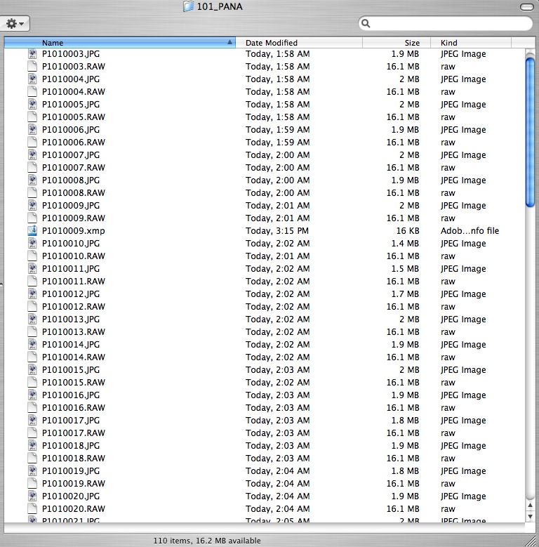
As you can see, each 16.1 mB RAW file is paired with a low quality 1.9mB JPG file and there does not seem to be any way of switching the JPG creation off. On the other hand, the space taken up by these JPGs is equal to six RAWs, so it’s not exactly a big deal, and the JPGs make for nice and quick web material, if needed. I use a Sandisk SD USB II card reader to load files onto the iMac, thus precluding the need to waste time loading the JPG files – I select the RAW files only. Plus that saves having to mess about with the custom cord provided by Panasonic which fits into a miniscule connector under a flap on the camera’s side – an accident waiting to happen.
Looking at the web pages of images, you will see that I have left many with the original 16:9 proportions, while cropping several others to the classical Leica 3:2 film format. I’m still learning how wide the widescreen format is, though it’s not a function of the optical iewfinder which accurately shows the 28mm width of the field of view. It’s just that I have to learn to get closer. As Robert Capa said “If your pictures are not good enough, you are no close enough”. After all these years I still have to remind myself of that.
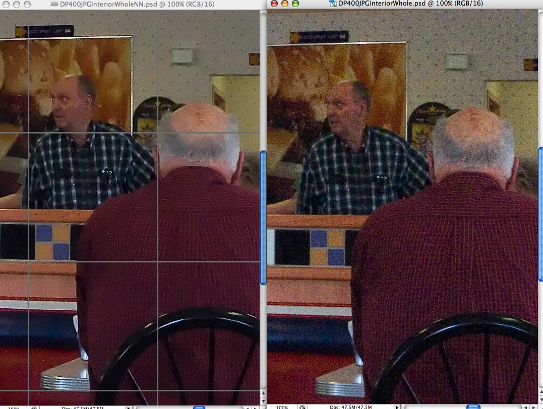
How about definition? In PS CS2 after ACR processing, the images result in a 47.5 mB PSD file. On my 17″ diagonal iMac G5 screen the ‘Fit on Screen’ image is 7.3″ x 13″ in size and as sharp as you would need for a print that size. Switch to ‘Actual Pixels’ and the effective size becomes 37.5″ x 21.1″ which is huge. The merest amount of purple fringing is visible on bright white edges. Here’s the definition of a center portion without any post processing added.

Dial in 70/1/0 Unsharp Mask and you get the following:
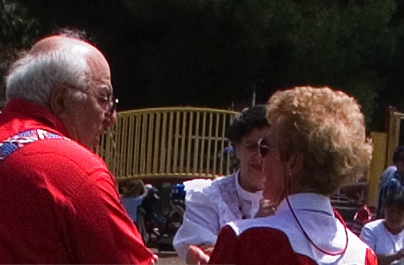
These are both screen shots so the definition in a print would be markedly better, but even from these examples you can see central definition lacks nothing and there is no grain/noise. The modest level of USM is much less than dictated by the Canon EOS 5D’s full frame sensor, which need something like 250/2/0, so it’s a case of horses for courses when applying USM. One size does not fit all.
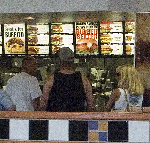
Edge definition? Here’s the extreme edge at 16:9 and f/6.3 after applying USM:
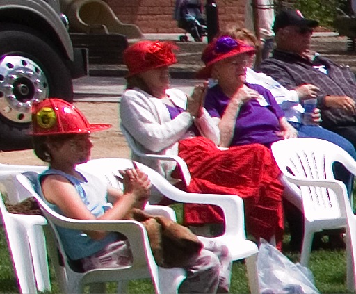
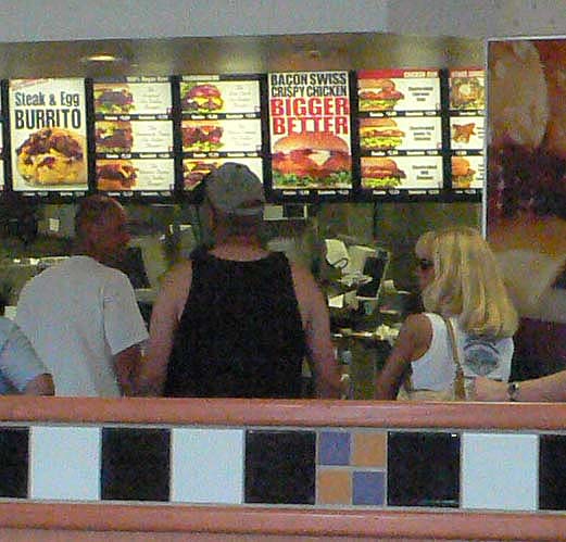
Here’s the full frame image after downsizing and using ‘Save for Web’:
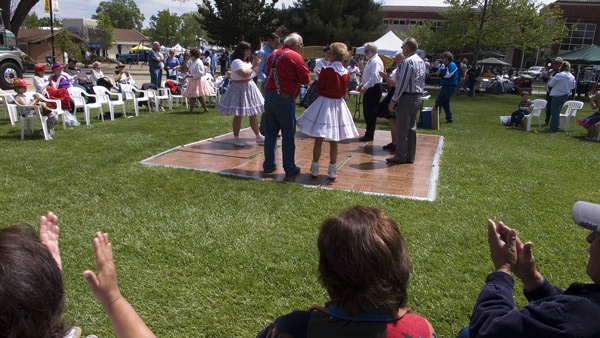
Bottom line? 13″ wide prints with this combination will be just fine, but expect some wide angle distortion toward the edges and some purple fringing on bright color edges. The latter can be easily taken out with ACR’s controls. You are stuck with the distortion. Is the lens as good as the 24-105mm Canon IS ‘L’ f/4 on my EOS 5D? No, but it’s close. Plus three Leica DPs would weigh less than the Canon lens alone!
The other thing I noticed is that the native contrast of the RAW files was very high. Sure, the pictures were taken in contrasty lighting but the image contrast for the most part was too high. I’m going to reset the in-camera Contrast setting from Normal to Low and see if that makes a difference in RAW images, or if it only affects the JPG clone. Otherwise, Aperture or PS CS2 controls are fine, if a bit of a pain to have to apply.
What else? Carrying the DP by the wrist strap is a joy. The small right hand finger grip (missing from the over priced Leica D-Lux 2 clone) helps a lot and, of course, holding the camera to the eye where it is naturally braced by the forehead, aids steadiness greatly, further helped by the integral vibration reduction. With the viewfinder mounted above the screen the LCD display is invisible with the camera at eye level, and not a distraction. The camera will switch the screen off at a user preset time to preserve battery power (there is no option to leave the screen off as this is, after all, a viewfinder-less camera!). That’s a shame as once the camera powers down, the lens retracts, although the camera remains ‘On’. A touch of the shutter release button is required to make the lens extend again which means a delay of unacceptable length for a street snapper. The ‘Power Save’ options are 1, 2, 5, 10 minutes or Off, with ‘Off’ meaning it never goes Off. So I’m going to switch to the ‘Off’ option and then reduce screen brightness to a minimum to preserve battery power. We will see – a spare battery may be in order as I suspect that the LCD display consumes a lot of juice.
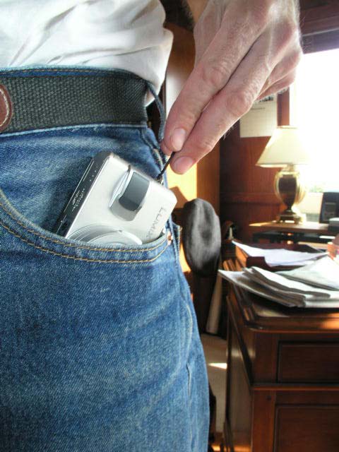
The purpose of all of this is, of course, to recreate the Leica experience with a modern digital camera. The Leica DP comes very close. No, there is none of the sensuous feel of the advance lever or the silky beauty of the controls. I doubt the M2/3/4 will ever be bettered in that regard. Shutter lag is barely longer than with a rangefinder M Leica, size and weight far less. The lens, while no Summicron or Elmarit, is very, very good and the camera is truly pocketable. There is simply no excuse for not carrying it at all times. The small size, aided by the amateur chrome looks aid greatly in making the photographer invisible and, most importantly, you no longer have to wait for your film to be destroyed at the local processing lab. Or by the X Ray machine at the airport. And you no longer have to curse the ridiculous film loading system in the Leica M body – in its refusal to change this, Leica displays German arrogance at its worst.
You want classic monochrome? Two clicks in Aperture and here you go:
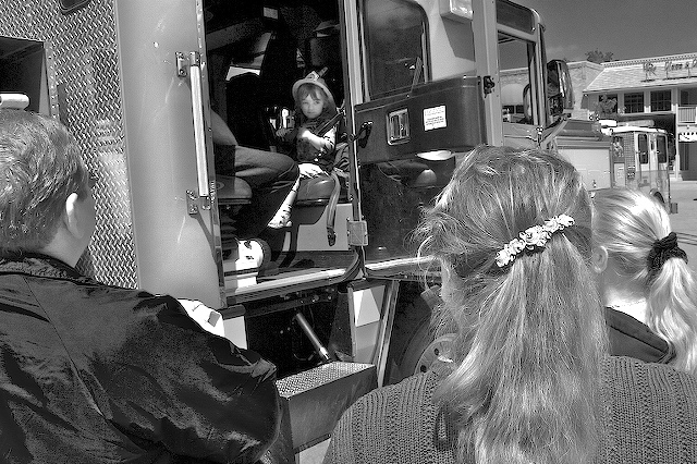
Best of all, the Leica DP is incredible FUN. Now when was the last time you said that about a camera?
In Part III I’ll try it out at ISO 200 and 400 and see what happens.