Working with the G1.
In addition to avoiding the Nazi guards trying to enforce a truly moronic ‘No Photography’ rule at the de Young Balenciaga show, I had to contend with camera shake and noise from the Panasonic G1’s small sensor which, even cranked up to ISO 1600, was resulting in long shutter speeds. While the OIS in the kit lens helps greatly, adding two full stop’s worth on the shutter speed front, it’s still all I could do to get a half decent image in the low lighting used at the show. The 1/10th shutter speed in the images below figures to probably an effective 1/40th as regards camera shake with the benefit of the magic that is OIS anti-shake technology. The 28mm (FFE) focal length used also helps, adding a further stop compared to a 50mm standard lens, so that 1/10th makes me look a lot better than I really am, figuring to an equivalent 1/80th or so with a 50mm lens and no OIS.
You can see the original snap which I am talking about here.
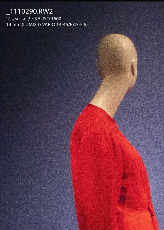
In the following images I show enlarged screen shots from Lightroom 3 which are equivalent to a 30″ x 45″ print, meaning huge.
Here’s the first snap with only standard sharpening applied on import of the file to Lightroom, meaning 100/1.1/64 which I find optimal in counteracting the anti-aliasing filter in the G1. Noise reduction in LR3 was set at 0:
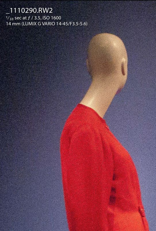
Luminance noise is clearly visible though I also have a 13″ x 19″ print in front of me, made on the HP DesignJet90 printer on HP Premium Plus Satin paper (the textured surface tends to mitigate noise to some extent compared with glossy paper) which is perfectly fine unless you stick your nose in it.
In the next picture I applied the following settings in the Detail panel of the Develop module in LR3:
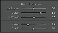
Anything much over 50 on the Noise Reduction – Luminance slider results in artifacts, and falling definition, so it’s a juggling act between noise reduction and sharpness.
The bottom line is that, even at ISO 1600, the small MFT sensor in the Panny can more than cope with noise at any reasonable reproduction ratio for your images. And, as I wrote here, anyone knocking the Panasonic kit zoom as a piece of plastic junk is simply clueless and would likely be better employed telling innocent patrons not to take photographs at costume exhibitions.
To get an idea of the relative size of the Micro Four Thirds sensor (same as Four Thirds – circled) the following image from Wikipedia tells all – it’s approximately one quarter of the area of a full frame sensor as found in the costliest DSLRs:
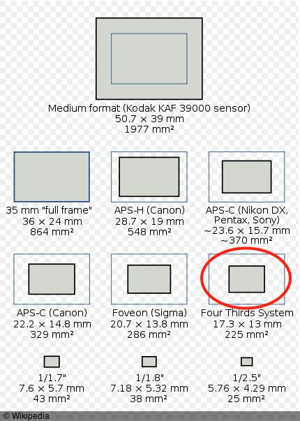
Incidentally, with the near-grainless sensors in full frame 35mm DSLRs it’s very hard to make a case for the extremely costly medium format DSLRs from the likes of Hasselblad (made by Fuji), Leica with their S2 and others. The gear is far heavier, the lenses bulky and the cost exorbitant, not to mention having to cope with huge file sizes which will need superior computer gear to process efficiently.