René Maltète

A fine French photographer.

A reader writes:

Thomas,

You often make reference to great or at least famous photographers. I am French and when I was a child (I am 56 now) I used to flip over my uncle’s photography books. There was one French photographer I loved and I would like to share it with you, here is the link.

You may have to brush up a bit your French to understand certains images, they were taken some 40 to 50 years ago.

Cheers,

Michel

Thanks, Michel. I was not familiar with René Maltète’s work and I’m grateful for the reference.

Most enjoyable!

At the Moscone Center

Sterility makes for opportunity.

The Moscone Center – named after the assassinated mayor – in San Francisco is probably best known for hosting the annual love-in where Steve Jobs previews the latest in Apple toys early each new year. It also hosts a playground which may be the most sterile I have ever seen, but that’s not all bad. It makes for interesting photo opportunities.


Moscone playground, 2000. Leica M2, 50mm Summicron, Kodak Gold 100. Contrast enhanced in Lightroom.

I was very much thinking of the work of Ludwig Schricker when snapping this.

No, I wasn’t there for an Apple love-in.

Importing into Lightroom

Automating sharpening on import.

One of the first things I have to do when processing images imported from my Canon 5D (or the Lumix LX1 for that matter) is to sharpen the RAW image. This is standard operating procedure for digital cameras and has nothing to do with poor native image quality. The process simply negates the effect of the anti-aliasing filter, used in nearly every digital camera. Apple’s Aperture is really smart about this and does it automatically, detecting the camera used and applying Apple’s pre-set adjustments. Lightroom is less smart but can be taught to make the adjustment automatically on import.

Here’s the process – I have enlarged the screen shots for legibility, hence the poor definition – if you want to see aliasing take a look at the ‘jaggies’ in the pointers!

Here are the Lightroom defaults for sharpening in the Develop module.

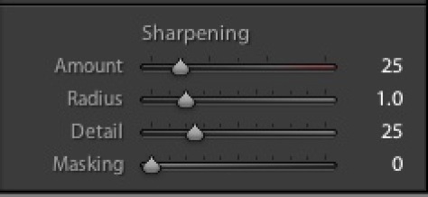
Leave them like this and you will have to sharpen every picture once imported. A waste of time.

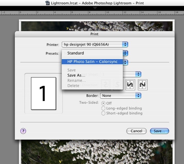
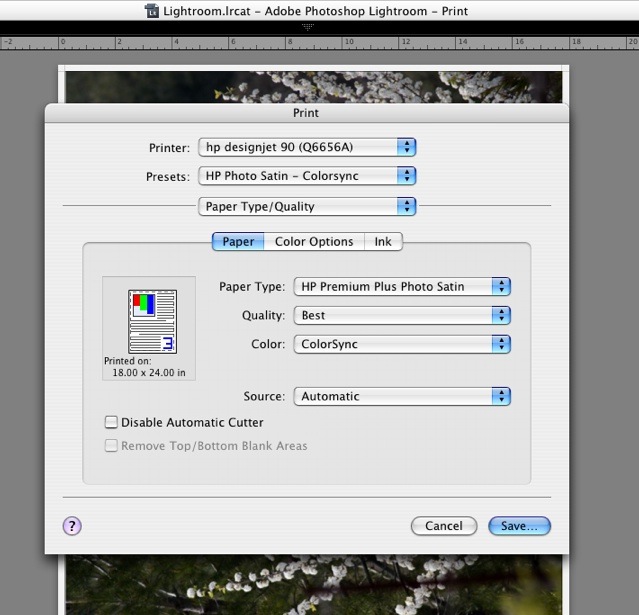
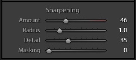
Here are the settings that work best for me – and I have large prints made on an HP Designjet 90 printer as my goal. For the small images used for the web it really does not matter what you do. A large print, on the other hand, is the most demanding output there is.

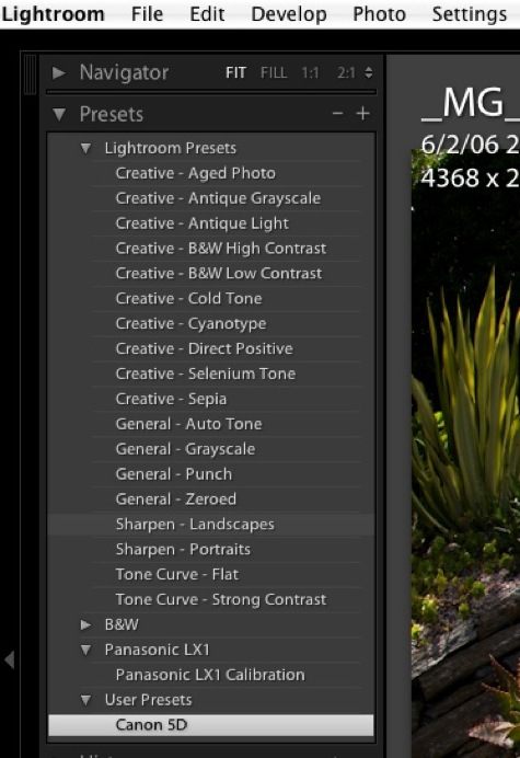
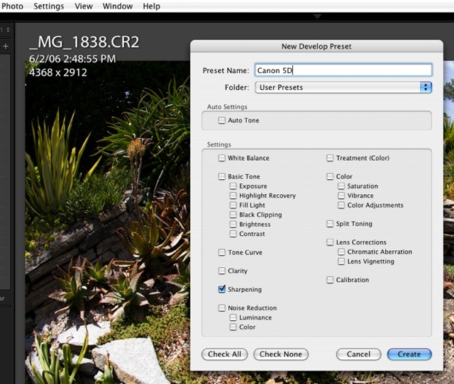
Having made those adjustments in the Develop panel I then create a new User Preset by clicking on the ‘+’ sign in the Preset area in the left panel and naming the current settings Canon 5D. No other defaults have been changed in the Develop module at this time nor do you want to make any changes:

Then when prompted which settings to save with this new User Preset, I choose ‘Check None’ then check only the Sharpening box. This will limited changes made whenever this User Preset is chosen to Sharpening only. Were I importing from a small sensor camera with inherent image noise (not an issue with the 5D) I would consider including Noise Reduction when creating the User Preset and would check the related box, below.

Next I insert a CF card containing images to be imported into the card reader and the import Dialog pops up. Under information to Apply: Develop Settings I click the drop down box and point to the Canon 5D preset just created:

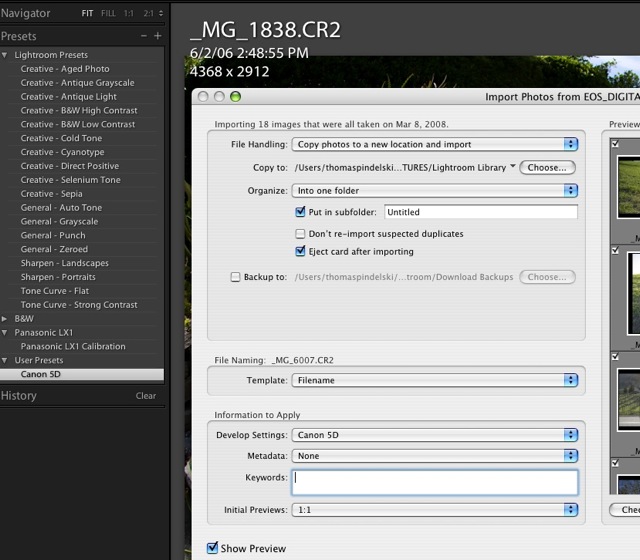
Now my preferred sharpening settings will be applied as the pictures are imported and 1:1 Previews are generated. As is always the case with RAW files, the original file is never changed – it’s just the Previews that are managed.

You can make User Presets which are specific to a camera serial number, if you want, but as Your Truly owns just one 5D (a status unlikely to change) and one Lumix LX1, that’s a luxury I do not need.

One size does not fit all:

Now the above approach is camera specific, not lens specific.

It doesn’t mean that you just merrily import every image without the need for any additional sharpening adjustments.

Even in my small set of Canon lenses there are noticeable variations. The 85mm, 200mm’L’ and 400mm ‘L’ optics are pretty constant when it comes to sharpness at all apertures. Indeed, the 200mm generally needs a small reduction, it’s that good. On the other hand, the 24-105mm ‘L’ and the 50mm f/1.4 at full aperture both need a little more and the 20mm needs more all the time. It’s a mediocre piece of glass at best.

And it’s not just sharpening you have to worry about. There are other lens aberrations.

It would be pretty neat to be able to automatically adjust for Chromatic Aberration (color fringing), Distortion based on the lens used and Vignetting, but that feature is not available, yet. CA and Vignetting would be especially tricky as they vary with aperture. Distortion is no walk in the park either as the distortion levels in zooms vary with focal length. That’s not to say that Adobe couldn’t do it (we are talking simple look-up tables here, although a lot of them, and a presumption of low sample variation) and I, for one, would love to be able to have the fairly pronounced barrel distortion in the 24-105mm ‘L’ zoom automatically removed when this otherwise fine optic is used at its wide end.

DxO Optics adopts this exact approach in a plug-in for Lightroom. They should be applauded for their efforts. The list of cameras and lenses they automatically adjust for is set forth here. I have not tried the product and, at $300, I’m not about too, but it may make sense to some. It looks like the latest Mac version is not yet available so I could not try it even if I wanted to blow the coin. Their video suggests the product is bog slow (a couple of minutes to adjust just five images), and you can bet they are using the fastest possible hardware to put a gloss on things, so a pinch of salt is recommended before you lay out your hard earned cash.

Does any of this really matter with small images – like those reproduced on the web or in snapshot prints? No. But once your prints sizes get large, it can make a significant difference to the appearance of the picture. And a little bit of automation to reduce the drudge of processing is always a good thing.

More on Lightroom printing

Some convenient enhancements.

Since publishing my first piece on how to profile monitors and printers for use with Lightroom, I have made a couple of interesting discoveries.

First, I listened to Adobe Podcast#1 (with Mark Hamburg, Kevin Tieskoetter and Jeff Schewe) from Apple’s iTunes store (search podcasts on “Lightroom”) which speaks to profiling (they are speaking about Lightroom Beta Release #4 for the Mac) and was intrigued to note that that we shared the same approach. The development team (a lot of very smart, well informed, outspoken engineers – highly recommended listening) does exactly what I published with regard to the use of Colorsync, letting the printer manage colors, not Lightroom. This philospohy is printer agnostic. Epson, HP, Canon, you name it.

My approach requires making Lightroom use Apple’s Colorsync utility to manage colors. You need a properly profiled screen and I describe in that earlier piece a very accurate way of doing that which does not even require a colorimeter, provided you follow certain disciplines regarding ambient lighting.

I suggest you give this method a try. Your maximum cost is a few minutes, a couple of pieces of paper and some ink. And the money saved on a Colorimeter (wish I had been that smart when I bought mine) will pay for a lot of paper and ink. It does not matter who makes your printer for this screen profiling approach to work.

The other thing I discovered is that it is possible to save the Colorsync setting in the Printer Profile – something I stated frustration at not being able to do.

I had forgotten that there is a ‘Save’ setting in the print dialog box. So elect Colorsync in Print Settings->PaperType/Quality then Save the setting with a meaningful name. I have named my saved file “HP Photo Satin – Colorsync” which states the paper type I chose before saving and obviously uses the Colorsync utility. Note that this named setting is independent of Lightroom’s Print templates – you choose it at print time after selecting a Print template. The printer dialog box dictates color management, the Lightroom Print template controls the paper size, margins and picture layout on the page.

Then, when it’s time to Print, I simple choose this drop down menu option in the Print dialog box (I have not yet figured out how to make it the default, something I would like to do as that’s what I use nearly all the time – what I need to do is work out how to delete the ‘Standard’ setting, I’m guessing, at the OS file level). A quick check – see the following screen picture – confirms that the Colorsync setting has, indeed, been saved and will be used when printing.

Now I am assured that both the right paper profile and the correct Colorsync setting is made without having to check yet another layer of menus in the print dialog box. So printing really is a breeze. I have created three templates – for three different paper sizes. That’s all I need, as I always use the same HP paper.

* * * * *

I learned an interesting thing from this podcast – what do you think Adobe did for the Lightroom development team for Christmas of 2005? They gave each member a digital camera and encouraged them to take lots of pictures. Maybe the resulting stress testing has something to do with the application’s speed? I wonder whether Apple ever considered doing that for its Aperture developers? Or do they simply get a $7,000 Mac Pro and 30″ screen which will run anything well ….

A pastoral interlude

The charm of central California’s wine country.

After the overwhelming power of yesterday’s picture, something more placid is called for. Nothing is finer than a gentle drive on the traffic-free back roads of central California’s wine country, which happens to be where I live.

And this little bit of nothing was a nice little something to chance upon. No drama. No message. Just some gentle beauty.


Central California wine country. 5D, 85mm, 1/1000, f/8, ISO 250. Processed in Lightroom.

With that combination of camera and lens, Canon could fairly claim, as Kodak did a hundred years ago, “You take the picture, we do the rest”. Processing was limited to the addition of a bit of vignetting, using Lightroom’s sliders to make the subject pop.

Some mood music helps, so why not the best?


Chopin, Mazurka in B minor, Op. 33 #4. Horowitz.