Richard Gere – Photographer

A moving book of pictures chronicles Tibet.


Pilgrim. Photographs by Richard Gere

I have long enjoyed Richard Gere as a film actor, not least for his light touch and excellent timing. For whatever reason, he seems to have fallen out of favor with US audiences, yet finds himself more popular than ever in Japan, where his movies are invariably huge box office hits.

But I’m not writing about Gere the actor here. Rather, this piece is about Gere the photographer, a man who has been a long time devotee of Tibetan Buddhism and documents his faith here. His love for the country and its gentle, cruelly oppressed people, shows well in this large book. Gere spared no expense in production, for the book is beautifully clothbound with the sixty-four pictures reproduced in warm monochrome tones on Mohawk Superfine acid free paper (I quote from the Appendix). Suffice it to say that the look and feel of the whole project is of something of the finest quality.

Gere’s photography is noteworthy. He does not hesitate to publish pictures which are blurred because of camera shake, where the effect justifies it (indeed, the cover picture is blurred) nor to use slow shutter speeds to blur moving people in otherwise sharp surroundings. This is no mere affectation for leafing through this book shows that the effect is used well and never detracts from the emotion of the pictures.

And emotional they are, none finer than that of His Holiness the Dalai Lama on page 63 or the simply gorgeous, there’s no other word for it, picture of the hands and prayer beads on page 48.

It doesn’t hurt to read that Gere donated all his profits to Tibetan charities.

Perhaps the biggest challenge with a book like this is the celebrity status of the photographer, but this is miles away from another tome of lousy snaps by yet another underemployed spouse franchising her marriage to a rock star. Gere, clearly, is not only the real thing in his beliefs, the photography is simply beautiful to behold and very moving.

The book appears to be out of print; my used copy came from Powell’s Books for the not inconsiderable sum of $35. Money well spent.

Canon lens quirk

Read this if you cannot insert your Canon lens in the camera.

Coming back from a little nature expedition today, I found I still had the 200mm L on the Canon 5D, so I went to replace it with the 24-105mm L which usually makes its home on the body.

The only snag is that it refused to even fit into the breech of the bayonet on the body. I checked for damage on the lens’s bayonet and there was none. Hardly surprising as I had not dropped the lens.

I checked against my other two lenses – the 200mm L and the non-L 15mm fisheye. All three have a small Phillips head screw some 20 degrees counter-clockwise from the red mounting alignment dot, viewed with the bottom of the lens uppermost. No other protrusions exist around the circumference. So, it must be the screw.

I located my smallest Philips head jeweler’s screwdriver and, sure enough, the screw was loose. A moment’s work and all was well.

So if you run into this snag, don’t panic. And carry a Phillips screwdriver with you. A tad frustrating on a $1300 lens.

Ugly sells

Why can’t American female executives appear attractive?

The latest in the daily amusement which is the saga of mismanagement by the Hewlett Packard Board of Directors is the release of her biography by ex-CEO Carly Fiorina. Seldom did a CEO so deserve to be fired as Ms. Fiorina, having destroyed HP’s culture and promoted the acquisition of failing Compaq Computer, a deal that ranks just behing the AOL-TimeWarner fiasco as one of the worst business combinations of all times.

So no love lost there, and at least HP lucked out (it cannot have been anything but luck, given their track record) and got a good CEO to rebuild shareholder wealth.

What is intriguing about Fiorina’s book is the cover picture. Nothwithstanding her lack of management and business skills, she is, even to her harshest critics – an attractive woman. Yet she chooses a cover picture which is, in a word, ugly.

The hair masculine, the gaze unyielding, the lips pursed, the face haggard, it’s a poor attempt at female business macho.

I asked a friend why anyone would use so ugly a photograph, given the power images have in our society, to promote their book. She made all clear to me.

“You see”, she replied, “In America to compete in the business world, you have to be one of the guys. In France, women naturally use their femininity to rise through the system. As for the looks and clothes sense of the English businesswoman, move on”.

Just when gender equality raises its head in the US boardroom, photography proclaims that its name is Ugly.

How sad.

Skrebneski – Portraits

A flashback.

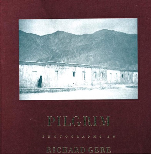
An email from a friend had me rushing to my bookshelves – sadly now dispersed over three rooms owing to their seemingly organic growth – in search of my Victor Skrebneski picture book. “You have to look at these” was the general thrust and, in fairness, I had probably not looked at ‘Victor Skrebneski – Portraits, A Matter of Record’, for ten years. Used copies can be had for a trivial sum on the web.

The only snag was that I couldn’t find the book. Whereas my own pictures are ordered in studied manner, my workshop tools each have an allocated space, DVDs reflect a near manic filing method replete with bar codes and scanners, when it comes to picture books my approach is one of sheer chaos. By design.

The goal is simple. By adopting a random approach to arranging these, the sole determinant of position being whether the height of the book will fit the shelf, the experience of looking, of searching, of surprise, is enormously heightened. The trade off is that if you tell me to find a book by, say, Minor White or Cecil Beaton, well, prepare yourself for a wait as the chances are that I will not have the faintest idea of its location.

Not that I mind being asked. Not at all. Because you can bet that in the frenzied search I will come across several other long lost friends that deserve an airing.

Victor, Victor, Victor, where on earth are you?

My first pass was a goose egg. No Skrebneski to be found in the ancestral manse.

Tried again the next day. Now I remember. The book was huge. Not huge in the sense of the modern novel or biography, whose quality is invariably in inverse proportion to the quality of its content. No, huge in the sense of big. Not thick. Big.

So I reset the grey matter to search for Big, which helped not one whit. There are lots of Big photography books. Lots of tall shelves to accommodate them. But persistence won the day and there it was, Skrebneski’s book of portraits of famous people.

To this day the photographer makes his home in Chicago, that haven of civilization in the culturally arid desert that is the mid-west. True, the climate is abominable, but all these famous people must have made the pilgrimage to Skrebneski’s studio for a reason, and it was clearly not for the weather.

Now if you usually think of fashion photographers as purveyors of candy and fantasy, I agree. However, Skrebneski’s portraits are on a higher level.

The reason is, of course, self evident once you peruse his work. ‘Portraits’ is a collection of his ‘black-turtle-neck-dark-lighting-period’, for lack of a better cliché, and one of the most amazing aspects of the pictures is that in many you can see the subjects’ eyes …. but you cannot see their eyes. Meaning they are lost in unlit sockets. Somehow this conspires to make them more dramatic, conferring a sense of ‘Guess Who I Am?” on the portrait.

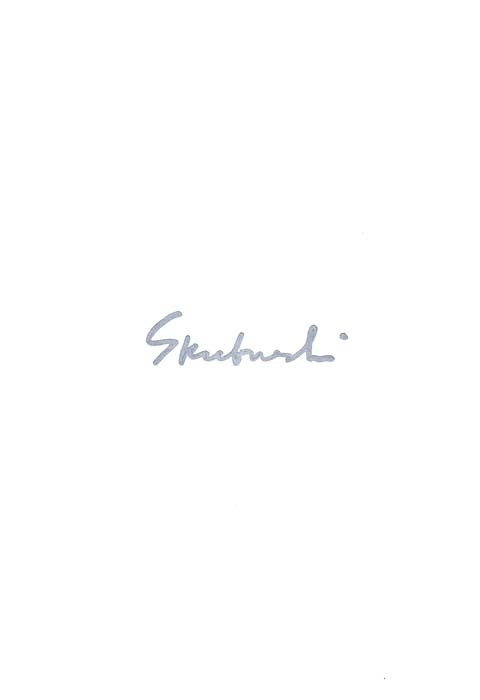
The strong sense of déjà vu is fomented by the fact that I was a young man growing up as a photographer when these were taken. I can recognize fully half of the subjects today, the book having been published in 1978. It’s no accident that the index is not referenced, so you have to follow along diligently, flipping back and forth, if you want to put a name to a strange face. Skrebneski is playing along with his style which is, once again, “Who Am I?”

Let’s see. An Audrey Hepburn, her face in such extreme close-up that you cannot recognize her.

That iconic image of Miss Blow Up, V. Redgrave. Every red blooded male recognizes that one.

Orson Welles, haughty, threatening, mischievous.

Diana Ross at the top of her game. Gorgeous, powerful.

Karen Graham. The Estee Lauder Woman. So used to the lens she seems almost bored. Wow!

Brooks McCormick Jr. and his threatening German Shepherd. (Have you noticed that nearly all the killer dogs have German names – Rottweiler, Doberman, German Shepherd, Weimaraner?)

Georg Solti. A wonderfully warm man whose orchestral rehearsals I used to attend frequently when a student. The price of concert tickets was beyond me back then.

The ageless Patrick Lichfield, society photographer with great hair.

An ice cold Hubert de Givenchy followed by the radiant warmth of Oscar de la Renta. Personalities displayed in their couture.

Cliff Robertson looking for all the world like Francis Bacon. Probably those unlit eyes remind me of Bill Brandt‘s work.

Irving and Mary Lazar. The cold eyes of the one and the almost equally cold eyes of the other. Not people to mess with.

Truman Capote looking …. well, like Truman Capote.

And finally, Fernando Bujones. When I saw Bujones dance Giselle the ‘Bujonistas’, as the press dubbed his followers, were whooping and hollering. So naturally I joined in, and what are you going to do Lincoln Center? Arrest us?

I have named but a few. It’s a book worth tracking down.

HP DesignJet Z photo printer

Brought to you despite the Board of Directors.

If you have been following the financial news recently, you could be excused for thinking the Board of Hewlett Packard couldn’t organize a booze-up in a brewery. Depsite the twits in the corner office, the great engineers at HP continue to make innovative products. The most recent announcement is the HP DesignJet Z photo printer.

Long time readers of this journal will know how pleased I am with my HP DesignJet 90, which will make up to 18″ wide prints using fade-resistant inks. Having made some forty 13″ x 19″ and 18″ x 24″ prints in aggregate over the past six months on mine, ink levels remain astonishingly high – if those meters are linear this has to be one of the most economical printers available. Three cartridges are still showing full, the other three three-quarters full. Print quality is as good as it gets.

The new floor standing DesignJet Z comes in 24″ and 44″ widths and is focused on extreme color accuracy, courtesy of a built-in Gretag/Macbeth/X-rite spectrophotometer to automate paper profiling and ICC profile generation. I use an external version of the X-Rite to profile my screen and then adjust the ICC profile manually for the paper used with HP’s provided tools, as I explained in my review. Well, now the need for tortuous manual ICC paper profiling is gone. You can get some idea of HP’s target market by looking at the picture above – that looks like a photograph of a Tissot painting in the printer on the left.

These are not cheap. The base 24″ model will sell for $3,400, compared to $1,300 for the six ink 24″ DJ130. The price of the new printer compares favorably with that of the 24″ Epson 7800 at $3,000. The new DesignJet will come in eight or twelve (!) ink models, so you can see how totally focused HP is on color fidelity. As a point of reference, my six ink DJ90 goes to 18″ wide and sells for $1,050. This will be a great machine to fool all those Label Drinkers. Just tell them the print was made using traditional darkroom techniques, just like Ansel Adams used.

Which just goes to show that no matter how disfunctional your Board of Directors may be, you can’t kee a good engineer down.