Grain

Who needs it?

I was making an 18” x 24” print the other morning for a friend and noted, with mild annoyance, the presence of grain, however fine, in the blue sky. The original was a 2 1/4” square medium format Kodak Portra VC160 negative, taken on a Mamiya 6, aand scanned in a Nikon Coolscan 8000 scanner. All sold earlier this year, by the way, with the advent of the Canon 5D.


That ‘grainy’ picture….

My reaction gave me pause for thought. First, no rational person could complain, as the grain was extremely fine. Second, at any normal viewing distance, no grain was visible. I confess to having had my nose in the print when I noticed the grain, as it was coming out of the HP DJ90 printer. Just like the old darkroom days, it’s still exciting to see the end product of all that work!

So what is the significance of grain to the art print today?

As an art concept, I think that Tony Armstrong-Jones, Lord Snowdon as he would later become, popularized the idea of intended grain with his monochrome series of inmates of mental homes in England. I don’t have it lying around at home, but the work was very moving, rendered more powerful by that Tri-X grain. It was a great idea that worked to complement the pictures and, inevitably, became a cliché though overuse.

While the great early Leica photographers – Cartier-Bresson, Kertesz, Brassai – all struggled with grain owing to the poor emulsions available at the time, for the most part you see their work reproduced in books. Rarely are the reproductions larger than 8” x 10” and what little grain is visible at that modest enlargement ratio is further masked by the printing process. So we don’t think of them as ‘grainy’ photographers. Grain, stated differently, is not relevant to the aesthetic appeal of their work.

Absent the excesses of a David Bailey and a Sarah Moon (who did it in color), fashion photographers avoided grain like the plague. After all, they did actually have to show the fashions, and the finer details of lace don’t exactly benefit from coarse clumps of grain.

Today, grain is mainly used by the cadre I think of as “photographers’ photographers”. That’s anything but a compliment. What I mean is those photographers who use grain and, yes, black and white, to make ‘art’ prints whose content is solely appreciated by other …. photographers! In much the same way that those late nineteenth century French academic painters strutted their stuff with some of the most insanely boring pictures ever committed to canvas – folks like Bouguereau, some of whose excrescences, incidentally, may be found on the walls of Hearst Castle here in central California.

Show the loving mother a grainy picture of her baby and she will immediately dismiss it as an example of poor technique. Show a grainy landscape to anyone but a photographer and the reaction is similar. And warranted.

So, gazing at that grainy sky in the print I had just made, I consoled myself that today, with the best digital gear, grain is already a thing of the past and that, for the point-and-shoot class of equipment, it will likewise disappear very soon as sensors are perfected.

And I, for one, will be more than grateful.

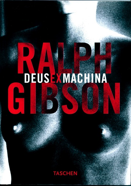
Ralph Gibson – Deus ex Machina

Mass passing as class.

You either like Ralph Gibson’s work or you hate it. The pretentious Latin title is certainly a warning. And you really need the nude on the cover?

I’m OK with it, but anytime you see a book published by Taschen, be assured there will be lots of gratuitous nudity, and this one is no exception.

Gibson does have a strong, identifiable style and that has me coming back to this very thick book time and again. And every time I like it a little more. Or hate it a little less.

Too bad he didn’t exercise more critical editorial judgment when deciding what to publish.

768 pages of Elliot Erwitt I can handle, but 768 pages of Ralph Gibson?

Worth a look, I suppose; Amazon has it.

The Teds

A book by Chris Steele-Perkins.

By the time I was old enough to think or remember, Teddy Boys were a thing of the past in England. These disenchanted youth made their home in the Fifties, affecting a distinct form of clothing – long Edwardian coats with velvet collars – and strangely shaped hair.

‘Teddy Boys’, the collective noun used to describe them, purportedly stems from the association their choice of clothing had with the grandest of British eras, the Edwardian, named after that wanton wastrel, Edward VII. Old ‘Teddy’ had waited most of his life to succeed long-lived Queen Victoria to the throne of England, (like the current monarch she was too wise to the ways of the world – and of her son – to abdicate) amusing himself in the meanwhile by bedding most of Europe’s eligible women and eating and drinking his way through a modest fortune in gustatory delights. Prince Charles should bone up, if you pardon the verb, on his history, lest he continues repeating it.

However, Teddy, short and worthless as his reign was, enjoyed the height of luxury that the British Empire had procured for the country in four centuries of conquest. It was all over by then, of course, but it would take a while, and Queen Victoria’s German relatives, to make sure everyone in England knew that. It was called World War I.

Anyway, the fifties’ Teddy Boys emulated at least some facets of Edwardian dress and proceeded to spoil what little they had going for them with foul hair, dipped in axle grease.

Not a lot to like, then, except that Chris Steele-Perkins’s pictures do a great job of conveying the feel of that era. There’s almost a careless sort of snapshot quality to much of the work here and it seems especially appropriate to what would prove to be a transient fad.

Recommended.

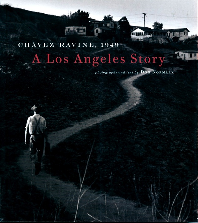
Chavez Ravine, 1949

A fine book of pictures by Don Normark.

Click the picture.

This wonderful book, published in 1999 and available from Amazon, showcases the pictures taken by Don Normark when he stumbled upon a Hispanic area of Los Angeles near what is now Dodger Stadium. Little was he to know that one year later the slums there would be condemned to be replaced by a public housing development. Characterless slums replacing charismatic ones.

Only many years later did Normark realize what he had; he tracked down the former residents of Chavez Ravine and documents their recollections here – a place with vibrant memories illustrated with his superb photographs. That this tightly knit community of Latinos allowed a white boy into their midst is wonder enough. But his photography makes it clear just how blessed his many visits would turn out to be.

Mercifully Normark avoids the trait of most ‘photojournalists’, who somehow think their training in darkroom chemicals qualifies them to be political commentators. In much the same way that Hollywood actors and singers suddenly conclude their fame empowers them to pontificate on geopolitics, once that Oscar is on the mantle or the platinum selling CD is on the wall. Hey, it’s free publicity, no?

None of this sort of nonsense is to be seen here. What you do see is a sensitive, no, more than that, dignified, portrait of a vibrant community of tightly knit people, shortly to be cruelly replaced by a development crafted in a smoke filled room by corrupt politicians and their paymasters, corrupt developers.

This is a very special book which deserves to be on every photographer’s bookself.

Mounting Really Big Prints

Some practical hints.

Every year, a couple of months before Christmas, I invite a few friends to select a couple of prints from a small web presentation, asking that they elect 13″ x 19″ or, now that I have the HP DJ90, 18″ x 24″.

So as this year’s print ‘orders’ came in, I thought it might be instructive to share my technique with readers. Those who see obvious errors are encouraged to set me on the straight and narrow and those contemplating the self-abuse that is print mounting might like to see what they are letting themselves in for.

First, I should point out that I do not accept the apologia proferred by many for ‘hinge mounting’ where a print is held to a backing board with a few pieces of tape at the top in the purported interest of archival permanence. The moment the humidity changes, the print cockles and you have a throw away print. It’s just another excuse to cut corners masquerading as technique. Don’t believe them when they tell you ‘curators insist on this’. Sheer Rot. I have prints which I dry mounted thirty years ago (using a domestic iron, no less), before we knew about acid free this and pH neutral that, and they remain perfect and unfaded. So when people tell you dry mounting is no friend of permanence, look elsewhere.

Key dimensions:

I typically mount both 13″ x 19″ and 18″ x 24″ prints on 22″ x 28″ boards. The HP DJ90 and 130 leave a 1/4″ border top, left (long side) and right (long side), with a bottom border of 9/16″ (short side). For the HP Designjet 90/130, after allowing another 1/8″ for safety,the mat openings are as follows:

  • 13″ x 19″: Opening is 12 3/8″ x 18 1/16″
  • 18″ x 24″: Opening is 17 3/8″ x 23 1/16″

These openings will leave 1/16th of an inch of printed image to work with on all sides, for alignment purposes. Matboard & more will custom cut these for you. Stock mats which come with 12 1/2″ x 18 1/2″ and with 17 1/2″ x 23 1/2″ openings will not work, leaving white borders on the matted print.

Archival issues:

My goal is a print which will outlive me and here’s what is involved:

1 – A printer with fade free inks. The DJ90 uses dyes, others use pigments. Both are great. Most modern ink jet printing inks are fade free. Look for them when making your printer selection. Older designs will fade in as little as a year in bright light.

2 – Cotton gloves. Yes, I do advocate delegating the drudge of routine printing – meaning anything under 8″ x 10″ – but when it comes to show prints I am not about to let the clerk at the framing store, who has just feasted on a Big Mac, cheese and fries, get his hands on my print. Grease is the last thing I need. Not to mention that ten of these will pay for that overpriced Seal press. The cotton gloves are used from the moment the printing paper is removed from the box all the way through final placement of the mounted print in a protective glassine bag for shipping. Cheap insurance.

3 – Acid free mounting board. I use the 3/16″ thickness – it costs little more than the 1/8″ and is more robust.

4 – Acid free mats cut by Redimat. Their machine cutter is incredibly accurate. As Apple’s Aperture leaves a 1/2″ border around the print with the DJ90, my 18″ x 24″ prints get a 16 7/8″ x 22 7/8″ cut out, while the 13″ x 19″ ones use 11 7/8″ x 17 7/8″. That way I have 1/8″ to play with when positioning the print on the mounting board. Color? Anything your heart desires. I mostly use black. Simple. No distractions.

5 – Seal Bienfang RC Colormount tissue. This seals at 185F and is intended for RC paper. Its low sealing temperature is ideal for ink jet prints. Go much over 210F and these start to fry.

6 – A Seal mounting press.

7 – A Seal tacking iron to tack the mounting tissue to the print and the print + tissue to the mounting board.

8 – 3M two-sided adhesive tape to attach the mat to the mounted print.

9 – Release paper for tacking and heating in the press

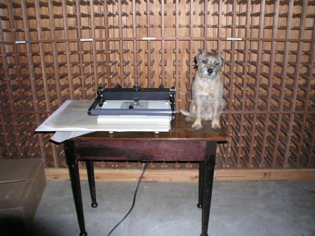
10 – Bert the Border Terrier to keep me company. These are very hard to find and, in my opinion, essential.

Strict cleanliness throughout this process is key. Any dirt or grit and your print is shot.

The tissue is precut using a sharp knife and a granite counter.
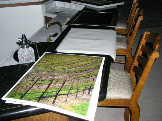
The Seal tacking iron, set just below ‘Med’ and no higher, is warmed up.
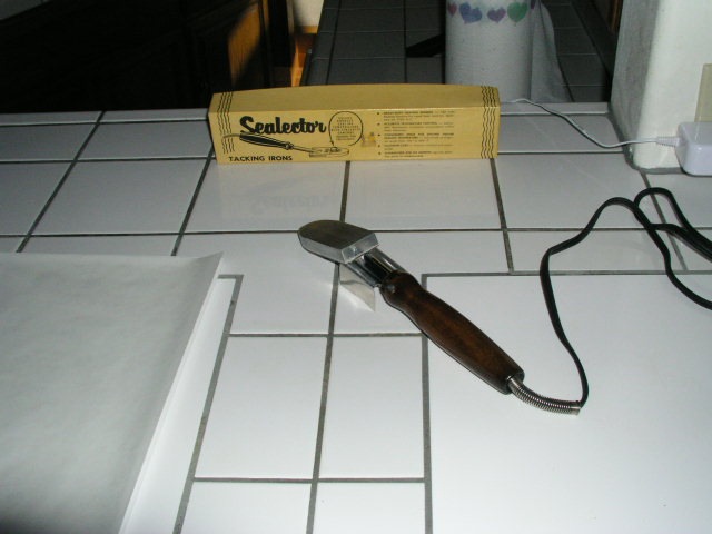
Using a small piece of release paper betweeen the mounting tissue and the back of the print, the tissue is tacked to the print – count for 10 seconds – remember those darkroom days? “Elephant One, Elephant Two, Elephant Three….”
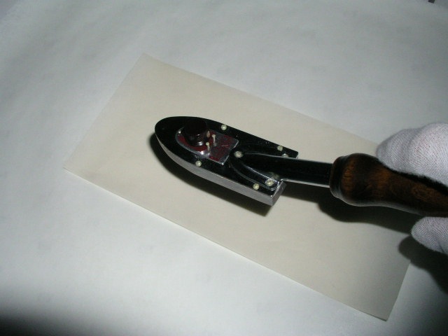
Hold the tacked part down for a couple of seconds to cool.
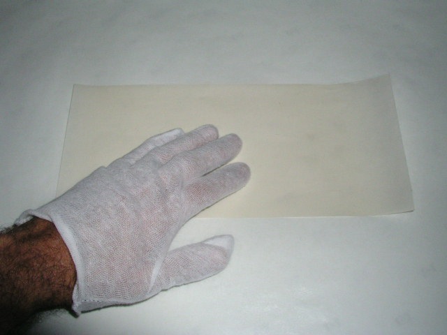
Get one mounting board and one mat – the latter will be used as a positioning template.
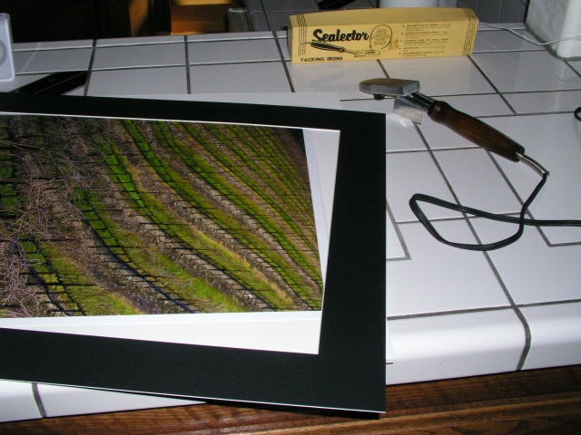
Having positioned the print + tissue on the board using the mat (the mounting board and mat must have identical outside dimensions), tack the print to the board, protecting the print with the release paper:
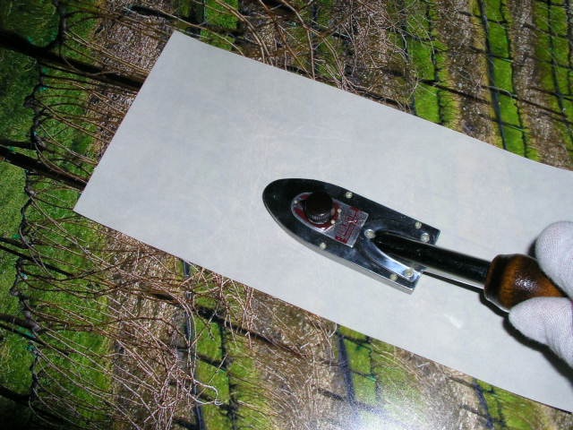
Once more, hold the heated area for a few seconds to ensure a good ‘tack’.

The print is now tacked to the board.
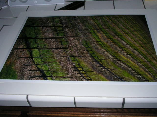
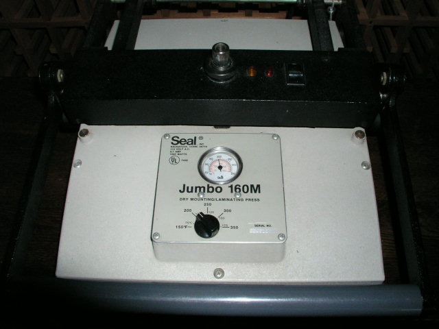
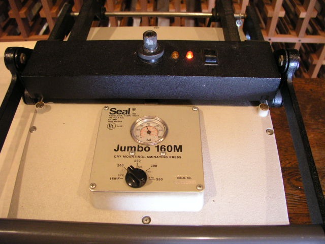
Heat the press to 170F.
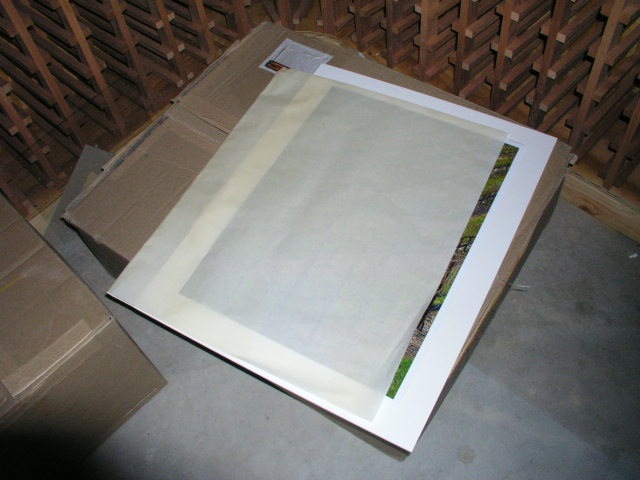
Place the print + board in a folded over piece of release paper.
The press must be adjusted so that reasonable hand pressure on the lever closes it. Too much and you will have creases in any print that needs multiple passes. In my press, an 18″ x 24″ print needs four passes. This is where you put the Border Terrier in play.
The red light indicates the press is on, and the orange light to the left will extinguish once the set temperature is reached. Once the orange light goes off you are at the set temperature. I do not bother to preheat the print or board to get rid of moisture as both are stored in a dry, heated home.
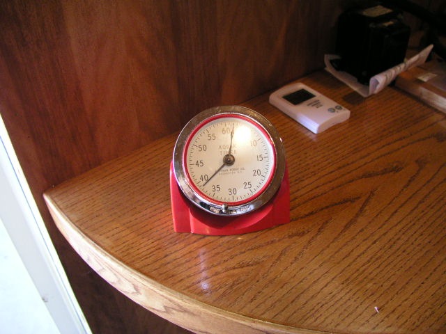
Each heating cycle must be for at least 90 seconds – pull out that 60 year old Kodak analog timer, the one you can read from across the room. Overdoing it is not a problem – I sometimes let it run 4-5 minutes while I do something else, but if you are in a hurry, less than 90 seconds is a no-no.
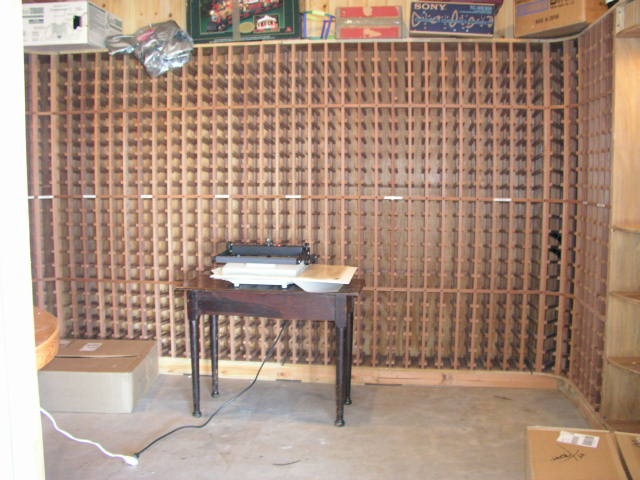
My press makes its home in the wine cellar, but yours does not have to.
Once the heating process is complete, pull out the Scotch 3M double sided tape dispenser. Do not economize by using something cheap.
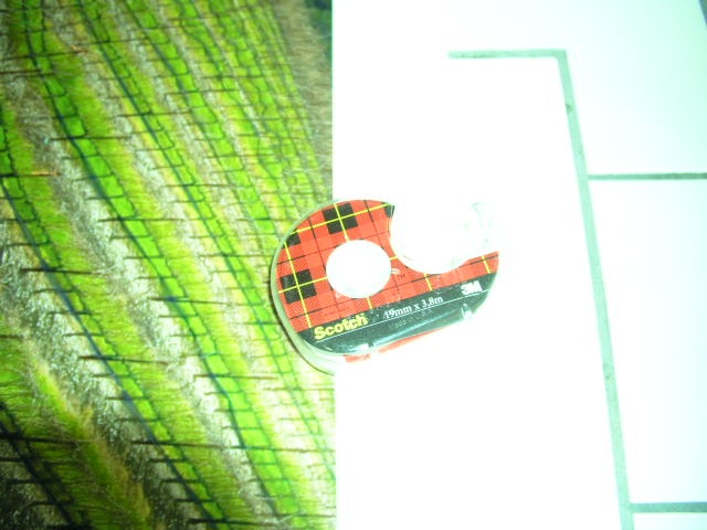
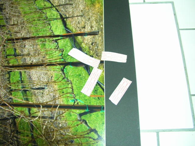
Place two inch strips in the center of the board on all four sides of the print between the print edge and board edge. Now place the mat on the print, aligned edge to edge, and press down on these four points. The goal is to lightly glue the mat to the board – the framing process will ensure the two stay together.
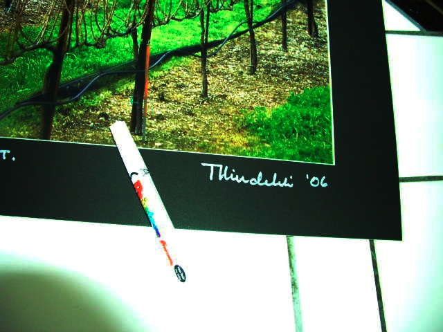
Do yourself justice – sign the bloody thing. Wilting violets …. wilt. I use a white ink pen from the art store.
Sticking with the cotton gloves, insert the ‘sandwich’ into an acid free, sealable, glassine sleeve for storage and transit.
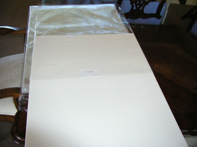
Stand back and admire your work.
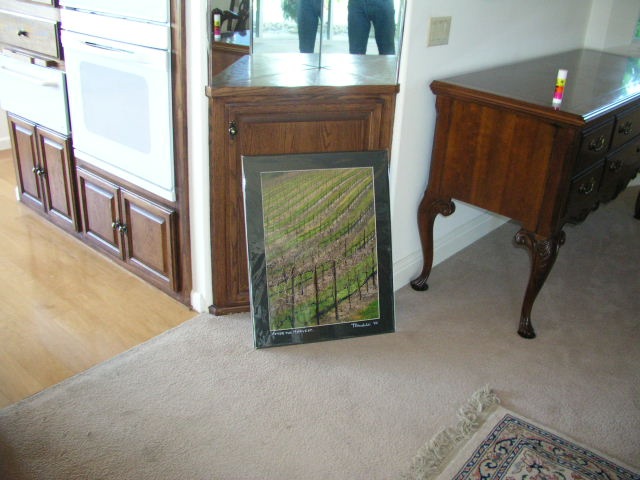
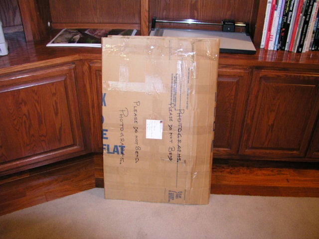
Finally, pray the post office does not bend your prints in transit.
Framing is addressed here.