Margaret Bourke-White – early work

A great woman photographer in a man’s world.

She was beautiful, well educated and had a strong sense of design. That Margaret Bourke-White (1904-1971) photographed the first cover of Fortune magazine in 1930 is well known. It is no less surprising a fact today, when one considers the extent to which men dominated journalistic photography at the time. Indeed, just three years earlier, Bourke-White had to lobby for weeks to be allowed into the Otis Steel Mill in Cleveland, for her gender was a ‘do not enter’ sign writ loud and clear in a man’s world. Fitting, then, that the resulting pictures, taken in 1927, made her famous.

This book chronicles her Machine Age photographs, taken through 1936, before she grew into a great humanist photographer, one adopting the candid style that the Leica had made possible. You will not find Leica pictures here. No, large format was the order of the day and Bourke-White embraced it enthusiastically, reveling in the fine level of detail the medium afforded.

Perusing my collection of photography books the other day I realized with some dismay that there was not a single one dedicated to the photography of Margaret Bourke-White. That omission was quickly corrected. This volume, published by Rizzoli in 2005, remains available from Amazon. You will not find a photography book with better quality reproductions, the pictures being printed with great tonal range and depth.

Bourke-White was not loved by the dominant working class male photographers of the day, a fact well illustrated in the excellent text by Stephen Bennett Phillips, which is quite devoid, mercifully, of dry academic drivel, and a fascinating read. As Phillips points out, where a Walker Evans would record his subjects in dry, unemotional, square on detail, Bourke-White could never resist the soaring diagonals which render her photography of man made objects so exciting. Further, she committed the cardinal sin of working for Big Business, becoming one of the highest paid women of the day, rather than choosing to starve nobly in some unheated garret. In these, her early works, people are mere design elements in pictures which glorify machines. Only later would her style change and adapt, and people would become the subject.

This book is not for everyone. Certainly it will stir the socialist souls of those convinced that industry exists to dehumanize and control. But for those who see the Machine Age, that time during which America simultaneously became the most powerful and most generous nation that the world has ever seen, as a true reading of America’s greatness, will revel in the magnificent photographs on display here.
Five stars

About those ‘best’ pictures.

One thing both Aperture and iPhoto encourage the user to do is to rate images with up to five stars. What constitutes a one, two, three, four or five star image is left up to you, of course, but the system adds a useful learning process to the cataloging experience.

As my use of Aperture is recent (as is the application) and I use it to store ‘photographs’ rather than ‘family snaps’ (iPhoto is ideal for those) I get to rate all the images in the Aperture database at one time, suggesting that I am at least applying like standards of evaluation. Over time this process may be worth less, for what seems great today may not pass muster tomorrow as taste and standards change. However, at this one point in time it seems to me the star ratings may be reasonably meaningful.

So what is a ‘Five Star’ image? For me that’s easy. It’s the one where my instinctive reaction is, simply, ‘Wow!’. I want to show that one to everybody, mount it, matt it, frame it. Rightly or wrongly, I expect you to like it. I will to come back to it time and again.

I have been taking ‘serious’ pictures since 1971, when I was twenty and for the first thirty years my ‘serious camera’ was a rangefinder Leica, so you will understand the preponderance of Leica and monochrome pictures in my Five Star list.

My Aperture library holds 2,748 pictures.

Of these but 64, or some 2%, get Five Stars.

18 of these are monochrome, all film.

5 are digital. (Three on the 5D, two on the LX-1, which tells you something about that little point-and-shoot)

44 are on 35mm film.

11 are on medium format.

4 are on large format.

39, no less, were taken on a Leica.

4 were with 20-28mm (or equivalent) lenses.

51 were with 35 or 50mm lenses, about evenly split.

6 were with 90mm lenses.

3 were with 200mm or longer.

So the most common thread is a 35 or 50mm lens on the Leica using TriX – hardly surprising for one who grew up as a street photographer. Now I no longer use film and my only Leica connection is the Leica lens on my Panasonic LX1, and a fine lens it is, invariably used at its widest 28mm setting in widescreen format.


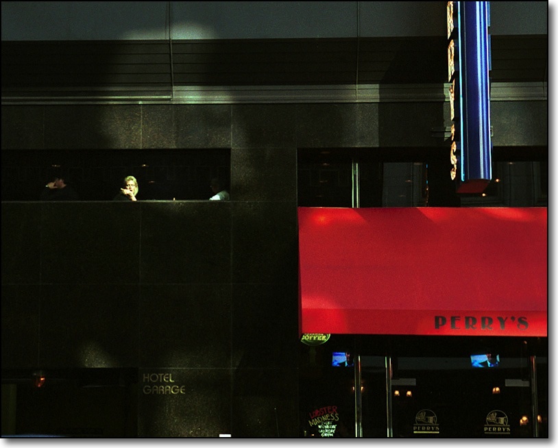
A Five Star image.
Lonely – a tribute to Edward Hopper. Leica M2, 90mm Apo Summicon-M Asph, Kodak Gold 100.
The last day of the millenium. December 31, 1999, San Francisco

What is intriguing about the above small data set is that 5 out of the 64, or nearly 8%, were taken on digital, a medium I started using seriously with the purchase of the Canon 5D in February of this year, barely 8 months ago. Now when I converted the picture library to Aperture there were some 2,000 film pictures, at which point new additions were digital, so the ‘Five Star’ rate for film pictures is 3% (59/2000) whereas that for the digital additions is 0.5% (5/748). So that’s a high number of digital Five Stars added in an eight month period (over 35 years that extrapolates to 263 Five Star pictures!) but a low rate of Five Star digital snaps, barely 0.5%.

Which sort of points to where I had already arrived intuitively before running these numbers – digital, because of its accessibility and speedy production time, encourages you to take more pictures but there’s a lot of dross burying the jewels. But I think it’s a fair trade off. I would rather increase my output of Five Star pictures, even if the trade off is more mediocre ones.

Richard Gere – Photographer

A moving book of pictures chronicles Tibet.


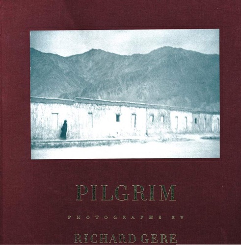
Pilgrim. Photographs by Richard Gere

I have long enjoyed Richard Gere as a film actor, not least for his light touch and excellent timing. For whatever reason, he seems to have fallen out of favor with US audiences, yet finds himself more popular than ever in Japan, where his movies are invariably huge box office hits.

But I’m not writing about Gere the actor here. Rather, this piece is about Gere the photographer, a man who has been a long time devotee of Tibetan Buddhism and documents his faith here. His love for the country and its gentle, cruelly oppressed people, shows well in this large book. Gere spared no expense in production, for the book is beautifully clothbound with the sixty-four pictures reproduced in warm monochrome tones on Mohawk Superfine acid free paper (I quote from the Appendix). Suffice it to say that the look and feel of the whole project is of something of the finest quality.

Gere’s photography is noteworthy. He does not hesitate to publish pictures which are blurred because of camera shake, where the effect justifies it (indeed, the cover picture is blurred) nor to use slow shutter speeds to blur moving people in otherwise sharp surroundings. This is no mere affectation for leafing through this book shows that the effect is used well and never detracts from the emotion of the pictures.

And emotional they are, none finer than that of His Holiness the Dalai Lama on page 63 or the simply gorgeous, there’s no other word for it, picture of the hands and prayer beads on page 48.

It doesn’t hurt to read that Gere donated all his profits to Tibetan charities.

Perhaps the biggest challenge with a book like this is the celebrity status of the photographer, but this is miles away from another tome of lousy snaps by yet another underemployed spouse franchising her marriage to a rock star. Gere, clearly, is not only the real thing in his beliefs, the photography is simply beautiful to behold and very moving.

The book appears to be out of print; my used copy came from Powell’s Books for the not inconsiderable sum of $35. Money well spent.

Canon lens quirk

Read this if you cannot insert your Canon lens in the camera.

Coming back from a little nature expedition today, I found I still had the 200mm L on the Canon 5D, so I went to replace it with the 24-105mm L which usually makes its home on the body.

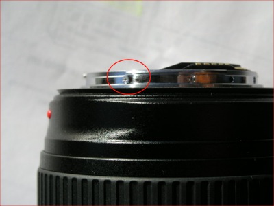
The only snag is that it refused to even fit into the breech of the bayonet on the body. I checked for damage on the lens’s bayonet and there was none. Hardly surprising as I had not dropped the lens.

I checked against my other two lenses – the 200mm L and the non-L 15mm fisheye. All three have a small Phillips head screw some 20 degrees counter-clockwise from the red mounting alignment dot, viewed with the bottom of the lens uppermost. No other protrusions exist around the circumference. So, it must be the screw.

I located my smallest Philips head jeweler’s screwdriver and, sure enough, the screw was loose. A moment’s work and all was well.

So if you run into this snag, don’t panic. And carry a Phillips screwdriver with you. A tad frustrating on a $1300 lens.

Ugly sells

Why can’t American female executives appear attractive?

The latest in the daily amusement which is the saga of mismanagement by the Hewlett Packard Board of Directors is the release of her biography by ex-CEO Carly Fiorina. Seldom did a CEO so deserve to be fired as Ms. Fiorina, having destroyed HP’s culture and promoted the acquisition of failing Compaq Computer, a deal that ranks just behing the AOL-TimeWarner fiasco as one of the worst business combinations of all times.

So no love lost there, and at least HP lucked out (it cannot have been anything but luck, given their track record) and got a good CEO to rebuild shareholder wealth.

What is intriguing about Fiorina’s book is the cover picture. Nothwithstanding her lack of management and business skills, she is, even to her harshest critics – an attractive woman. Yet she chooses a cover picture which is, in a word, ugly.

The hair masculine, the gaze unyielding, the lips pursed, the face haggard, it’s a poor attempt at female business macho.

I asked a friend why anyone would use so ugly a photograph, given the power images have in our society, to promote their book. She made all clear to me.

“You see”, she replied, “In America to compete in the business world, you have to be one of the guys. In France, women naturally use their femininity to rise through the system. As for the looks and clothes sense of the English businesswoman, move on”.

Just when gender equality raises its head in the US boardroom, photography proclaims that its name is Ugly.

How sad.