Some comments on my draft book
I wrote about composing a book of fifty color snaps using Blurb here. My book was transmitted to Blurb on May 30 and was delivered to my door by UPS on June 7; that’s 7 business days if you count both first and last. Very reasonable. It came from Seattle, WA, whence UPS regular ground takes just one day to my central CA location, so it will take longer for those on the east coast or in fly-over country. Sadly, Blurb saw fit to charge me CA sales tax (add 8.25% to the cost) despite the fact that the book was printed out of state.
First, some Dr. Pindelski truth serum.
Blurb claims their paper is 80 pound weight:
Sure. And I’m going to cut your taxes. Trust me.
Out comes Dr. Pindelski’s BS Meter – in the guise of a $10 Chinese micrometer:
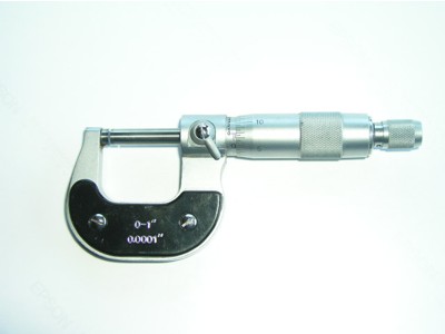
I measured the thicknesses of pages of the following, with the results shown:
HP Premium Plus Photo Satin paper, as used in the HP DJ90 = 0.0110″
The Ilse Bing book – a standard any photo book should aspire to = 0.0066″
Blurb picture page (average of 23 pages, also confirmed by measuring one) = 0.0044″
Blurb dust jacket = 0.0100″
Well, no way that the paper in the Blurb book is 80 pound weight. HP claims their paper is 76 lb., and I am inclined to believe them. So 76 lb. is equivalent to 0.0110″ thick. This results in the following:
HP = 76 lb
Bing = 46 lb
Blurb photo page = 30 lb
Blurb dust jacket = 69 lb
Indeed, the Blurb pages feel far flimsier than the HP paper so the feel of the pages is nowhere up to that of an HP DJ90 print or even a page in the Bing book. Let’s be nice and say that Blurb is no good at math, but do not expect 80 lb. paper.
How about the look and feel of the overall book? Though the paper thickness is disappointing, the dust jacket is beautifully printed, though mine had a 3mm divot off center, not the result of in transit damage as the cardboard box used for shipping was undamaged. Time to get out the payroll and blue pencil in the shipping department. The black cloth hard covers are very good and while I didn’t rip the book apart in search of stitches (I could see none) the whole feels substantial, opens flat and I guess will respond well to frequent handling.
On many of the pages in my test book I instructed Blurb to print on both sides with a grey border. Holding the relatively flimsy 33 lb paper up to the light you can see the image on the reverse, but in normal use there is no bleed through, so double sided printing is not a problem.
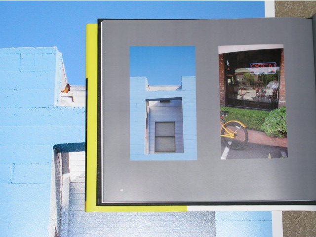
Definition on the 8″ tall by 9.25″ wide (that’s all that’s usable, compared to the stated width of 10″) paper is superb – as well it should be given that the originals are 3000 x 2400 pixels in size. Two of the snaps used inside were also used on the dust jacket with no loss of quality. So when you see the book your first inclination is to pick it up – a very good thing. It immediately catches your eye. Nothing that screams ‘amateur’ from the outside.
The printing process results in a fragile image – meaning that when I was dragging the Dr. Pindelski BS Meter off the page, the micrometer’s super smooth jaws abraded the paper enough to remove the top layer of color. The inside paper is semi-matte and fingerprints are easily removed with a clean pocket handkerchief. The dust jacket is high gloss and even better in this regard.
Now for the most important issue – color matching. I leave On Screen Proofing switched on at all times in Aperture, as I like to see how prints will look on the HP DJ90, and because my screen is properly profiled, as is my printer.
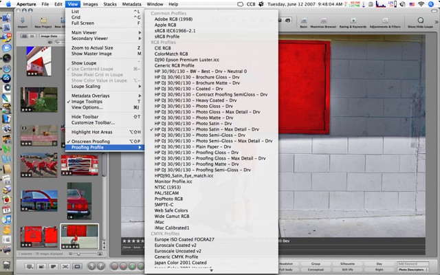
Once more, here are the presets I used to generate the large JPGs for input to Blurb’s BookSmart application – I use the standard sRGB profile:

Bottom line is that I know my screen matches the print closely, so in a perfect world the book should match the print. I have no scientific way of reporting on this, but here’s a snap of the book lying on the source print:
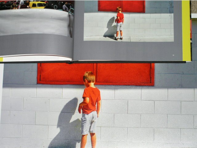
The Blurb page is just a tad cooler than the original – not so much that you would notice on a casual look, though I would experiment more if Caucasian skin tone accuracy is key to you. For me this more than works.
Here’s another comparison snap with mostly blue and cyan content:
Given that the above snaps were taken with the same lighting on the book and the DJ90 print, the comparison has some value, if little scientific merit.
In the above I have tried the ‘two photographs per page layout’ and Blurb printed exactly what I submitted. There are many more templates in the BookSmart application, but few of interest to those seeking to make art books.
Dynamic range of the printed snaps is excellent – there seems to be no shift to the bright or dark end of the histogram, meaning shadow and highlight details match the HP print. Very well done, Blurb. Reproduced quality is simply in a different league from Lulu where I published my first book. The smoother, higher quality paper probably has something to do with it.
Page and cover composition is exactly as shown in the BookSmart application – what you see is very much what you get in this regard.
So, in summary, great color and dynamic range, nicely bound and with a superb dust jacket. The bad? They misrepresent the thickness of the paper (assuming HP is correctly stating the weight of their paper used as a basline for comparison, above) and the Blurb pages do, in fact, feel chintzy – not something you would be especially proud of in an art book, OK for family snaps, I suppose. I exceeded the 40 page count (coming in at 50) which drove the price up some $6 with taxes. 40 pages in the revised, final version will take care of that. Remove the dust cover and you will find there’s nothing on the spine – shame. Dust covers get lost over time and you will end up with an unidentified book on your shelf.
Cost? Exhorbitant – $57.35 delivered for one fifty page book. You can get discounts for volume, but it’s still a very costly proposition. Not Blurb’s fault, I suppose – just the economics of low volume publishing at work.
Mistakes I made: I used a grey background which does a lousy job of showing black printed words. Blurb uses white numbers for pagination and these show well, so I will switch to white text. I will stick to the grey background as it avoids the distraction caused by acres of white while not falling into the contrast-altering trap of a black page background. Other than that, I got what I saw on the screen.
Should you commit to Blurb? Well, it’s better than Lulu, but you need to be aware that Silicon Valley is awash with venture capital money for this sort of thing and, as we are in the late stages of Web 2.0 excess, the question remains whether this venture will survive? New online publishing ventures are announced often enough to suggest that only the strongest will live and while Blurb should not fail from a quality perspective – what they deliver is fine if not quite what they advertise – the competition is using pretty much the same technology for printing and binding, so quality of reproduction may not be the distinguishing feature.
Price competition is near non-existent, so it comes down to the deepest pockets. Blurb raised $12mm in venture capital last year in a second round. Assuming they blow all of that they will have to sell 480,000 books at $25 just to be cash neutral! Fancy doing that? Not trivial.
By all means try Blurb but don’t build up an inventory of book projects there expecting that they will survive for the long term. I hope they do, but only time will tell.
In Part I of this piece, one correspondent asked that I compare the print quality to that from Aperture; I cannot do that as I have never made a book using Aperture, owing to that application’s inadequate text composition tools.