Category Archives: Photographers

Architectural photography

An under-appreciated field.

For an index of all my book reviews click here.

While I cannot remember a time when I did not think about photography on a daily basis, an interest in architecture did not seriously take seed until the age of 29. That was the year I moved to New York City. While its inherent bias on the editorial pages sadly infects the news reporting in the New York Times, no such favoritism was evident in the writings of Paul Goldberger and Ada Louise Huxtable. Their topic was architecture.

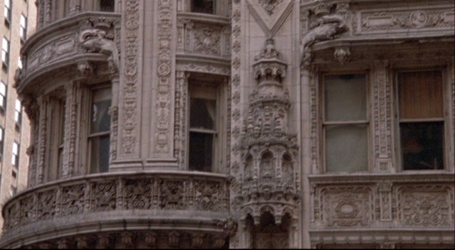
Before I knew it I was attending lectures by prominent architects, fascinated by the melding of big business, art and massive budgets with all the related logistical complexity which is what results when you try to build in New York. I mean, look at the realities. Those seeking to do you harm include the Mob (concrete to this day costs 20% more in NYC than anywhere else), the City of New York (relatively cheap to buy, after the Mob is accounted for), Albany, Washington and just about every other government apparatchik you can think of. The only difference between the Mob and the government is that the latter wrote the laws. If you can make a tall building in Manhattan you can make one with impunity anywhere.

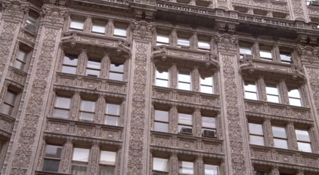
Absorbing Huxtable’s and Goldberger’s teaching I cemented my relationship with architecture by visiting Chicago for the first time. Simply stated, Chicago’s finest buildings are to Manhattan what Ferrari is to GM. But New York’s winters were tough enough, thank you, so it wasn’t as if I was about to move there, much as I love the people of the mid-west. And those writers’ teachings made an indelible expression. Give me those charming moments of partial consciousness that define falling asleep and, likely as not, you will find my mind straying to New York City architecture.

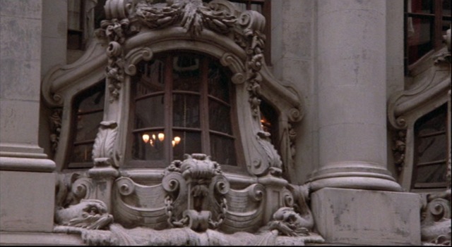
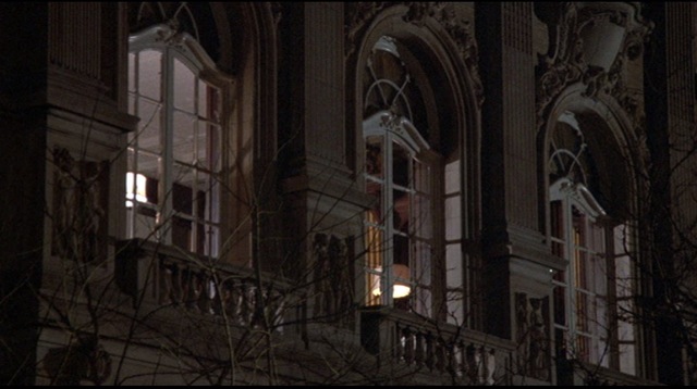
You can say an awful lot about a building by measuring your desire to touch it. Not metaphysically. Walk up to it and touch it. And for me there were always three which made that distinguished cadre. The Flatiron Building. Philip Johnson’s AT&T. And Seagram. Johnson again.

So bad did this habit become that I made a point of walking past the last two on the way home just to be able to brush them with my fingertips. Maybe some of the magic would rub off?

No secret that I would make special efforts to entertain clients at lunch in the Four Seasons at the plaza level of Johnson’s Seagram masterpiece. From there I could gaze at the no less wonderful Lever House, airily perched on stilts on the west side of Park Avenue. It was my privilege to watch AT&T grow from my 40th floor office in the so-high-tech Citicorp Center, sloping roof for solar panels and all. Still not installed last I checked. Like the corporation, the architecture was crass, vulgar and ethically challenged. AT&T was so beautifully made that you just had to touch it. And they had that Apollo chap in the lobby, all gilded, with massive transatlantic cables draped about him.

As for the Flatiron, forget about all those schoolboy statistics about it being the tallest, the first with a steel frame, the first with elevators, etc. All you had to know was that Stieglitz had photographed it in 1903.

I was lucky to be reminded of all of this by the loan of a book on architectural photography from a friend. There, on page 113, Stieglitz’s masterpiece of the Flatiron is annotated thus:

Stieglitz’s ethereal view of the Flatiron, taken with a hand-held camera, typifies the Pictorialist approach to architecture.

That got my attention. I am of that school, after all. And here is that snap:

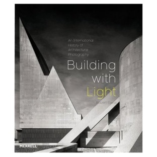
The book is Building with Light by Robert Elwall. American architecture is remarkably well represented (the author is the Curator of the British Architectural Library) with not a trace of condescension, and the whole 240 page tome is a breathtaking survey of architectural photography from the early nineteenth century through today. (Note: Architectural photography has not improved in the last 150 years).

Some of my favorite images are, unsurprisingly, from California residential architecture. Shulman and Neutra are amply represented as they adapt the new international style to a smaller scale. The photography changes too. What was once formal documentation is now pure pictorialism. It’s the effect of the building, not its technical detail, that fascinates.

Sieglitz would be proud.

All of which gives me two suggestions. First, get the book if buildings speak to you. Second, stay tuned for some of my architectural pictures ….

Cataloging movies and books

An important source of inspiration.

I believe it’s important for any photographer to manage his sources of inspiration, be they books, magazines or movies. As is clear from yesterday’s journal entry, movies are an important source of ideas for my photographs so it’s important that all those DVDs are properly cataloged for easy retrieval.

In my case each DVD is labelled on the spine with a sequential number and that number is recorded as the location in the database. Movies are filed in numerical order – to arrange by title is futile in a growing library, as you will be constantly rearranging things.

For the past few years I have been using Delicious Library to do the database work but have become increasingly disappointed with its poor export capabilities and general slowness. When the new iPhone software was announced the other day it was immediately obvious that DL’s creators had dropped the ball and failed to deliver a capable iPhone export. Add the fact that you cannot network your DL data unless all networked computers use OS Leopard and I was ready for a change. Networking is important in my setup as the database is maintained on the office MacBook and then shared with the old iMac in the bar, where movies are looked up. The old iMac, no speed demon with a 1 gHz G4 CPU, is perfect for this sort of thing.

Along comes DVDpedia which not only offers a host of export formats, it also permits dynamic syncing with your iPhone once you download the related application to your phone. And, best of all, it’s very fast, far easier to use than DL (it’s as fast as OS X’s Finder) and has an import function to bring in all your Delicious Library movies. The import works well. You really do not want to have to reenter everything manually if you have as many movies as I do – some 500 and counting.


‘Location’ refers to the movie’s number for easy retrieval


Apple’s superb Coverflow view is a built-in option if you use OS Leopard

You can see my library online in one of the many export formats by clicking the Link at the bottom of the page. Download is very fast.

A related product from the same vendor – Bookpedia – does the same thing for your book collection. In aggregate, the cost of these two applications is less than DL which integrates the movie and book cataloging functions. Click on my book Link below and you will see a Bookpedia version of the photography books in my library.

Here is my Bookpedia library Syncd to the iPhone:


Touch any thumbnail for a full screen view of the cover

Learning monochrome

Everything I ever needed was in the movies.

I ceased taking monochrome pictures in 1977, though every now and then you still can catch me hitting the monochrome button in Lightroom.

But that’s not monochrome photography.

While the simplicity of seeing imposed by a monochrome palette makes anyone a better color photographer, I no longer take pictures thinking in black and white. My black may be red, my white blue, but I simply do not take black and white pictures.

Color is more challenging and, done right, more satisfying. Black and white, in a way, is cheating. Take out enough variables and anyone can do it. Not that all modern color is good. Anyone can paint a late Rothko or Motherwell. Fine work, true, but the genius of seeing and the skill to convert the vision to canvas are hardly abundantly on display here.

But when it was all I did, I loved black and white. No serious work in color was being shown by anyone in 1960 and that changed little through 1977. The pioneers, as ever, were the great fashion magazines, but the establishment critics saw to it that their art was disregarded. Shame. You could miss an awful lot of Parkinson, Clarke or Penn that way.

While my love of black and white was doubtless furthered by all those great books in the Kensington Public Library on Hornton Street, what really flipped the switch for me happened a good deal earlier when I first saw Carol Reed’s ‘The Third Man’ (1949) on our home TV which, of course, was black and white, like the movie. I was already familiar with those expressionist masterpieces ‘Metropolis’ and ‘M’ by Fritz Lang, but this was on a far more approachable plane. It did not need much imagination to grasp Graham Greene’s plot or to be awed by the acting of Orson Welles and Joseph Cotten. But what really gripped you was Robert Krasker’s photography, and rather than go on about it, I’m attaching nine favorite images from the movie. Krasker’s use of tilted perspective to convey an unwordly, wide angle look, is tremendous.

It’s not really clear on the small screen, but the next image shows the dying Harry Lime (Welles) poking his fingers up though the sewer grating as he tries to escape the good guys:

The camera cuts to his face. Sheer genius.

See what I mean? Krasker got the Oscar that year. There was no competition.

On a trip to Vienna in June, 2024, my son WInston searched out the original location and his photograph even replicates Krasker’s crazy tilt. Mercifully the ugly gratings have gone, but little else has changed 75 years later:

Tools

Another fine lesson in macro.

A few years back I developed tendonitis, meaning that if I stress my wrists too much everything from elbow to wrist hurts like hell. One likely cause is that many years of woodworking as a hobby did a number on my tendons and, as I understand it, these are not things that readily mend.

In the event, it was probably a timely warning. I still had all ten fingers attached where they should be and, let’s face it, I wasn’t giving Chippendale any competition, so the woodworking tools were sold and the proceeds applied to converting the workshop to a home theater. Suffice it to say that all those newly white walls made for a fine photography exhibition space in addition to a great place to watch movies, play pool, throw the occasional dart and …. well, you get the idea. American leisure at home.

From those woodworking days, I recall that easily the best magazine addressing amateur woodworking is ‘Fine Woodworking’ published by Taunton Press, a specialty publisher with a very high end focus on content, presentation and photography. One of their editors, a superb woodworker, published this labor of love a few years ago:


Click the picture for Amazom. I do not get paid if you do that.

Not only are the tools depicted beautiful art works, the photography is stunning. Great care has been taken with settings, backgrounds and lighting and the whole thing is a masterpiece of table-top photography. Best as I can tell, Nagyszalanczy is both writer and photographer.