Book review
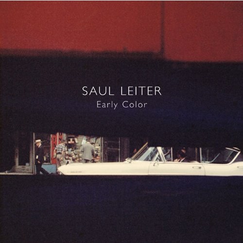
Recent comments by reader Giovanni Maggiora in response to a couple of journal entries here (1 and 2) saw recommendations for the color work of Saul Leiter, a photographer I had never heard of.
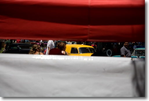
Paso Robles hot rod show, 2007. Canon 5D, 24-105.
So I hopped over to Amazon and a few days later Early Color by Leiter was in my hands. You will understand the level of trust I place in my readers when I admit to having blown $45 on this small volume, which is some sort of record given that I ordinarily only buy remaindered photography books. A remaindered Brassai is a cheap Brassai, after all.
Leiter’s work uses color sparingly in these pictures, taken during 1948-60; frequently, the colors are faded. The style is somewhere between Ralph Gibson (Leiter’s work being far more approachable) and Andre Kertesz, which is funny when you recall how much Kertesz denigrated color photography. As much as I (mostly) denigrate monochrome today. Stated differently, the style is street photography, but has nothing to do with the Decisive Moment school. People often feature in Leiter’s streetscapes, but as an architectural adjunct, seldom as a subject. As the text suggests, he would have done more color but couldn’t afford it. Boy, do I know how he felt.
I found the work wonderfully fresh and inspiring to look at, not least because my own style of street snap is very reminiscent of Leiter’s work. I say that unselfconsciously, having never heard of him until now. So while I can honestly report that Leiter’s work did not influence me one bit, the similarities are striking.
I make some disclosures below about the copyright aspects of reproducing Leiter’s work here; bottom line, I make no money from it and, hopefully, he will when you buy his book. Additionally, I have added an imprint on his pictures to make things clear. Then, compare his work with some of my color street snaps over the ages:
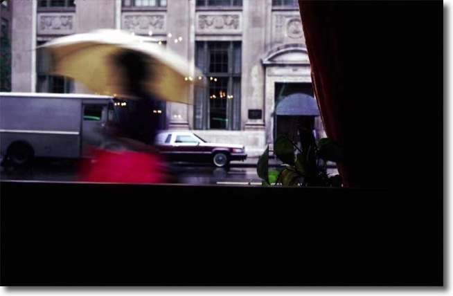
Madison Avenue, NYC 1982. Leica M3, 35mm Summaron. Kodachrome 64
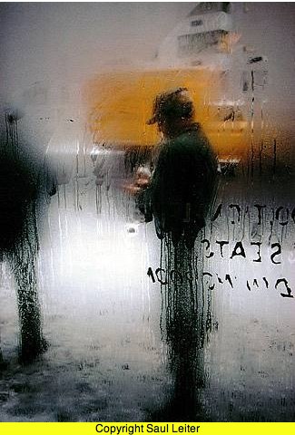
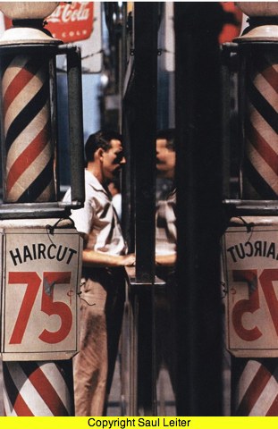
Leiter’s version, 1960
Stanford University campus, 2002. Olympus C-5050 digital
Leiter’s version, 1956
Union Square, San Francisco, 1999. Leica M2, 90mm Asph Summicron, Kodak Gold 100.
Leiter’s version, 1954
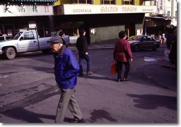
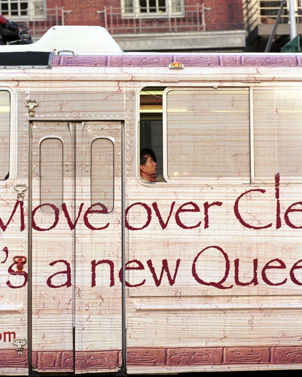
Chinatown, San Francisco, 2000. Leica M2, 35mm Asph Summicron. Kodak Gold 100.
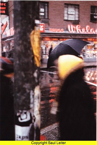
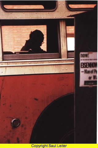
Leiter’s version, 1956
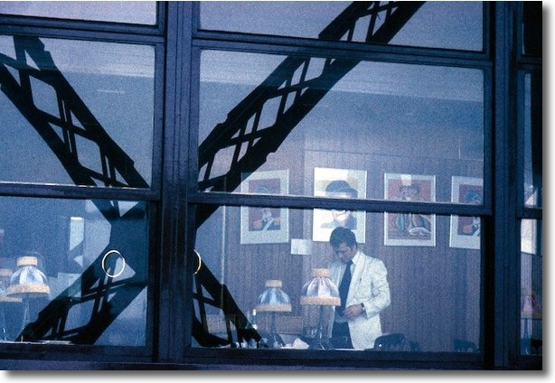
Eiffel Tower, 1977. Leica M3, 35mm Summaron. GAF Ansco 500
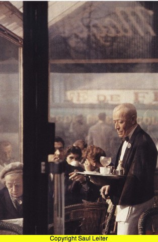
Leiter’s version, 1959
If this “street/color” genre appeals to you, do take a look at Leiter’s book. And thank you, Giovanni, for putting me on to Saul Leiter’s work.
Update:
Leiter passed away, aged 89, on November 26, 2013. The New Yorker has a thoughtful obituary here.