Category Archives: Photography

An exchange of shared values

The UPS driver was getting used to the routine.

Every Friday there was a delivery to the estate from B&H in New York. Place your order for film or paper or printing inks on a Sunday and the following Friday, as sure as the Government wants your money every April 15th, UPS arrives at your door with the supplies.

A First Class Business selling First Class Products delivered by a First Class Business.

Now this little haven in the undiscovered central coast of California, has much to recommend it. Beautiful landscape, vineyards as far as the eye can see (not least the few acres of Zinfandel we pride ourselves on, affording isolation from all and sundry, and looking gorgeous in the process) and fine, honest Americans.

So we got to chatting, every Friday, our UPS man and I. There’s something about UPS that encourages that sort of relationship. FedEx doesn’t have it. Too harried, no time for civilized discourse. The grandly named United States Post Office obviously does not. Are you going to trust someone who takes your tax dollars? But no one refers to the UPS man. It’s always our UPS man.

So after a few months of this routine, and after copious quantities of Portra, Gold and Epson paper and inks had been delivered, it was natural to graduate to first name terms. I’m Marty. Hi, I’m Thomas.

And thus it went for a few more months. Ice is hard to break and these UPS chaps have it in their veins in abundance. As is well known, every one wants a UPS man of their own.

Then, the other day, Marty opens up with “I’m giving a concert at Castoro this Sunday at 3 p.m.”

Let me start by saying that Castoro makes the second best zinfandel on the Central Coast. Needless to add, Chateau Winston, named after my son, a.k.a. the family abode, is superior. Both reside in that small area of paradise known as the Templeton Gap, west of Highway 101 and south of Highway 46. The world’s best Zinfandel grapes make their home there.

Before I could ask ‘What do you play’ Martin Paris proferred a CD with a picture of him on the cover, acoustic guitar and all. Without thinking, after profuse thanks, I offered that I was a photographer and could I please inscribe a copy of my book for you? The thought of commerce did not remotely enter my head. After all, it hardly needs saying that playing classical instruments or taking art photographs are two of the least commercial enterprises on this God’s earth. So we made an exchange. Marty’s Spanish guitar playing, all of his own compositions, is simply wonderful. His generosity of spirit and basic sense of American decency unsurpassed. My book of picture is….well, you be the judge.

So we exchanged good wishes. Marty signed his CD “Thomas – All My Best” and I reciprocated with “For Martin – with thanks for the beauty you have brought us”.

This little episode, seemingly insignificant in the grand panoply of life, brings us back to the central beliefs of these essays. Show your work and you will be rewarded. The rewards may be psychic rather than financial, but they are deep and lasting.

Publish a book. Now. Have something to exchange.

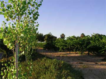
The vines doing their thing on the estate, framed by a cottonwood.

Anonymous writes

Now and then Anonymous soils these pages with his Comments. Or detritus, more accurately.

He is always Anonymous.

After all, would you want anyone to know that your grammar is that of the mean streets, and your mental capacity somewhere around Second Grade?

No problem. Clean up of Anonymous’s leavings takes as long as is required to hit the ‘Delete Comment’ button and life goes on unsullied by life’s losers.

However, now and then, old Anonymous writes something so completely inane, that his nonsense rises out of the field of tragedy and migrates to the truly hilarious. Here, for your amusement, are some of Anonymous’s best:

On my piece about Cartier-Bresson: “All his pictures were posed anyway”.

On Film is Dead (Anonymous had lots of foul mouthed company on this one – the truth hurts): “All digital photographs look alike, anyway, which is why I use film”. “Just because you have gone all digital, don’t expect real photographers to”.

On Make Mine Monochorome: “Yes, color is hard, which is why I use black and white”.

On Losing my (large format) Virginity, where I refer to my Harris Tweed cap and Tartan tripod bag, both purchased when I was one of Her Majesty’s loyal subjects some 30 years ago: “Harris Tweed cap and Scottish tartan tripod bag. You Americans make me laugh”.

On Throw away your lens cap and case: “Unlike you, I keep a lens cap on my pristine Leica at all times to avoid having the sun burn a hole in the shutter”. Guess how many great photographs this one takes.

On Rot which debunks all the silliness about Art poseurs using plastic cameras: “If you weren’t such a bigot you would get a Lomo, a fine (sic) made Russian camera and take some really good pictures”.

On Leicas – this one is a real Dusie: “Would it be to (sic – notice the grade school grammar) bold to speculate that you have never owned a Leica yourself. (sic) If you had you would understand the quality of the camera. There is no mistaking a picture taken with a Leica lens vs. any other brand.” And more from this child: “As to your point about AUTO FOCUS??? (sic) Why would anyone ever, want to use auto focus for any type of professional photograph. (sic). Since you used a car analogy once before perhaps the one I use will sink in. Compare a manual car to a stick shift (huge difference there!). They both will run, however, the stick shift will always go faster when the driver knows how to operate it.” What a pleasure it was to hit the ‘Add to Spam list’ button on that one. Phew!

All happily deleted, their authors added to the permanent spam list. This list not only forever bans these folks from posting here it also bans them from soiling other lists using like spam software as the database of spammers is shared. Neat, huh?

So, Mr. (and Ms.) Anonymous, keep ’em coming and we will be pleased to add you to our list, allowing all and sundry to join us in a good laugh. But think twice first as you may just be excluded from many other blogs. On second thoughts, just hit the ‘send’ button and do us all a favor.

Stop wasting Time – Part I

You need some woodworking done in your home. Two laborers show up bidding to do the work. One brings with him only hand tools. Not a motor or power source in sight, save his well developed biceps. The other comes with an assistant and every power tool known to man. Both come recommended, so you know the quality of the work is not an issue.

Which do you choose? The romantic aspects of the craftsman with the brawny arms notwithstanding, you obviously choose the man with the power tools and the assistant. He will be faster, his work more dimensionally accurate and less of your precious time will be taken up with the sawing and hammering that ensues. Plus it will cost you less.

In that example the value of your time is irrelevant as you are not doing the work in either scenario.

Now translate the problem to one of making photographic prints. You pride yourself on traditional darkroom techniques, you set up your darkroom, prepare the quickly aging chemicals and potter about in the dark, shading here and burning there, never quite sure how it will turn out, the while praying that little Johnny will not come into your miserable, smelly work area and destroy yet another box of printing paper.. You are automatically constrained to monochrome, of course, because it is beyond any rational person’s effort to home process color prints using traditional chemical means. So right there you have excluded 99% of your audience. When all is done and the print fixed, you pray it will look something like what you want when the light is switched on (you did put the unexposed paper away first, didn’t you?) and luckily, even if it does, your are still faced with the task of washing the prints in an attempt to render them permanent, drying, glazing, and on and on. You have retained the artisan with the hand tools.

You and the artisan have failed to notice one key thing about life. Technology has moved on. Both of you have unconsciously placed a very low value on your time.

The power tool photographic worker, meanwhile, having established a well rehearsed routine, has used Photoshop or whatever his application of choice is, done what dodging and burning is needed, removed dust spots (he only needs to do this once, ever, while the artisan must do it on every print) and spooled out twenty print jobs to his computer and left it to print while getting on with other more important things. Like taking more photographs.

The power tool worker’s level of retouching and corrections is infinitely superior and his prints are all identical. Exactly, you say, see, they are all identical. No two of my prints are ever alike. Obviously not. Your are technically incapable of making identical prints as your technology is inept. Making prints that look different is nothing more or less than a statement of your incompetence and refusal to recognize that times have changed. And they have changed for the better.

You tell yourself that none of that makes any sense, of course, as your traditional darkroom print is so much better. Of course, it is impossible for you to make that statement, as you have never mastered the modern technology of the computer print, but it makes you feel self satisfied and happy. Your time, in other words, is worth very little.

The reality is that not only is your print not better than the ink jet worker’s, you produce one for every twenty or thirty his modern machinery outputs. His artistic output is thus many times yours, his chances of acceptance and success commensurately greater. Worst of all for you, the artisan, is that the consumer cares not how the print was made. He just cares about the result. Unless you are showing your work to those sad souls who collect equipment and cannot take a picture to save their lives (why would you waste your time doing that?), believe me, no one will ever ask you what camera you used or – I mean how comical – inquire whether this is a chemical or ink jet print!

You already have a computer or you would not be reading this. Supremely competent ink jet printers are available for under $100. Photoshop Elements retails for a similar amount unless it happens to come free with your printer.

Then, when you become supremely successful, the resulting tripling of your time for photography certainly enhancing your prospects greatly, you can delegate all printing to some poor toad who does this for a living and get rid of the printing drudgery for once and all.

If all else fails, Make Mine Monochrome.

It’s high time we got off the “Monochrome is Art” bandwagon and learned to use Color.

When I was a kid growing up in London, all I used in my Leica, representing some 95% of my worldly assets, was Tri X. Monochrome film. Easy to buy, easy to process, lots of exposure latitude for my wonky exposure meter and not least of all, very macho. Every street ˜shooter™ (that foul word had not yet been applied to photographers) used Tri X. It was a rite of passage. The quirky fellows with the strange odor used HP3 and HP4. You avoided them.

But none of these was the primary reason I used monochrome. The real reason was that it was cheap and cheap was all I could afford. The idea that you could use color never entered my mind. Economically prohibitive and why would you want color when street work dictated monochrome? Why, could Brassai, Kertesz, Cartier-Bresson and Erwitt all be wrong? Of course not. They were Masters. Gods, beyond criticism. Look to points west and further confirmation that Monochrome was Where It Was At could be readily obtained from its American boosters. Adams, Weston, Cunningham, Callahan, Stieglitz, Steichen, the list goes on and on. And while one or two of these would eventually venture into color, they would forever be known for their black and white work. Their subject matter might be the landscape and the nude, but their vision was monochrome. Goodness help us. A monochrome woman….

Then a couple of strange things happened. A great British photographer named Anthony Armstrong-Jones popularized the idea of very grainy pictures, in black and white, of course, whether in his fashion magazine work or in social commentary pieces. Another great British photographer named Sarah Moon, who wisely chose to make Paris her home, followed up on the idea when GAF/Ansco introduced its wildly grainy GAF 500 color slide film. Suddenly, in this world of Seurat redux, pointillism was back and all wrinkles and imperfections disappeared into a gentle haze of colored dots. But there was a photographer far more important than either of these, as regards the history of color, and that photographer was Eliot Porter.

Porter was a devotee of color almost from the beginning, most famously garnering Ansel Adams’s scorn for his adherence to this new medium. Porter, not a voluble man, famously said “I believe that when photographers reject the significance of color, they are denying one of our most precious attributes – color vision.” Porter may not have changed our view of landscape photography, but his vision of the beauty and infinite complexity of nature changed the way we see. If we care to see.

Let’s just make a seismic shift, for a moment, to the mathematical work of Benoit Mandelbrot. Quoting from his paper presented to the Society for Chaos theory in Psychology and the Life Sciences, presented at Berkeley in June, 1996:

Fractals, as all present know, are irregular geometric objects that yield detail at all scales. Unlike Euclidean, differentiable, objects that smooth out when zoomed into, fractals continue to reveal features as more closely regarded. Fractals also have “self-similarity” which, in one meaning refers to the presence of parts that resemble the whole, or to the continual repetition of a feature. Benoit Mandelbrot not only invented the term fractal, but advanced the position that fractal geometry is the geometry of nature. Eliot Porter, the nature photographer, upon reading of Mandelbrot’s work, realized he had been taking pictures of fractals in nature for decades. To promote the point, he produced a collection of photographs for a book titled Nature’s Chaos.

I do not doubt that there is no more important body of work, when it comes to our fundamental appreciation of nature and of color photography, than that of Eliot Porter. Porter made color respectable for the art photographer. It is that simple.

OK, back to the simpler world of situation comedy, beer advertisements and SUVs.

Now it’s time to ‘fess up.

Take one of your color pictures, you know, one of those not good enough to boast about, but not bad enough to throw away. A decent but not a great picture. You know the one. We all have many to choose from. They are the bane of us photographers. Too good to lose, too bad to print, the result being that we keep the disk drive manufacturers, the album makers, the storage sleeve specialists in business for no good reason other than, were we brutally honest, we would simply throw these mediocrities away.

OK, so you are a sane modernist. You may not have gone the whole digital hog, but you are smart enough not to waste time in a darkroom, preferring the civilizing light of nature. You prefer, in other words, Porter’s world. You scan those mediocre negatives and ruminate over them in Photoshop. Now that insanely complex application happens to have a ˜Desaturate’ option in one of its many tediously detailed menus. Don’t fight it. It’s under Image->Adjustments->Desaturate. Click. Yes, Siree Bob!, you have made monochrome from color. Gold from dross. Art from a snap.

C’mon. Admit it. You have done it. Or you have thought about doing it. Because Monochrome is for artistic simpletons. Two dimensional thinkers too constrained in their cages, too bound by convention, too attuned to mediocrity, to think that anything other than black and white, B&W, monochrome, sepia, platinum toning, etc., etc., can be Art.

I think back over five hundred years of painting. From Ucello and Giorgione, via Raphael and Velasquez, through the Impressionist and the Fauves, to the modern day. Not one, not a one of them painted in monochrome. Why? Because there was no cost difference and because patrons regarded monochrome as the province of the poor. The dictate of the sketch. The conté crayon drawing. The pencil rendition. The idea for a painting.

So stop fooling yourself. You can no longer justify it, as I did, on grounds of cost. The very fact that you are reading this on your computer places you in the top 1% of the world’s income bracket. You can afford color. But your excuse is simple. I Am An Artist, you say. What you mean is that you are not good enough for color. Because you cannot handle it. It’s just one variable too many as you avoid making the effort.

Color is hard.

But, as Porter reminds us, color vision is one of our most precious attributes.

Really Large Prints

Big is good.

Something wonderful can happen when the print is much larger than seems reasonable.

Apropos my toe in the water of large format photography, I found myself in a gallery of photographic prints in one of the many charming coastal towns near my estate in central California. A pleasant ride some 25 miles away on Highways 46 and 1, especially on a fine German motorcycle, no excuse is needed for a trip on a summer’s day.

This particular gallery is home to the work of just one photographer, with content limited to the Large Landscapes of the great American West. Now I do not particularly care for his work, hence my reticence in identifying the spot. However, befitting the grandeur of those vistas, the prints on display are truly huge, as large as anything seen outside the world of the delivery trucks used by the supermarket chains, replete with 10 foot high tomatoes.

What makes the prints apparently larger than they really are – sizes range up to 40″ x 60″ – is that the gallery space is fairly long and narrow, making it difficult to stand far back enough to make the whole thing in. Thus, you are forced in close. After the first shocked reaction at the sheer size of the prints, one starts to realize they are really quite effective in conveying some of the grandest landscape anywhere. California, Arizona, New Mexico, Nevada – this is landscape writ large. Who knows what Wagner might have been inspired to write were he a Californian….

There is a mixed reaction of techno-shock – My Goodness, those things are Sharp! – and the deafening sound of early warning bells – How Gauche! – to so over-enlarge a photograph. Large format photography is at work here.

Now the old estate is amply provided with large expanses of walls the better to display art. True, you are more likely to encounter a Seurat or Degas sketch on its walls, maybe some noodlings by Matisse, a Rothko here and there, but that’s in no way a commentary on the world of the photograph. Show me a good one and up she goes. Amazingly, I found myself revisiting the gallery in question several times, once with my three year old whose power of appreciation and observation I value greatly.

So what do these very large prints have to teach us? Simply this. They are involving. Once you get over the shock of their sheer size, you find yourself drawn into the landscape. You are one with it. You step back, pushing against the opposite wall to try and grasp the whole. You step in and wonder at the fine filigree of leaves and branches and grasses which define the whole. You ruminate on the wonder that is nature.

Anyway, this experience a few months ago, spurred in no small part by my boy’s repeated ˜Wows” in the gallery, caused me to make an upgrade in the default print size I adopt when showing my work to friends. For as long as I can remember that has been 8″ x 10″. Why on earth 8″ x 10″? Lethargy. Laziness. Lack of original thinking. Because they make it that way. Because it (used to) fit the print washer. Because the ink jet handles it easily. Because the computer is fast processing it. Because mats come in the right size inexpensively. Because frames are available anywhere.

Ice Cream. Mamiya 6. A Really Large Print.

So for the past few months I have disciplined myself to make one 18″ x 24″ print every day. My excuse is that that’s as big as my printer will make. Not large by the standards of that gallery but Boy, oh! Boy, you should see the look on friends’ faces when you hand them one.

Go ahead. Keep it! Now you have a memento, not just a photograph. And is that not why we take pictures? To make something lasting?

Try making some Really Big Prints really soon. Once you get over the technical challenges maybe you too, like my three year old, will say Wow!